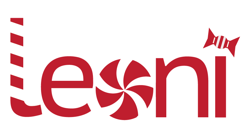
My first conceptually designed logo is inspired by the adjective ‘sweet’. I have created icons and replaced letters with them to express the word. Personally, I am a very optimistic and energetic person therefore the word sweet represents my personality. The ‘L’ has been changed into a candy cane and the ‘O’ into a peppermint. Finally the tittle on the ‘I’ is changed into a traditional sweet wrapper. I have done all of this through shapes and drawing with the pen tool and my intention is to create a recognisable logo that will evoke a sense of nostalgia and familiarity from those who see it, due to it being a traditional representation of sweets. Furthermore, the red and white motif is purposefully done to suit that purpose. Therefore with the sweet themed logo I think that it represents my nature as a caring, friendly person which is why I chose ‘sweet’ for my conceptual logo.
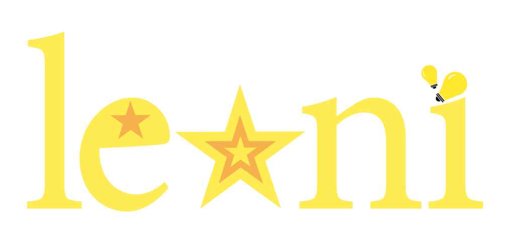
My second conceptually designed logo is done to represent the word ‘bright’. I love learning new things which is why the adjective bright applies to me. “Bright yellow radiates happiness, often evoking feelings of joy and contentment” (Picsart N.D) and I am an optimistic and happy person so bright and the colour yellow also references my attitude and personality. To create this logo I have used stars which traditionally shine bright and I have replaced the ‘O’ and the hole in the ‘e’ with stars. Similarly, in replacement for the tittle in the ‘I’, I have created a lightbulb which traditionally represents ideas and thinking therefore linking to the adjective, bright. The colour scheme for this logo is shades of yellow as it connotes brightness and happiness which represents who I am as a person. So, my conceptually designed logo is intended to be noticeable and unique, easily displaying the idea of brightness through the lightbulb and the stars.
References
- Picsart (N.D) Learn all about the color Bright Yellow https://picsart.com/colors/color-meanings/bright-yellow/ (Accessed 9th December 2024)