My three completed magazine spreads
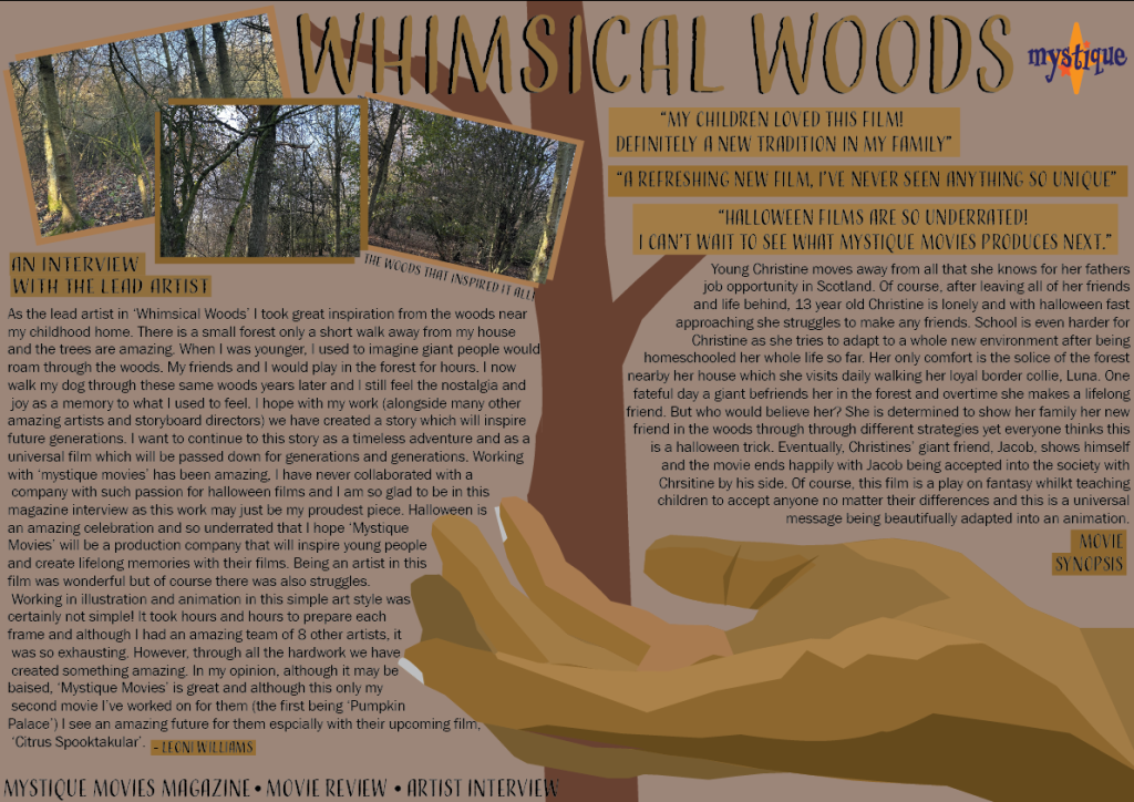
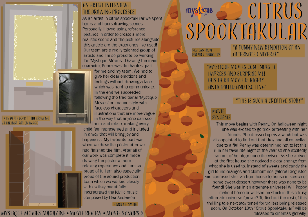
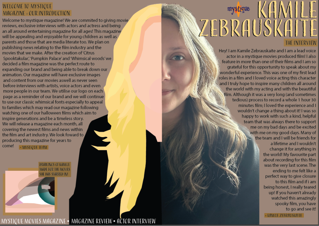
My editorial pages are pages from a magazine. These spreads are all created each based on one of the movie posters. “Readers are interested in what people have to say: their experiences, their feelings, their story” (S.Tarakson 2013). I decided to use an interview for a part of the writing within the content page spreads to interest the people that read it and give it more of an emotional, human feel so that it was more relatable. I also made it child friendly as I was aiming this content towards families and children. “Text messages, magazines, websites and emails have been found to be the most common reading choices for young people.” (Department for Education, 2012) I decided to create a magazine as they are most likely to be read by a younger demographic which are my target audience. I further aimed my content at this demographic through drawing pictures in the magazine to make it aesthetically pleasing and enjoyable to read. Furthermore, magazines are educational and it is important to be a positive impact as a brand. All three editions utilise the ‘Mystique’ logo in order to build a brand identity and integrate the recognisable logo. For the whimsical woods magazine spread I drew a hand which will of course link it to the movie poster which has the same hand in a different position. It further links through the colour palette and use of the tree splitting up the page. I decided to also utilise real pictures of a forest in order to use it as inspiration for the woods. I used shades of brown in order to link to all of my other work and keep a minimalist colour palette. The second magazine spread is about ‘Citrus Spooktakular’. I used drawings of oranges I made to create a partition in the spread to give the effect of them filling the page which linked to the film as there was too many oranges in replacement of candy on Halloween. I also used some original drawings of the door from the movie poster front cover and edited them onto the page to act as original artist work. Of course, I used earlier sketches of the door in comparison to the finished one on the movie poster in order to give the effect of it being a work in progress, alongside the inspiration pictures. “This is a powerful tool in designing a magazine layout as it is the visual storytelling element that captivates and engages readers instantly” (outsource2india, N.D). I utilised this visual storytelling element through my colourful drawing that are exhibited the whole way through all 3 magazine spreads for example, the oranges, the drawing of Kamile and the drawing of the hand. Finally, the last magazine spread is of Kamile. I drew half of her and used it to partition the double page spread. I also drew a picture of her eye in order to add to the colourful art. The intention behind the drawing was to show the inspiration of the before and after. I used writing about an introduction for the magazine as this was intended to be the first edition as well as an interview with Kamile (a voice actor) herself.
References
- Stella Tarakson (2013) Writing for magazines : Conducting interviews https://stellatarakson.com/2013/11/12/writing-for-magazines-conducting-interviews/ (Accessed 8th January 2025)
- Department for Education {N.D) Research evidence on reading for pleasure Education standards research team https://assets.publishing.service.gov.uk/media/5a7c18d540f0b61a825d66e9/reading_for_pleasure.pdf (Accessed 8th January 2025)
- Outsource2India (N.D) The Anatomy of a Perfect Magazine Layout – 10 Key Elements Explained https://www.outsource2india.com/creative-services/articles/10-key-elements-magazine-layout-design.asp#:~:text=This%20is%20a%20powerful%20tool,words%20may%20not%20fully%20communicate. (Accessed 8th January 2025)