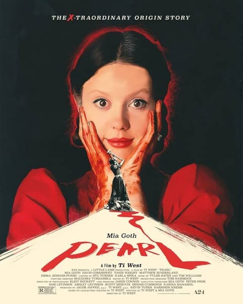
Figure 1. A great example of composition drawing the viewers eyes to key moments in the poster.
The use of the black and white pearl as a central point draws your attention to her with the white road. She is dynamic, holding up an axe and displays movement and although small on the poster it plays a central theme with the colour paralleling the black of the background. The monotone image creates a divide between the main image and the bright white path at the bottom of the poster. The blood coming from below her leading down this sharp, angled path is an effective display of conceptual design as the font looks written in blood which represents the key themes of this horror movie. Furthermore, this conceptual design of the blood turning into typography is perfect to harmonise this poster and connect the different sections. The red hues of the bottom, further front section of the poster is tied into the top half with the large, central image of Mia Goth as Pearl. Her direct eye contact and use of red through her clothes, lipstick, blood on her hands and background suggests she is dangerous, and this is a clear good example of colour. “Designers commonly utilize dark colors such as black, gray, red, and purple, as well as negative space, which creates suspenseful compositions that leave certain elements up to the viewer’s imagination” (The Tribe, 2023). The audience will clearly be able to recognise the malicious nature of pearl simply through this well-designed poster and the graphic designer almost urges the audience to theorise about the film and identify key themes. The composition of this poster is very effective at drawing the viewer’s eyes to the central image through the plain black background and angled white path. The black background is ordinary and unadorned which is purposefully done to draw all focus upon the center of attention, Pearl. Overall, this poster is conceptually well planned and executed, and this is clear through the graphic designers ability to display composition, conceptual design and colour.

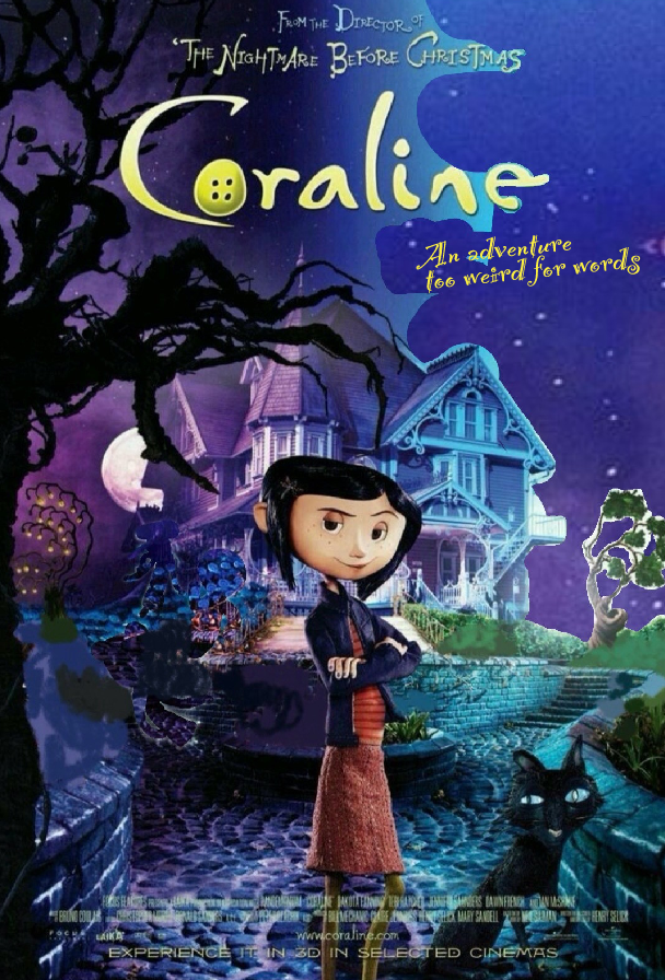
Figure 2. A bad, cluttered example of composition.
In my opinion, the composition on this Coraline poster is limited as there is too much happening within the poster for example: too many colours, unnecessary details, and clutter. Furthermore, to fix the limited aspect of the poster I have removed the ghosts which are distracting within the poster, especially since they have little mention within the movie. The removal of them makes the audience focus more on key aspects of the poster such as the main character and the house. Also, the background, which is a contrast between night and day, i have tried to change to a solid night scene as the dual background is distracting and done solely for aesthetic reasons, causing clutter, and deterring the audience from the main part of the poster. I have further removed the coloured flowers for the same reason as the bright colours distract the viewer, hiding the vital parts of the poster such as Coraline and the tree shaped as the other mother’s hand. The flowers in the poster have no real relevance to the movie and the colours do not match the clear Halloween palette. Also, the conceptual design is limited when regarding the flowers as they are purely added for aesthetic reasons. After removing the flowers and blue sky it becomes clearer the motif of purples and blues representing the whimsical nature of the movie. I have further changed the font to a more readable font as the words ‘too weird for words’ is hard to read. I have used a similar whimsical font and put it in the same place however with a clearer typeface it is easier for the audience to understand the concept of the film. The end result has lead to a film poster with great composition, naturally having the audience look around the poster at the key parts such as the tree, house, Coraline, cat and night sky.
References
- Figure 1. Postercinema. (2022) Pearl Poster 30 x 40 cm https://www.amazon.co.uk/Pearl-Poster-30-40/dp/B0BFWFMWQ9 (Accessed 18th October 2024)
- Figure 2. Jason. (2010) The world of Coraline stop motion animation puppets Hollywood Movie Costumes and Props: The world of Coraline stop-motion animation puppets… (Accessed 18th October 2024)
- The Tribe. (2023)The Art of Terror: Analyzing the Graphic Design of Horror Movie Posters https://www.wearetribu.com/blog/the-art-of-terror-analyzing-the-graphic-design-of-horror-movie-posters (accessed 23 October 2024)