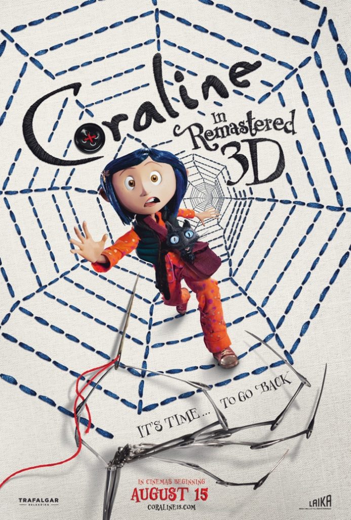
Figure 1. An amazing example of a conceptually designed poster, exemplifying key themes of the film.
This poster has a great conceptual design. Even as the remastered version, produced years later, it still pays homage to the original posters with its typeface. The ‘O’ is replaced by a button which seems to be sewn into the poster with a red thread (linking to the needle and thread held at the bottom of the poster by the other mother) which hints at the other mother being the villain and through her clawed hand, shows her supernatural characteristics. The typeface being embroidered into the poster with black thread is done to show the theme of embroidery within the movie as well as the background having a fabric texture.This further links to the background being embroidered with a blue thread which works as symbols for both a tunnel and a spider’s web. The motif of embroidery resembles the movie as Coraline tries to escape the possibility of having buttons sewn into her eyes. This background, although subtle, links perfectly to the movie’s themes and the particular scene in the movie when Coraline escapes and the subtle links to the movie are a perfect conceptual design and it links further to the button ‘O’. Coraline herself is one of the few elements not embroidered onto the poster which makes her stand out as the protagonist. She reaches out her hand clearly trying to escape, and this is reminiscent of the film where she tries to escape back through the tunnel. Perhaps the fact that she is not embroidered shows that she is escaping, the villain does not have control over her like she does the rest of the poster which is all hand crafted. The graphic designer had clear knowledge of the movie and has embedded it well within this poster, giving it amazing conceptual design.

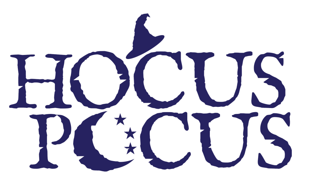
Figure 2. A poor example of conceptual design, only creative regarding the typography.
Regarding conceptual design, I have decided to remake the ‘hocus pocus’ logo. The original logo focuses heavily on typography and does not have any kind of conceptual design which makes it limited. I have chosen to incorporate a moon and stars, a symbol heavily associated with witches as the ‘O’ on ‘pocus’. I have done this to make a conceptual link to the movie through the logo which is effective. Furthermore, the moon and stars link to key moments and themes in the movie as the witches disappear in the daytime. As well as stars and the moon representing darkness and spirituality, further linking to witchcraft. I have kept a similar font to the original as it connotes Halloween, and the serif font looks effective and matches the atmosphere of the movie. My recreation of the original font was done purposefully as the font was a good example of typography as the typeface was rugged and links to the mysterious, supernatural aspect of the movie. Differing from the original logo, I have decided to add a witch’s hat symbol on top of the ‘C’ to represent the witches in Hocus Pocus. Whilst changing the logo, I intended to make it symbolise a more conceptual design of the movie and easier for the audience to associate it with the movie. After drawing the witches’ hat in illustrator, I made it resemble the font more with the rugged edges and moved it on top of the word as if the word is wearing it like a hat.I kept the colour of the typography as a deep purple as it traditionally represents witches and witchcraft. I kept the logo compact and easy to understand, leaving a strong connotation of witches and a mysterious, supernatural movie through colour, typography as well as conceptual design.
References
- Figure 2. Logopedia (N.D) Hocus Pocus https://logos.fandom.com/wiki/Hocus_Pocus (Accessed 15th October 2024)
- Figure 1. Coraline in Remastered 3D (N.D) Coraline in Remastered 3D https://www.coraline15.com/synopsis/ (Accessed 15th October 2024)