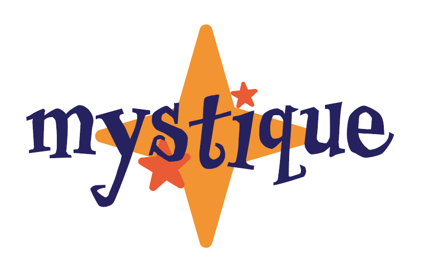
This is my finished conceptual logo

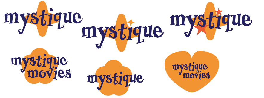
These are the tests I did to ultimately choose my logo
For my logo I have decided to go with a star with the word “Mystique” in it (the name of my production company). The “I” tittle is replaced with a star which is what makes this a conceptual logo. The meaning behind the star is that the voice actors in my films are stars. Therefore, the star is fitting as it represents all of the people that are involved in the company and pays homage to them. The logo is made up of the people that work hard in the industry. Traditionally “They symbolize excellence, professionalism, quality, and imagination. It also helps that stars are a powerful, globally understood symbol.” (TailorBrands N.D) I of course want to embrace a professional, universal symbol in my logo, and it will distinguish my brand as reputable and prominent in the industry. Having a strong, identifiable logo is vital and that is why I chose to make it memorable “representing the whimsical and imaginative nature of the film industry.” (UPPERMOSTBRANDS N.D) I also want to emphasise the whimsical and fantasy aspect of my films in particular. Whilst creating this logo, my classmate inspired me to pursue the focus on the stars in different colours which adds depth to a still simple and effective logo. Being a film production company focusing on children’s films I decided it was important to show the creative nature of animation films and posters with its individual art style. Furthermore, the stars add a sense of childishness and playfulness which is imperative so that children also find the logo appealing and recognisable. I experimented with a variety of different compositions and arrangements to create my finished logo. For example, I tried a heart and flower for the main shape behind my logo. Ultimately the use of a 4 pointed star worked much nicer aesthetically and conceptually to symbolise the film industry and all of the stars within it. I decided to use “Mystique” in my logo rather than “mystique movies” as a shorter logo will be easier to remember. I decided to combine a 5 pointed star and a 4 pointed star in this logo to truly emphasise the stars in the film industry and give depth to this simple logo without making it too crowded. The use of the whimsical font was to emphasise the fantastical, creative part of making children’s movies. Furthermore, the whimsical font also links to Halloween movies which of course my production company makes. The font, ‘Professor Minty’ is both spooky and whimsical which represents Halloween movies but also the originality and creativity behind these movies. The colour blue I used for my logo was chosen specifically to represent the night sky and align with the stars. The blue also compliments the shades of orange and yellow therefore a cohesive logo is more appealing aesthetically. I decided to use yellow and orange to differentiate the differently pointed stars and represent cartoon stars that are traditionally depicted as yellow and orange. Making the connection between cartoon animation and my logo is imperative as I intend to be an animation company.
References
- Tailor Brands (N.D) Stellar Star Logo Inspiration Stellar Star Logo Inspiration | Tailor Brands (Accessed 31st December 2024)
- UPPERMOSTBRANDSC (N.D) Brands with star in logo Why brands add a star to their logo (Accessed 31st December 2024)