My three typographical brand standards pages
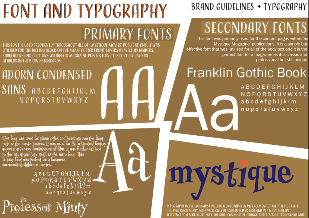
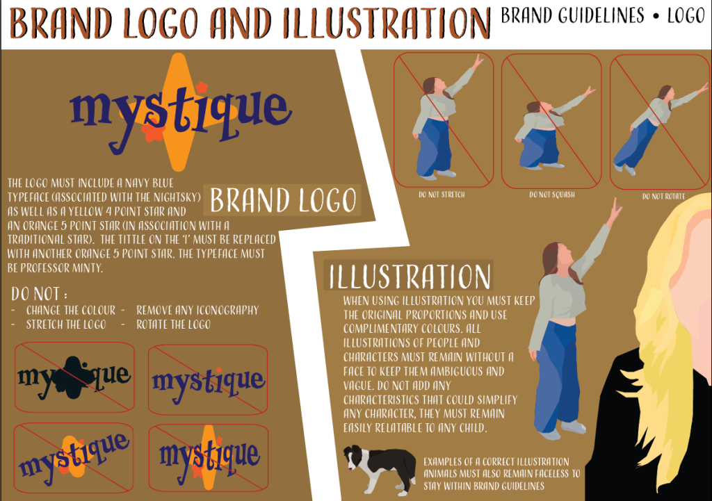
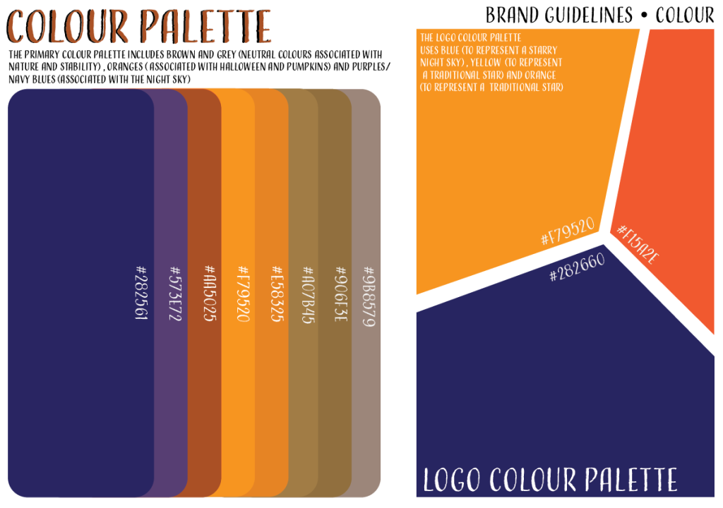
My typographical brand standards include: fonts and typography, brand logo and illustration and colour palette. “Today, brands go far beyond existing as mere logos and products – they’re personalities that tell stories” (M.Noel N.D) I wanted to communicate my brand through my guidelines. Through these aspects of my brand it is clear that the company is whimsical and creative. In the background of the brand guidelines I used shades of brown that are used all throughout my company products as a motif and I wanted to continue this when outlining my brand. “Your core values can be translated into your visual and verbal brand”(V.Potchekailov N.D). I wanted to communicate my core values through my brand guidelines for example staying true and loyal to the Halloween genre through the minimalist colour palette or through fonts that are imaginative such as ‘Professor Minty’. I further communicate the brand values through making sure the illustrations and characters all remain faceless in order to leave them vague and help children relate to and identify with their favourite characters. I created the font and typography page on brand guidelines to ensure that my very limited fonts remain the only ones used in order to build an identity with these fonts. I used an example of each typeface and then explained the importance of each font to the ‘Mystique’ brand whilst also breaking down the font utilised in the logo itself. The brown background is aesthetically pleasing and breaks up the large amount of writing whilst also making these brand guidelines suit my creative brand. The logo and illustration section of brand guidelines is created with the same shades of brown and the same style of background in order to create a motif. “The human mind processes things in images. The majority of people respond quickly to visual images instead of texts, so make sure your visuals support your message” (V.Potchekailov N.D). I placed great importance on the illustration and characters in my movie posters and content pages therefore the brand guidelines should represent the style of drawing that I have utilised. I made sure the visuals were bright and easily seen and showed ways not to use a character and the the correct way to employ a character into my magazine or films. I am aware visuals have great importance therefore I utilised more than one example of a correct character drawing. Regarding logo, it was much more simple to show the correct way to use my film logo. Lastly, I used a minimalistic colour palette and this is clearly shown through this section of brand standards. Although this page is more plain it highlights a bigger focus upon the colours which are of course necessary. I displayed the colours in a gradient next to complimentary colours before it and it is clear to see that it follows a Halloween aesthetic. The minimal colour palette also links with the palette used for the logo which is complimentary and uses similar colours. These colours are important and the focus on these brighter colours related to Halloween are to make it easier for the younger demographic of children to associate these colours with the mystique movies brand.
References
- Michelle Noel (N.D) The Six Elements Which All Brand Guidelines Should Have https://studionoel.co.uk/elements-of-brand-guidelines (Accessed 9th January 2025)
- Valeri Potchekailov (N.D) Brand guidelines – What is it, how to use it and how to create it https://storychief.io/blog/brand-guidelines-done-right#:~:text=Consistency%20in%20your%20visual%20communication,visual%20appearance%20is%20always%20consistent. (Accessed 9th January 2025)