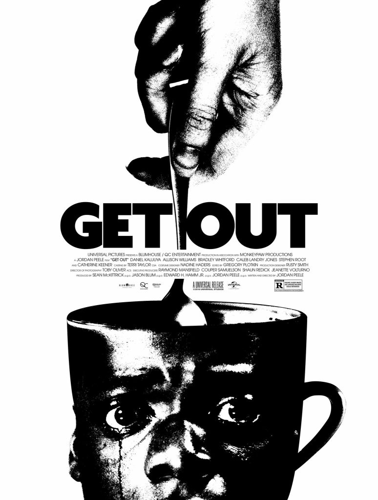
Figure 1. A great example of colour though simple, creating an effective poster.
It’s clear that this ‘Get out’ poster is a great example of colour. The graphic designer has purposefully chosen to only use a grayscale (black and white), and this is likely done to represent the racism and segregation within the movie.There is also amazing conceptual design with the main actor’s head superimposed into a teacup. This represents a key motif of the film as the protagonist is hypnotised with a teacup which almost leads to their death.In regards to typography, the typeface is bold and large, as well as black which clearly gets the reader’s attention and draws them to see the finer details of the poster. The simplicity of this typography in contrast to the intricate details of the conceptually designed poster is clear and it creates one cohesive image.The colour of the font as black (as well as being a part of the monotone image) further emphasises the importance of the key themes within the movie such as racism and exploitation which is being addressed by the director (Jordan Peele). “The starkness of the black and white imagery ignites the moment and illuminates the battle between the two races at the heart of the movie”(Murphy M,2018). The use of a plain white background is done intentionally to draw the viewers eyes to the main image and purpose of the poster. This composition is well executed and gives the viewer very little chance to look anywhere besides where the graphic designer intends them to look. The idea of his head being open like a teacup also represents the control the hypnotist had over him, as seen with their hand holding the spoon. Overall, the graphic designer displays a great use of colour through the intentional use of grayscale although they also utilise a great typography and conceptual design.


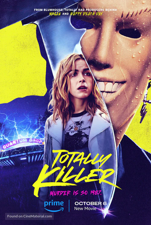
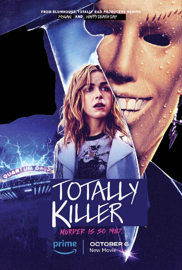
Figure 2. A poor example of colour, the yellow distracting from the horror poster
I believe that the yellow in this poster is limited. Although it is trying to pay homage to the 80s (as this is when the movie is set) it instead looks tacky and unserious. The vibrant yellow removes the fear and horror atmosphere therefore I have changed the background to black. The background being black makes the poster more simple as well as drawing the viewers focus to the main points on the poster such as the murderer, main female protagonist and even the ‘quantum drop’. I have further changed the typography that is yellow. I have chosen to instead make it white which is not distracting and instead uplifting, highlighting the central images which should be focused on by the viewer. I have attempted to keep a similar font as I believe it was an effective horror font and links to the stereotypical slasher movie. “There’s a certain psychology linked with colour usage in films and in the horror genre yellow is often linked with madness, isolation, insecurity” (Fright Club,2020). Although, I would argue this is not being conveyed in this particular poster and instead the yellow is limited and distracting. Furthermore, the common analogy of yellow in horror films is not being met here as this is about a serial killer in the 80s, further limiting the effect of this vibrant, luminescent yellow. The colour palette of this poster becomes more subdued and scarier with the black background which of course preferable for a horror/thriller movie. The new dark palette is nicer to look aesthetically as well as conceptually, making it easier to recognise the silhouette within the image of the slasher killer which makes a more pleasant viewing experience for the audience. Altogether, I have recreated this poster to suit a more horror aesthetic and atmosphere whilst still paying homage to 80s movies which it references.
References
- Figure 1. Mikado Murphy. (2018) The ‘Get Out’ posters you didn’t see at the movies. The New York Times, Internet Edition. 2 March. https://www.nytimes.com/2018/03/02/movies/get-out-movie-posters-oscars.html (Accessed 18 October 2024)
- Figure 2. PixelDemon. (N.D) Totally Killer Cinema Movie Poster A2 Sizehttps://pixeldemonmg.co.uk/products/totally-killer-cinema-movie-poster-a2-size (Accessed 22 October 2024)
- Mikado Murphy. (2018) The ‘Get Out’ posters you didn’t see at the movies. The New York Times, Internet Edition. 2 March. https://www.nytimes.com/2018/03/02/movies/get-out-movie-posters-oscars.html (Accessed 18 October 2024)
- Frightclub. (2020) Shades of horror: Yellow https://www.thefrightclubni.com/post/shades-of-horror-yellow (Accessed 24 October 2024)