The subject I’ve chosen for this assignment is Halloween movies, specifically children’s movies. I have explored a range of halloween movies from horror to children’s and have ultimately chosen a younger demographic.
Figure 1. A great example of typography regarding children’s halloween films.
I would argue that the typography in this Coraline poster is very well done, and it captures the key themes of the movie whilst also matching the atmosphere of the poster. Firstly, the typeface for the writing is child-like and almost messy which emphasises the youth of an 11-year-old Coraline. The whimsical feel of the font reflects the movie and the font being black contrasts with the light which comes from the doorway. Although, the black typeface links to the darkness surrounding the doorway in this poster. Furthermore, the logo itself represents the key themes of the movie through the ‘o’ being a button and the ‘l’ having the cat come out of it, like a doorway. The graphic designer has utilised these letters to represent the storyline, especially with the doorway as the light coming out of it reflects the movie poster itself. “And it showcases a critical point during the catalyst of the story, in which Coraline first encounters the magical door” (AlynnFergusun, 2018). The poster acting as a teaser to a pivotal moment wthin the movie. The cat being in the doorway is further important as it reflects the movie where it can travel through worlds. The contrast of the ‘O’ as a button, in addition to having a different colour in comparison to the rest of the word is striking and makes it stand out. Through doing a black button, the graphic designer has altered the typography and brought attention to the letter, this is useful as it is vital to the film as Coraline escapes getting buttons sewn into her eyes. Furthermore, the colour yellow as the key colour for the font represents the atmosphere of the movie and links to the yellow raincoat and boots that Coraline wears. So, this movie poster has been designed with an influential example of typography which represents the movies’ themes and style whilst also complimenting the atmosphere of the movie poster.
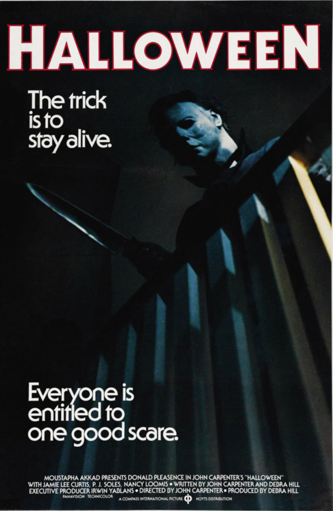
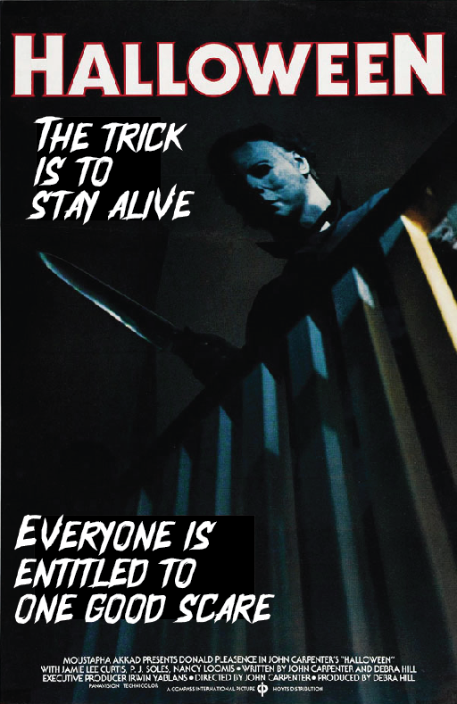
Figure 2. A limited example of typography that makes a scary poster unserious.
The traditional movie poster has a sans serif typeface which does not match the horror poster. The atmosphere the poster is trying to create is almost ruined by the unserious typeface, removing the ominous, supernatural serial killer aspect that the movie represents. I wanted to implement a different typeface which connotates more of a horror movie (in comparison to the original which is not scary and does not symbolise or represent the movie in any way). I have chosen to block out the previous font in order to replace it with my own typeface. The font I used is more horror themed and sinister which represents the key themes within this horror film. I have kept the words the same although slightly enlarged the font in order to draw the viewers’ attention to it. The Halloween font I’ve chosen is ominous and slightly messy which emphasises the horror aspect as it seems scratched onto the poster. Furthermore, I have combatted the limitations of the previous poster through the removal of the typeface which is not scary and almost removes the fear and apprehensiveness which this scary film poster is attempting to achieve. The white colour of the typography I have left unchanged (although slightly brightened) as it is a great contrast to the dark poster with Micheal Myers (the serial killer) looming over a balcony. The typography and main logo are both white which helps them stand out and create a more interesting poster which people will read and take the time to appreciate and understand every detail of the poster. Furthermore, the lack of white in this poster other than with the fonts makes the poster more sinister and frightening which of course is the purpose when creating a scary horror movie.
References
- Figure 1 POSTERITATI (N.D) Coraline (2009) original movie posters coraline-original-2009-us-one-sheet-movie-poster (Accessed 10th October 2024)
- Figure 2 Nick, Sherman. (2014) Halloween film titles and marketing https://fontsinuse.com/uses/8149/halloween-film-titles-and-marketing (Accessed 10th October 2024)
- Alynnferguson. (2018) Coraline: Beat Sheet (Save the Cat)https://alynnferguson.wixsite.com/howareyoucovered/post/10-of-the-most-memorable-celebrity-interviews (Accessed 23 October 2024)