


For my first portrait I have made a plaid background and I experimented with the shape of a strawberry. I chose to do the deep red lines in a lower opacity to create the darker boxes for when they cross over. I think it goes well with the portrait as they contrast but also complement each other. I drew the strawberry icon and then reflected it to create this cohesive pattern which reflects me because I love strawberries.
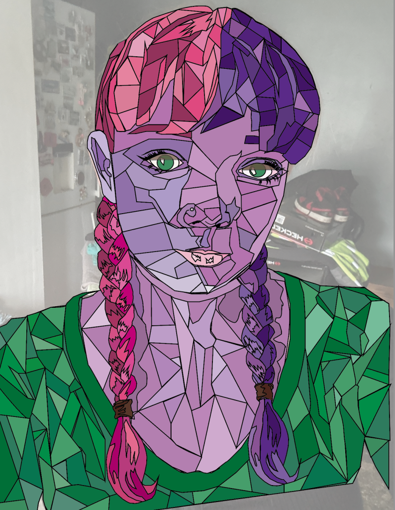
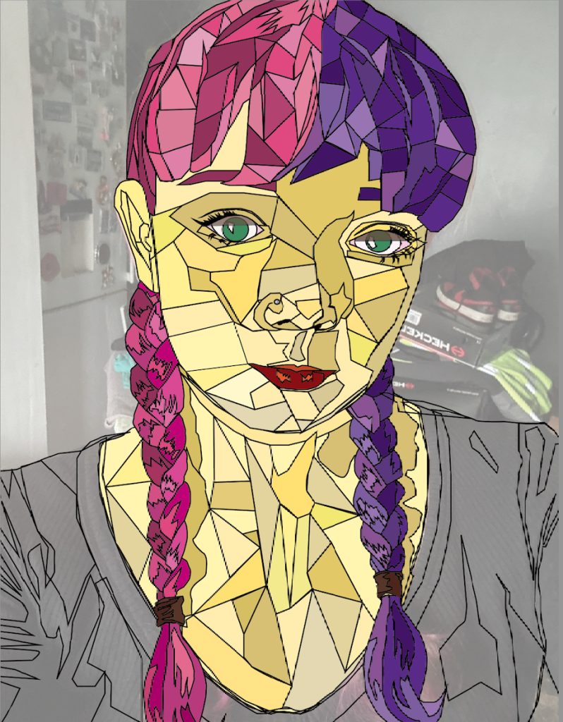

I decided to try out different colours for the stained glass portrait in order to find a suitable skin colour. Originally I wanted a more abstract colour so I decided to test a purple and a yellow. I ended choosing a more peach skin tone to make it more realistic as I didn’t want the portrait to be too abstract, especially as I was taking my interest from Marc Chagall. Through choosing a more realistic skin tone it made the background pop out as well as the vibrant choice of hair and clothes colouring.