This is my low fidelity prototype for my app/website.
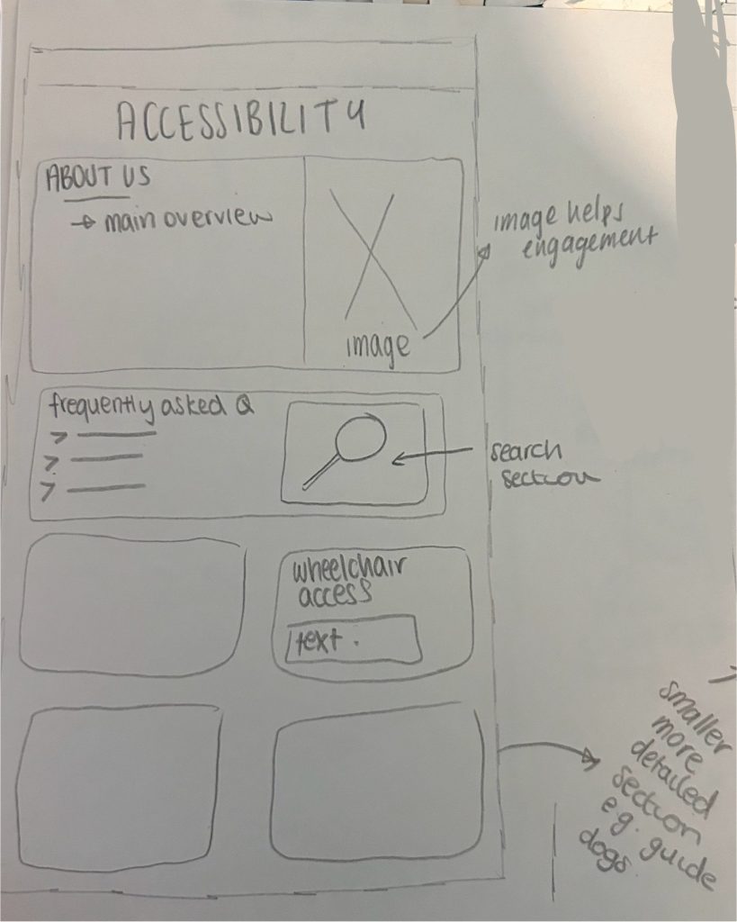
My accessibility page is useful as it contains a main overview as well as a search bar with frequently asked questions, this is efficient and engaging which makes it easier for the user to find the information they needed.
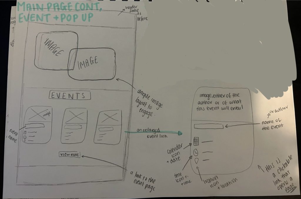
This is my design for the main page and a minimised event. The images are engaging and aesthetically pleasing (aesthetic-usability effect law) and a unique layout to encourage the user to see more. The main page has event links that are small and concise but easily explain what the user needs to know. The user can then click on these event links to navigate to the page of more information.
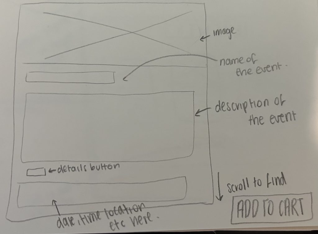
This is the event link that is navigated to after clicking on a small event. There is an initial image and large name of the event followed by the overview and information needed to understand and decide if the event is what the user is looking for. This page has an add to cart option after the location, date and time information.
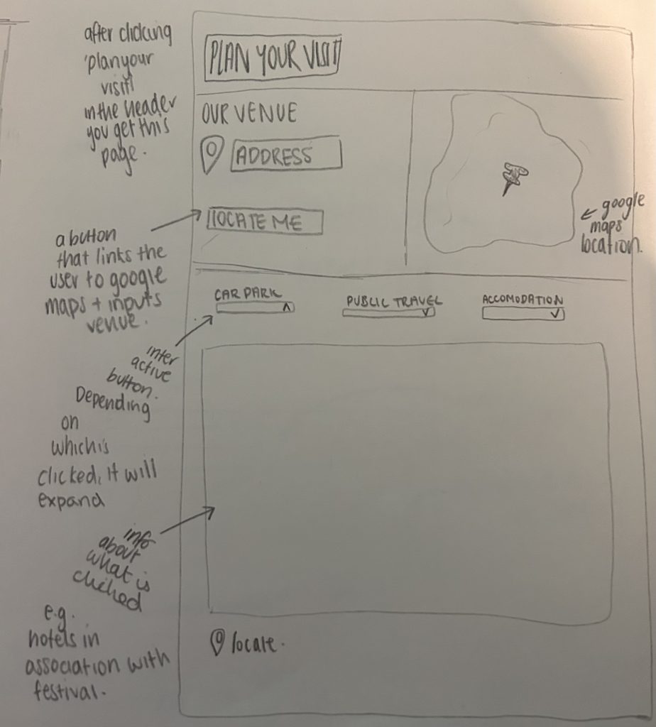
This is the layout for the ‘plan your visit page’. It contains a map detailing the venues location swell as a link that navigates to google maps. Furthermore, there is all down option for different modes of travel as well as an option for accommodation for the time the event is active.
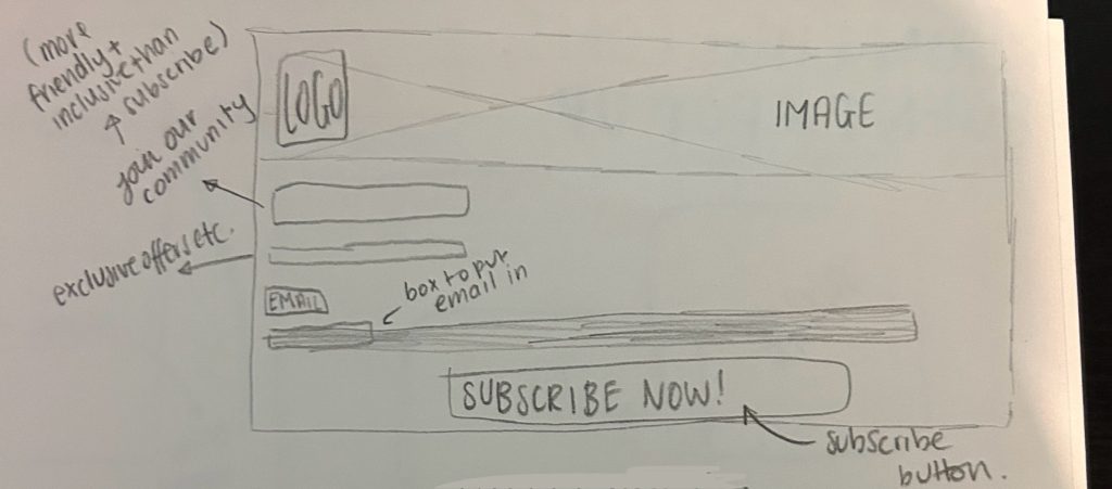
This is the pop up that encourages users to subscribe. It is aesthetically pleasing and will give the stakeholders a good overview of the benefits of joining the mailing list such as exclusive offers. This is constrained as it had to be a stereotypical design which was hard to create whilst still making it aesthetically pleasing however I think I achieved this.
This page details the name and locations of vendors and sellers for example food trucks and even the authors selling their novels and the merch sellers. It is efficient and easy to understand with their exact locations given.
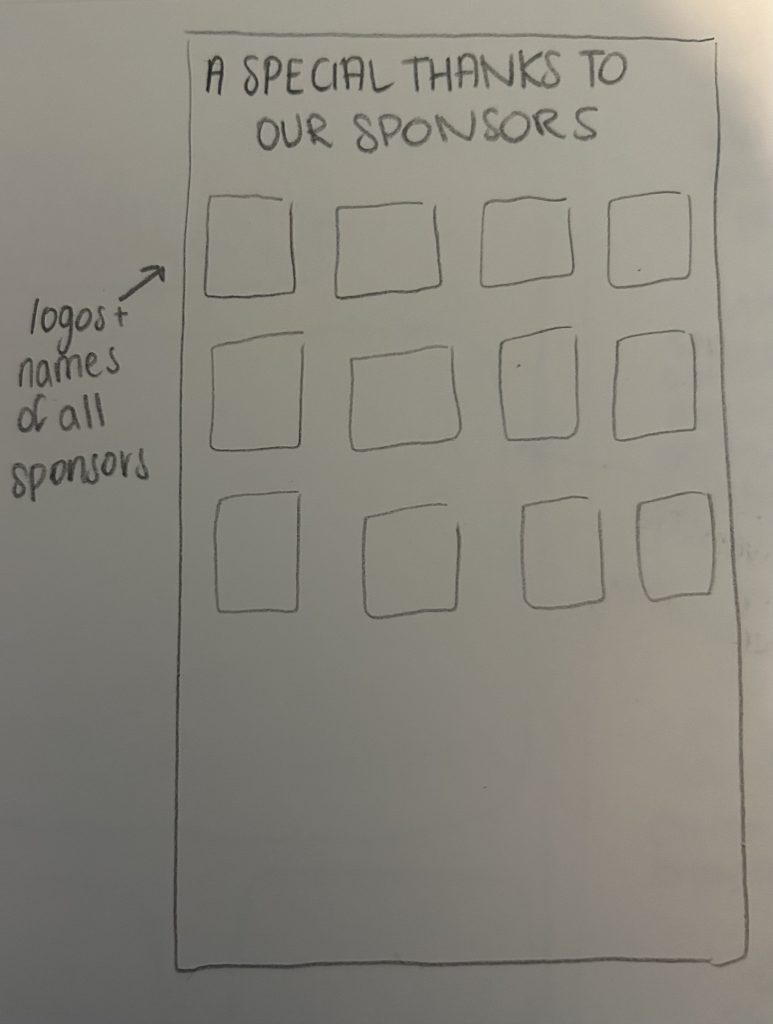
This stakeholder/sponsor page gives thanks to all stakeholders through promoting their brand logo and name.
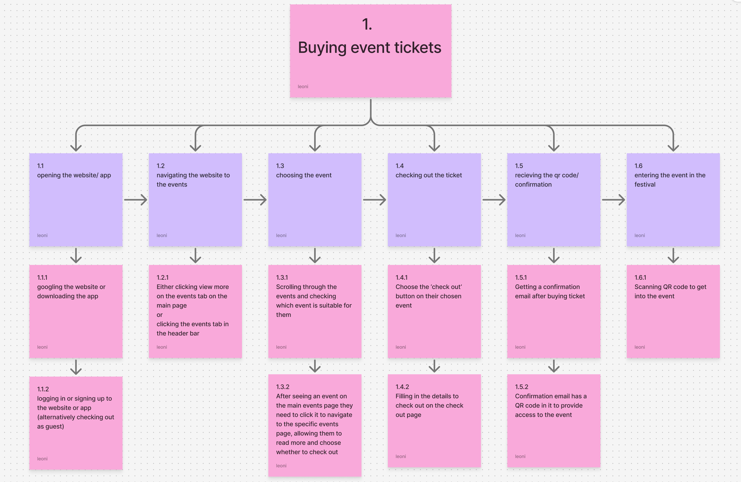
This HTA is an organised approach of showing how a user can purchase tickets for this event. It is a simplified process so users without technology skill can still use it.
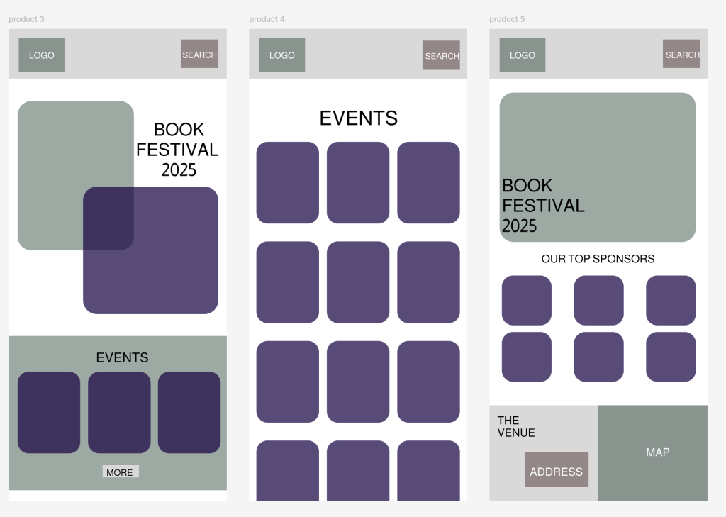
Finally this lo-fi prototype I created to visualise the main page and event process. It replicates my paper prototype and is a simple design as not to confuse the user, it is a familiar design in order to keep the user engaged.
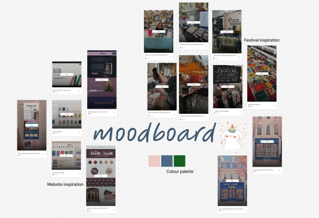
This is my moodboard, detailing the inspiration for my festival and the ideal colour palette.