These are my rejected designs. Many of them were rejected due to accessibility limitations swell as lack of usability whether that be not effective or engaging.
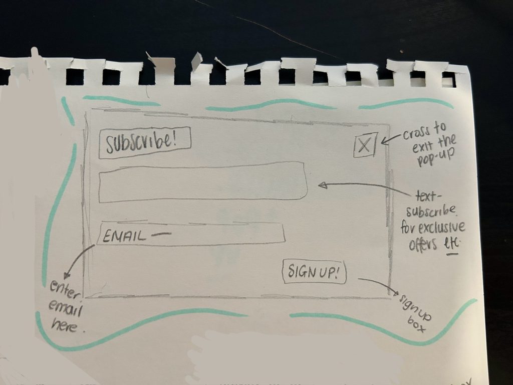
My first rejected design is a pop up subscribe box. This box is limited because it is too simple and basic and although it is cohesive which ‘Jacobs law’ encourages, I intend to make the design slightly more unique although still familiar to the audience. In order to make it more aesthetically pleasing, I tend to add an image at the top. Furthermore the copy ‘Subscribe’ will be replaced with ‘Join our community’ as it sounds more inviting and familiar which in turn means the user is more likely to subscribe. So this design ultimately didn’t work well due to its simple design.
This is a rejected design of viewing an individual event. Although it seems to be aesthetically pleasing, the copy on the smaller text box means that it may not be accessible for all. I need the copy to be large and legible and perhaps the rounded smaller text box will limit this. To alter this , I will make the event text box bigger and as ‘Hicks law’ states, as I remove more options and choice on the screen it becomes easier for a user to comprehend the website/app rather then get overstimulated and stop booking their chosen event.

My final rejected design is a prototype for the events page. Overall I decided to use a different style as I believe this is limited. I think it is restricted because overall it is not aesthetically pleasing to the eye and according to the aesthetic-usability effect law it is clear that an aesthetically pleasing design is viewed as more usable and trustworthy. To alter and fix this design I will separate the individual events rather than have them in a grid format which will also make it more accessible allowing the copy to be larger and more easy to read for the users that need it.