Here are my mid-fidelity layouts I created in Figma. The pages I created include: Home page, events page, ticket buying/checkout page, sellers and vendors page, accessibility page, sponsors page and an individual page for an event. When creating these pages, I’ve kept my users and my user journey map in mind to make this app accessible and engaging to my users. Throughout this whole app, my typography is clear and easily contrasted to each background to help those with dyslexia or colour-blindness.
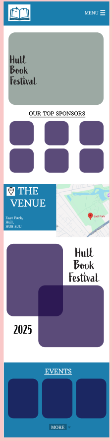
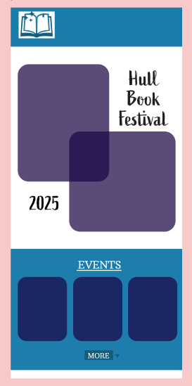
This is my homepage
My homepage is a long page which users can scroll through, and it has images to adhere to the ‘Aesthetic-usability’ design law as the images will make my app aesthetically pleasing and engaging. It has easy ways to navigate to each page for example the small events section that can be used to access the events page. This easy navigation will make my app accessible for everyone using it. Furthermore, the fonts on my home page are large and easily readable. The use of the map on the homepage will instantly inform the user where the venue will be.
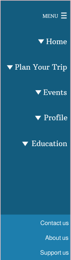
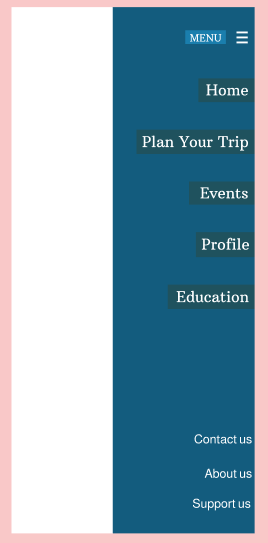
This is my menu page
The menu for my app is easily accessible and it is easy to navigate to the important parts of my app. “A well-designed app can make life easier with just a few taps.“ (Figma) and this is what I aimed to achieve through my simple structure that has familiarity as I followed the conventions of an app. I wanted the journey for the user to be easy and enjoyable.
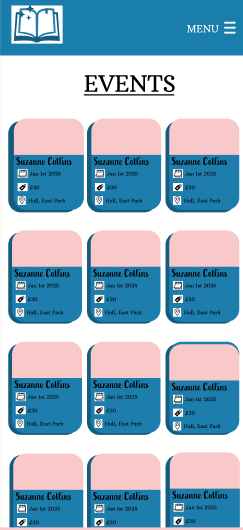
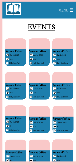
This is my events page
The events pages are important as they prepare the user for the contents of the festival as well as each event being purchased individually. The easy-to-understand layout is done to support my users as my user journey map showed that my audience have a variety of different genres and styles of authors/books that they prefer therefore these events pages are easy to differentiate allowing each user to choose what fits their needs.
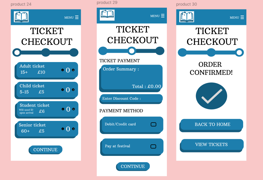
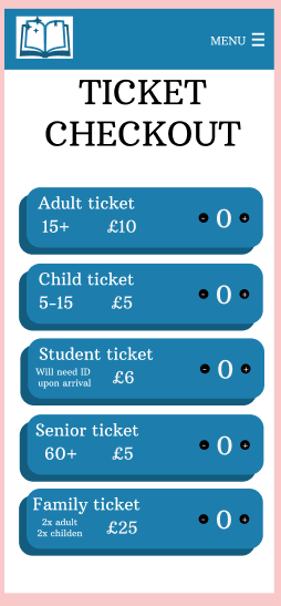
My ticket buying pages have a clear progress bar which will encourage the user to continue their purchase, this encouragement (clear through the coal-gradient effect law) is necessary to help the user complete their ticket purchases.

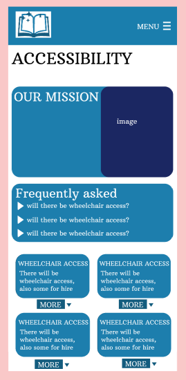
This is my accessibility page
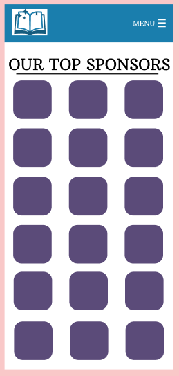
This is my top sponsors page to thank my stakeholders
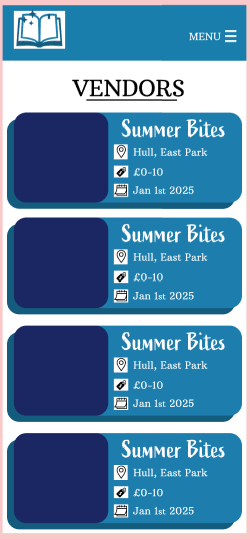
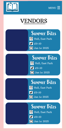
This is my vendors page to show the food available at my festival
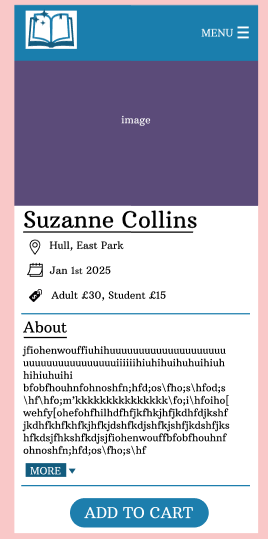
This is my individual events page
Rejected Designs
Many of my rejected designs are rejected due to the style as I preferred to achieve a bubbly aesthetic by layering rectangles. The layered effect gave my design dimension and made it more aesthetically pleasing therefore more engaging.
My rejected events pages
I rejected the events pages as the blue backgrounds are too busy and distracting. Furthermore, they may be less accessible due to the colours and perhaps it would be harder for someone that has difficulties with vision to read it.
My rejected ticket checkout page
My original ticket checkout I changed and edited to contain a progress bar to encourage the user to complete the checkout process. I also added a continue button so after the desired number of tickets have been added (through the plus and minus buttons) the user can continue through the process as before it was hard to use and not very motivating.
My rejected shortened homepage
Finally, I changed my original homepage to make it longer and more detailed, in order to be more engaging. I increased the usability of the app through this as there are large images and font which was excluded in the original design. My aim was to make this homepage accessible, engaging and aesthetically pleasing for my intended audience.
My rejected events page
My rejected menu pop up
My rejected accessibility page
My rejected vendors page
Figma (N.D) How to design an app in five steps https://www.figma.com/resource-library/how-to-design-an-app/#:~:text=A%20well%2Ddesigned%20app%20can,your%20app%20idea%20to%20life%3F (Accessed 5th March 2025)