In order to adapt my app design to a website I had to recreate the original design in Figma. I had to make sure to leave white space at either side of the desktop to avoid business or an overstimulating page. As a means to build a brand identity, I continued to employ the blue colour scheme throughout my website design. This also benefits my user as through my primary research many of my users chose blue as an identifiable colour for a book festival. Furthermore, I continued with the bubbly aesthetic and layered art style I had chosen. This design gave the website dimension, and the layered shades of blue complemented each other which made it overall an aesthetically pleasing design that mirrored the app version.
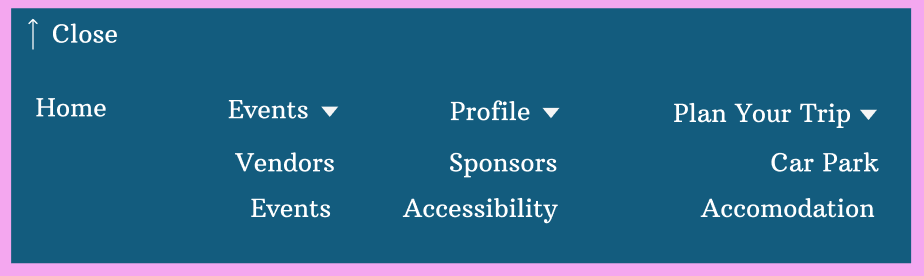
My website menu expanded
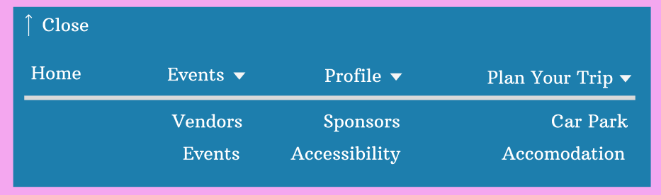
The main difference between my app and website is the menu pop up. The website menu is instead a more conventional style of a pull-down menu. I have applied the condensed version on each page and it will be easily accessible as it is clear on the top of each page. It has different key parts of the website such as events, trip planning and sponsors. Each user will be able to understand this as it is familiar but also unique due to the design and colour palette. The menu bar at the top of each page contains the logo as well as the name of the festival in the logo font. This paired with the menu bar is a conventional header for a website.
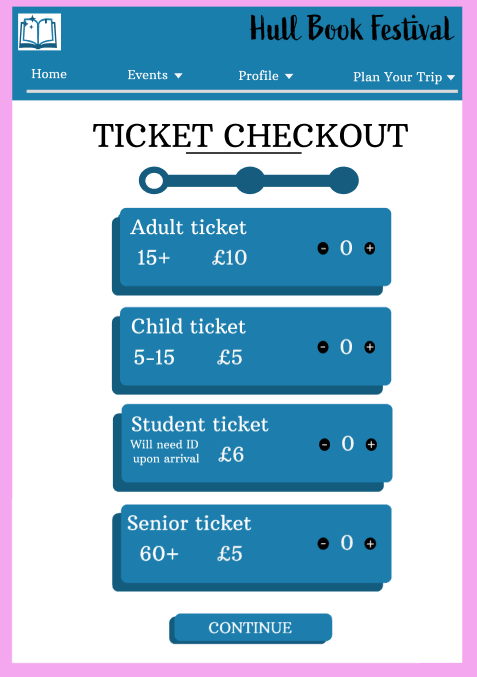
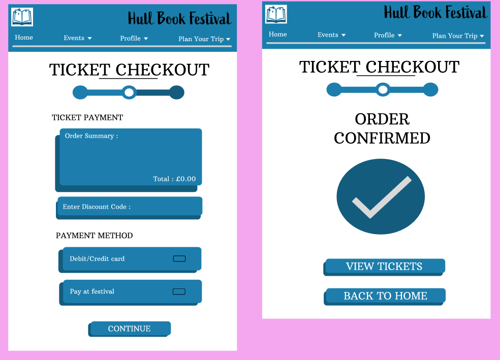
My tickets checkout pages
The tickets checkout page resembles the checkout page in my app. The progress bar is the same, still motivating the user to complete the task and the colours are engaging. Furthermore, the three pages of checkout are easy to use due to the large accessible font and the easy step by step process to checkout.
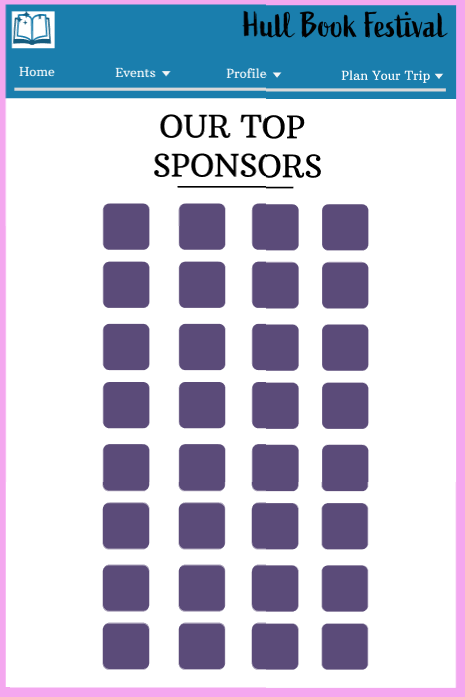
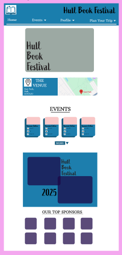
The top sponsors website page
The top sponsors page was created to thank the sponsors and stakeholders which would help fund the festival and the stakeholders such as the food vendors that will be present on the festival. Each purple image will have a logo from each specific stakeholder in order to pay gratitude.
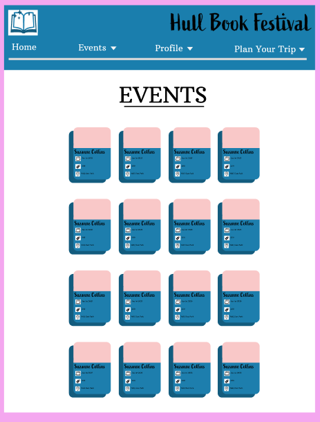
The events website page
The events page is easy to navigate as each event is separated into its own space. The blue events boxes are aesthetically pleasing, and the font is large enough for it to adhere to usability effects. Also, the image will help attract the user and help them choose the event they wish to purchase. Each individual event has a date, time and location on the front page which is key to immediately help the user decide if it is the correct choice for them. For example, the date may not align with the users schedule therefore they can keep scrolling the events instead of having to click on and off, saving the user time.
The rejected menu design
The rejected menu I have is done due to the design. The background colour is too dark therefore it may be harder to read therefore less accessible. Also, the lack of the separation between the main menu and the pull-down sections may make the user confused. Also, design-wise it is harder to see when the section pulled down if there is no separation clear to the user.
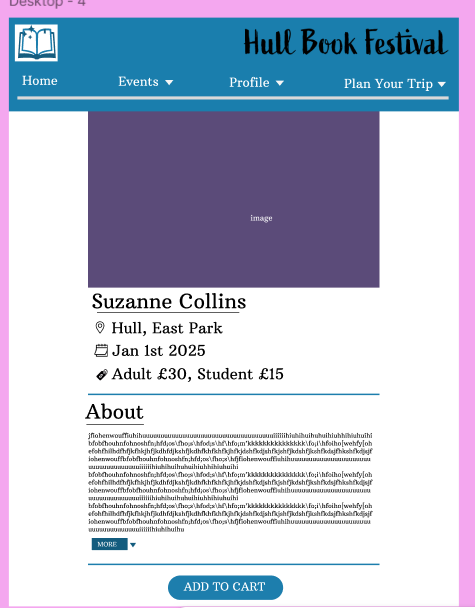
This is my event page
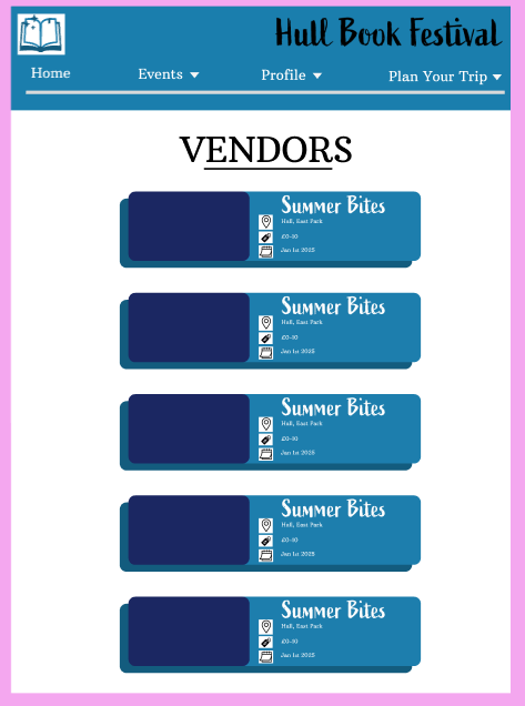
This is my website vendors page
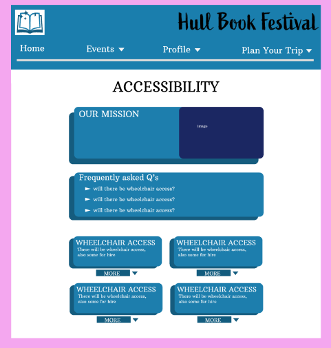
This is my accessibility page
This is my homepage