Festival atmosphere mood board
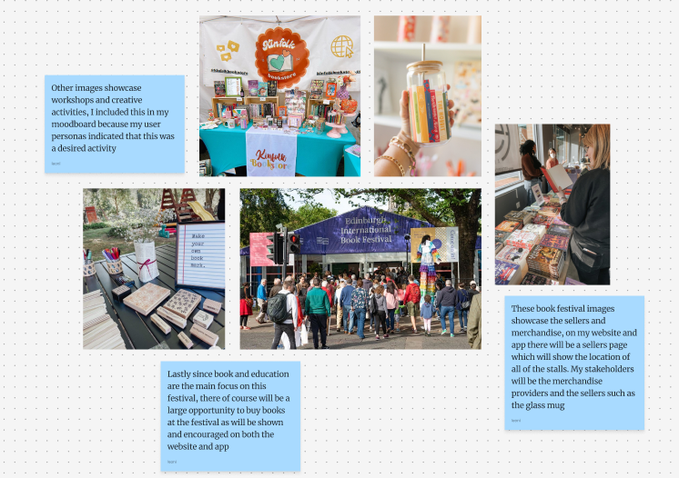
When researching my festival I looked at images of previous book festivals for inspiration. I particularly looked at different merchandise and sellers such as the glass mug in order to gain insight into common items sold at festivals. This primary research will give me insight into what to include in my vendors section in my website and app.
Mood board about book festival posters
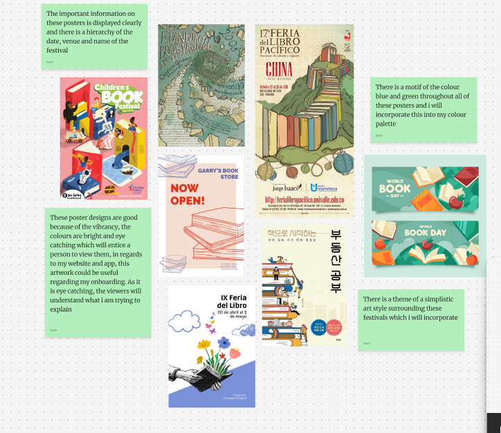
My second mood board focused on posters that were made to advertise book festivals. The main reason i researched these posters was to look at the colour schemes and motifs. It was clear to see that the important information such as date, time and venue were always listed in large writing which hinted that there was a clear hierarchy of information. I reused this information when creating my events pages as I listed these key information to immediately inform the user the important facts regarding each event.
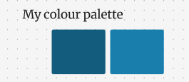
Colour Palette and logo competitor research
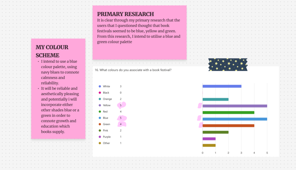
Primary user research questionnaire
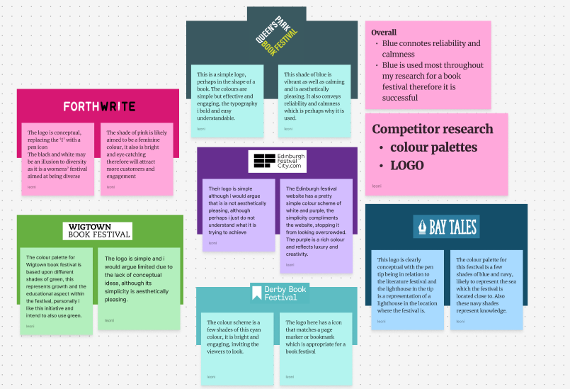
Regarding colour palette, I did some competitor research to conclude the most common colours and the most effective logos. There was a wide variety of colours used for each festival each with different aims and purposes but overall the most widely used colour was blue. The colour blue is engaging and inviting and it is easily associated with a book festival as the colour also represents calmness and knowledge which reading can also relate to. The colour blue also gives a sense of reliability which is useful in a design-sense when regarding a website or app as the user must trust it.
I utilised my colour palette of blue and this was necessary to create a brand and associate these colours with my festival. Furthermore, my mid fidelity design was created completely with my users in mind, for example the aesthetically pleasing colour palette was mainly chosen due to the responses from my primary research based upon what my users chose. Also the aesthetic- usability law states that the more pleasant a design looks, the more likely the users will engage with it
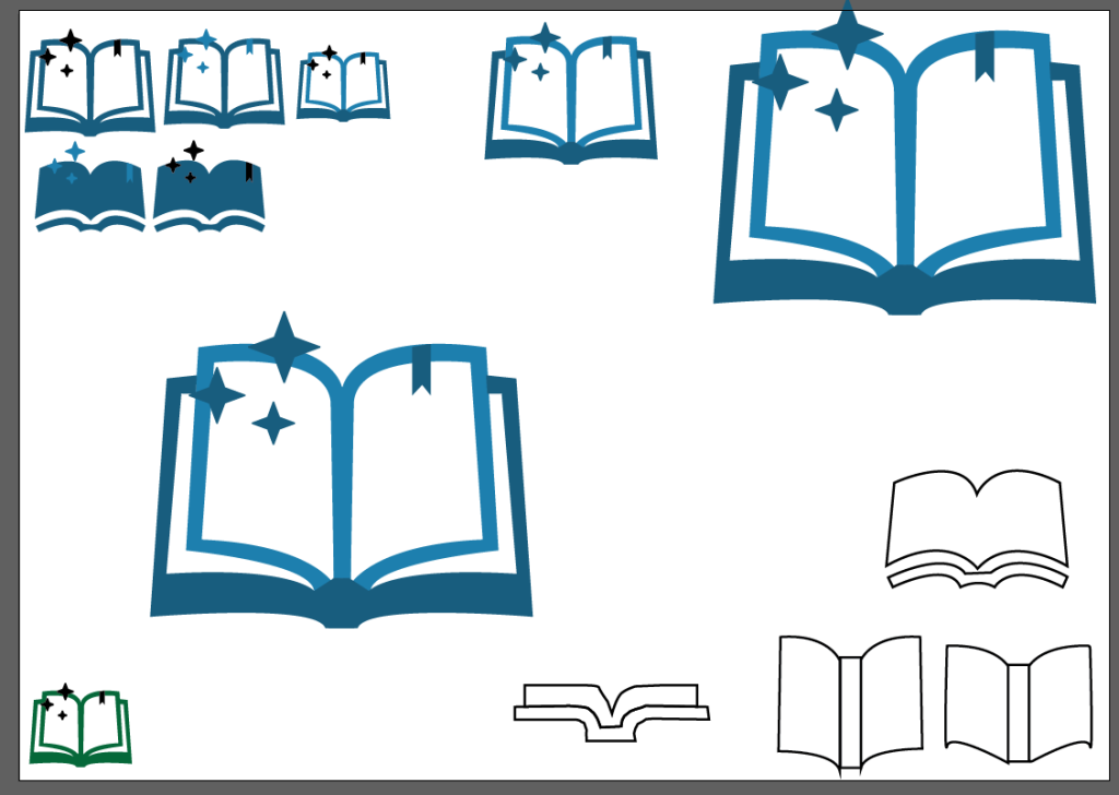
Logo creation trial and error
Finally, my logo is created in the shape of a book. After many different trials and errors i decided on an open book with stars coming out of it and a bookmark on the page. Originally, I tried different forms of books such as opened and closed and side wards however the idea of an opened book is inviting and encouraging which I also envision the festival as. The bookmark that I put on the pages is aesthetically pleasing but also conventional for a book therefore I added it. The stars are added to replicate the magic of reading and books and they also are used in order to reinforce that idea that the festival will be exciting, magical and like a fantasy adventure! Lastly, the colours used for this logo are a part of my colour palette that are used frequently throughout my design.
Many of the book festival logos feature the name of the festival in writing which I found through my mood boards. Therefore I also used this font to write “hull book festival” which is the name of my festival to go with the logo I created.
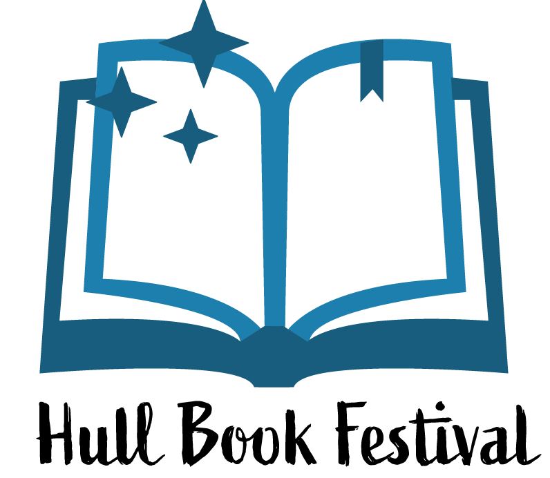
My final logo