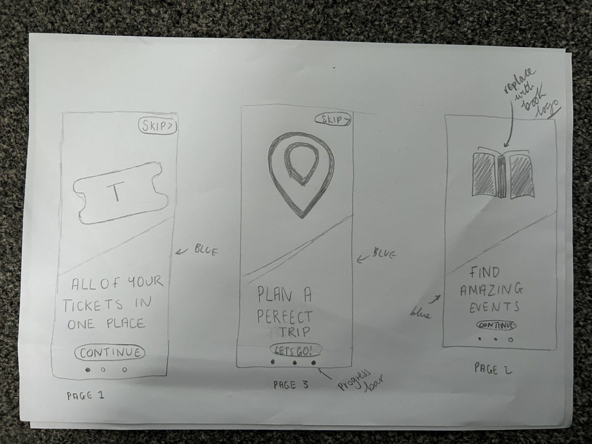
My initial sketches of the onboarding process
To create my onboarding I started with different sketches. I decided to follow a theme which all 3 pages included an icon/image. I did this in order to engage my users as they are easy to understand. The icons are easy to create and follow my colour scheme. The final icon is my logo which further reinforces my brand. The onboarding process I have created on Figma includes a progress bar. This was necessary as the user will know how many steps there are and how close they are to the end. This will motivate the user to continue and finish the process before viewing the app. Alternatively, the user has the option to use the skip button and go straight to the app. This is useful for users who already have experience with this app (or similar apps) and it also is useful for users with short attention spans that potentially are tech savvy and confident in their ability to use the app. The ability to skip gives the users control and this is vital in an onboarding system. Furthermore, I heavily used the blue colour palette in order to establish my brand. Through my onboarding research, I quickly concluded that the onboarding process must reflect the atmosphere of the app and I ensured this through the house style. Finally the continue and skip buttons both conform to my theme and the same style of button is used throughout my app.
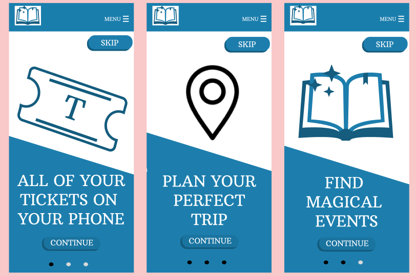
My interactive onboarding process, pages 1 2 and 3 (not in correct order here)
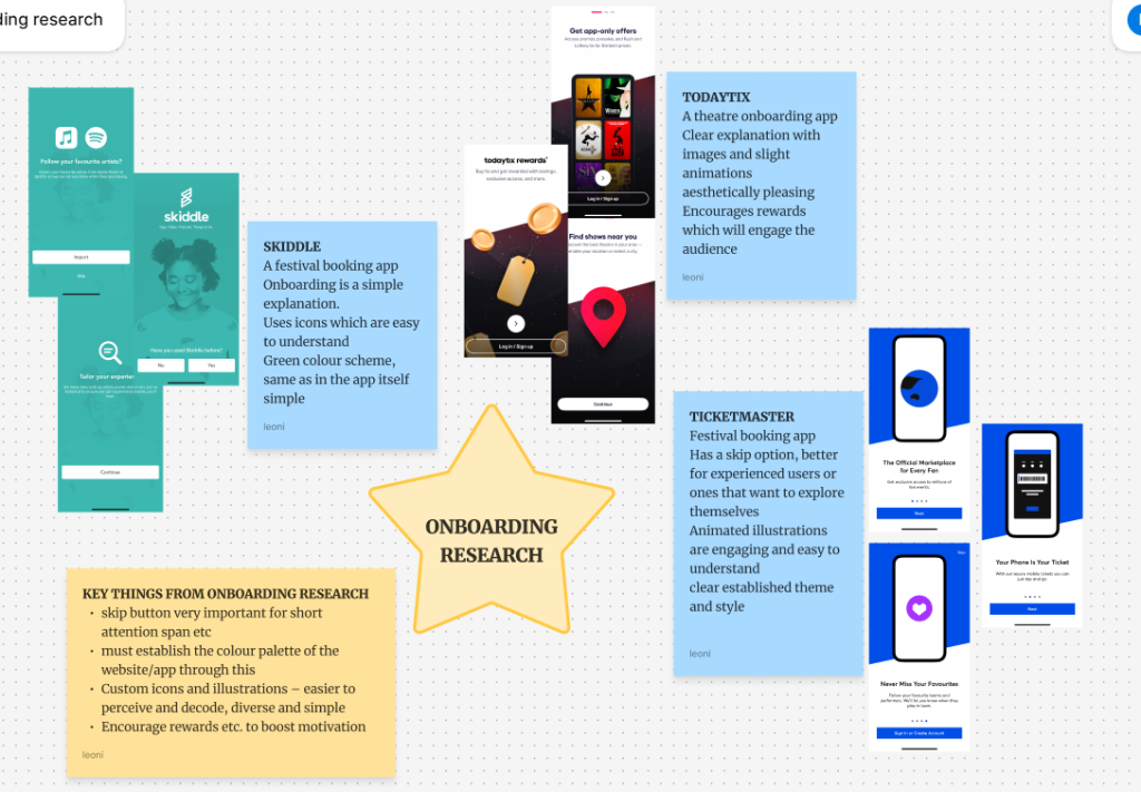
My onboarding competitor research
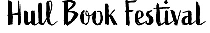
Regarding typography. I utilised two different typefaces. The typeface for the logo is ‘Active Regular’ and this I chose because the handwritten style is reminiscent of books and writing. It is aesthetically pleasing and even though it seems handwritten it is easily understandable and readable. The typeface complements my logo and together they clearly connote a book festival. When choosing my typeface I tested many different font styles but ultimately, the calligraphy, handwritten font was the most effective and representative of my brand.
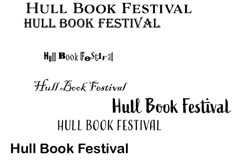
Different typefaces I tested
“Serif fonts can look authoritative, professional, and suggest the weight of history or experience.”(Adobe) This typeface (Arbutus Slab) will make my app look reliable and trustworthy which is vital as it will be used to deliver transactions such as ticket purchasing. The professional font also makes my app clearly seem respectable and will put the user at ease when using it. Furthermore, the font looks literary and academic which perfectly represents a book festival. Finally, the font throughout the app is large in order to be readable and accessible especially for people with dyslexia or that struggle to read small print. I further followed usability goals through the colours of the font as it was either white or black which contrasts with the background and makes it clearly readable and easy to understand. Furthermore all of the wording is simple and easy to understand. I only utilised 2 different fonts which also makes my design simple. The minimalistic design was vital in order to make my app accessible for every user and it is also aesthetically pleasing which entices and engages the user.
Finished logo typeface
References
Adobe (N.D) Picking the right font: Serif vs. sans serif. https://www.adobe.com/creativecloud/design/discover/serif-vs-sans-serif.html#:~:text=When%20to%20use%20serif%20fonts,century%20still%20use%20this%20font (Accessed 10th April 2025)