My mid fidelity app design narrated
When creating my app design, it was important for me to keep in mind that it had to be a responsive layout. My design is very simple which makes it flexible and allowing it to change from app to website very easily. I focused on ensuring a familiar user experience through both platforms and I achieved this through the same style and colour scheme on both. The design will be easily accessible on both devices and there will be no need for any additional actions in order to acquire access to either platform.
Whilst creating these final designs I focused upon usability goals. The design is effective on both platforms because it is simple and easy to understand and learn. The effective design requires only a few steps in order to acquire tickets and purchase access to the event as well as being able to navigate through sponsors, accessibility and planning a perfect visit. The effectiveness is also apparent due to the fact that the design follows typical conventions of a website/app for example with the menu bar and homepage, allowing users to easily understand and navigate through a familiar but unique app.
This design is also focused upon being accessible for all users. It is straightforward for those who are not tech savvy and it follows a familiar design to other book festivals so will be easier for users who aren’t tech savvy as it is a conventional, easy to navigate website. Furthermore, the app has a limited amount of motor movements for those who struggle with pinching, tapping and swiping. The uncomplicated design requires a very quick ticket checkout process therefore it is very simple to use the app. Regarding the website, it is accessible as it has large writing throughout each page which is clearly accessible for those with vision impairments. This large font is also used throughout my app as well as the font always being clear contrast to the background, making it accessible for those who are colourblind.
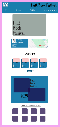
My mid fidelity home page for both website and app
The homepage for both my app and website resemble each other clearly. Both have key aspects such as images to engage the user and the name of the festival in the logo font. Furthermore, the homepage displays easy access to the events page whilst also displaying the top sponsors.
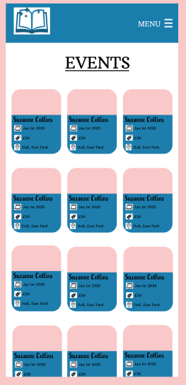
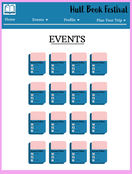
My mid fidelity app and website events pages
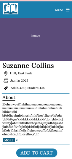
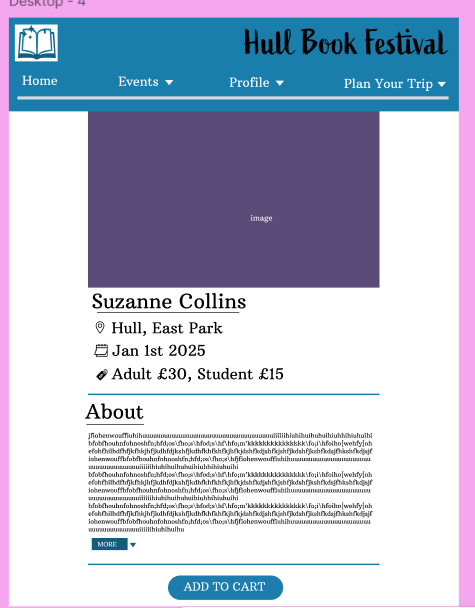
There is also clear similarities on the events pages, both follow the same theme displaying the rounded boxes featuring an image and the key information. This responsive layout makes the user seamlessly transition if they wish to use both platforms.
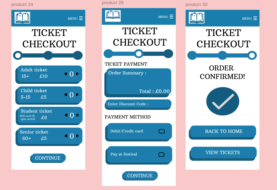
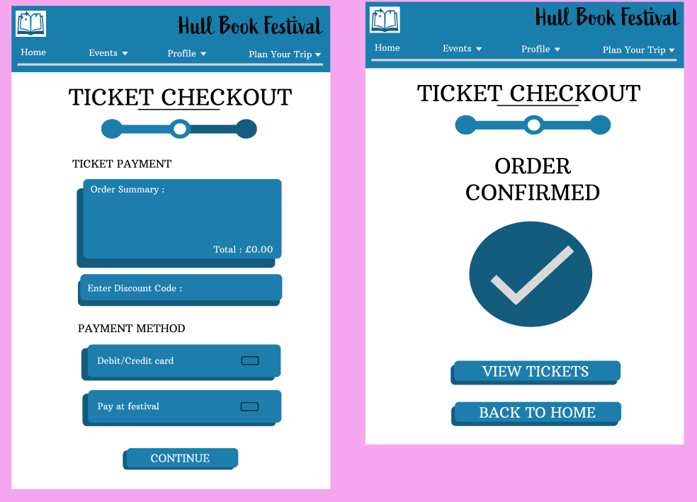
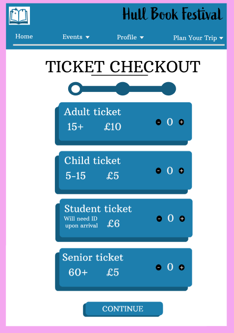
My mid Fidelity checkout processes for both app and website
Finally, the three-part checkout process bears very close similarities on both platforms. The key aspects such as the progress bar (to motivate the user) are translated through both platforms. The main difference between my website and app is the white space in my website, this was done in order to keep my website aesthetically pleasing without making it overbearing or overstimulating.
When creating my high-fidelity website and app design I intend to find meaningful images for each section. I will improve and change my mid fidelity to high fidelity for example through more detail in each page. Also, I will change the words and have a more intricate design which will still be simple.
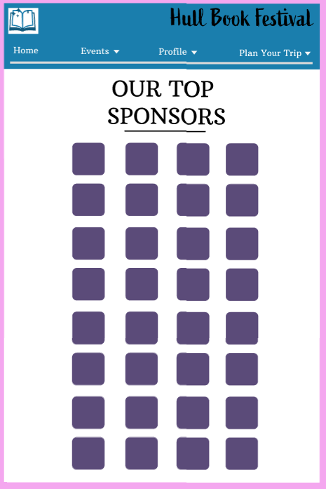

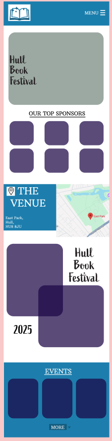
The sponsor page for my mid fidelity website and app
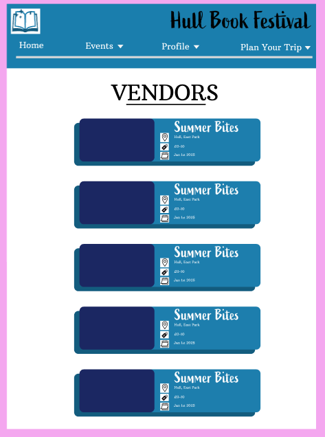
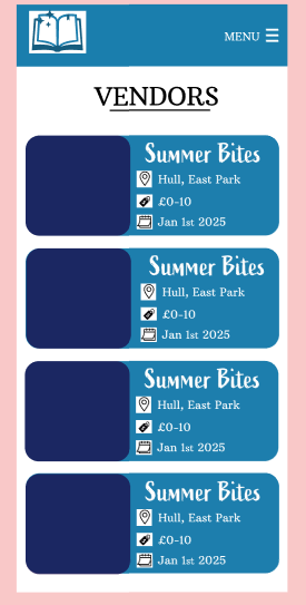
The vendors page for both my app and website design
The events page for both my mid fidelity app and website design
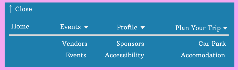
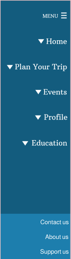
Both menus for my mid fidelity app and website


Accessibility page for my website and app