EXISTING EXAMPLES
(Scroll the carousel)
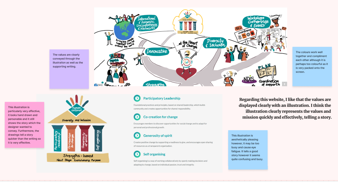
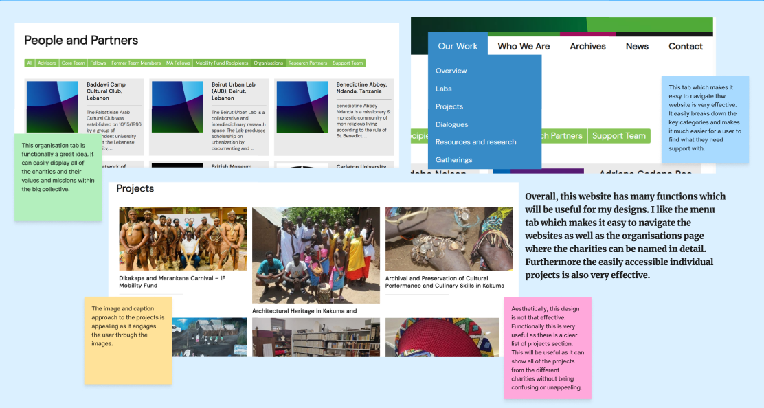
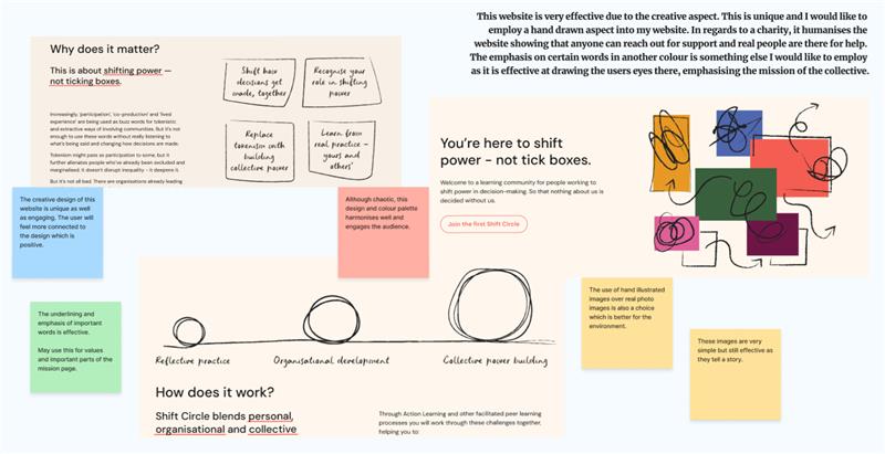
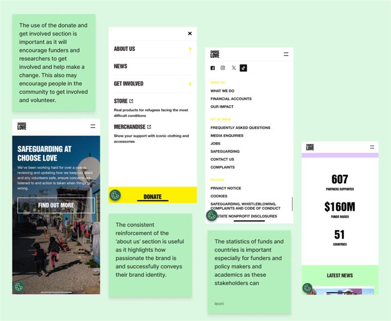
Here are a few examples of non-profit websites. The client really liked these websites and I also like the illustrated aspect of the website. These illustration websites helped me choose my font as a more unique font will make the website more creative allowing the illustrations to blend in and create a good brand identity. Furthermore, the use of illustrations over images is very important as it is better for the environment due to not needing to download the image when a user clicks on the site.
Through looking at many websites, it was clear to me that a cohesive colour palette and a large font is imperative to keep users engaged. A large, bold font is not only engaging but it is also accessible for all users. The websites that have images and illustrations are also more effective as people are more likely to look at an image first to decode the message therefore, using these components is vital.
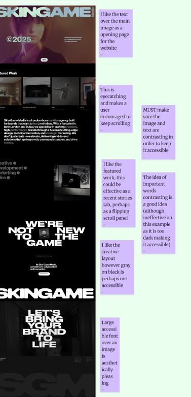
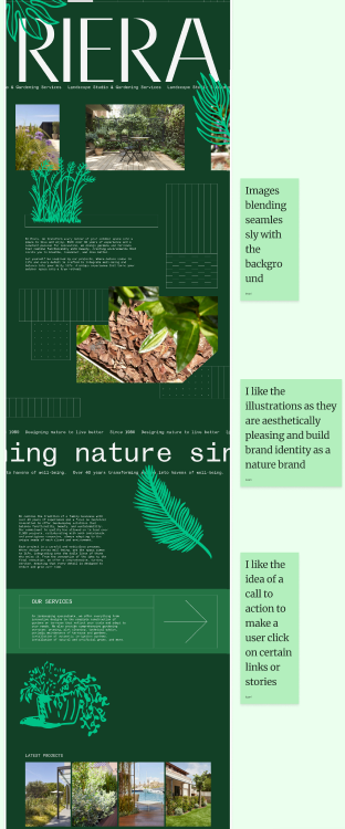
Through wider research, I found these website examples, it is clear to me that these sites both use very engaging tactics such as a bold font, illustrations and a unique layout.
Regarding website designs, “Its purpose should be to educate, engage and inspire. Include rich content, such as video, images, copywriting and graphics that teach your followers about your mission.” (Figure 2) This will be important as I create my mid and high fidelity designs as I will need to use a unique layout and engage the audience whilst also raising awareness equally for each charity.
MOODBOARD
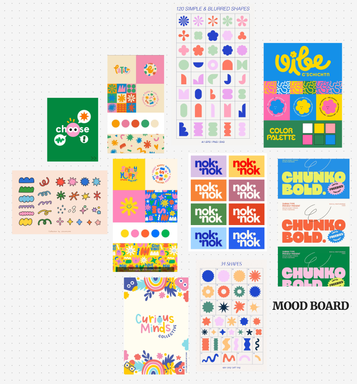
I created a mood board to illustrate the concept of the website design that I liked. I chose doodles and drawings that are bright but warm colours. I particularly liked the idea of doodles and illustrations as “Doodles are used in charity websites to make complex issues more accessible and understandable, as well as to build an emotional connection with the audience. They can break down difficult topics like poverty or mental health into simpler, more digestible visual messages, making them easier for a wider audience to grasp and remember.” (Figure 1) This is vital for the participatory collective as each charity deals with sensitive themes and communication of this message for a wide variety of audiences is imperative. As all of the projects are funded by the ideas fund, I tried to have a similarity to their brand design as they are the funders that made this possible. This is another reason why doodles and illustrations became an important part of my moodboard.
References
Figure 1 – BPS (N.D) Wellbeing through Doodle https://www.bps.org.uk/psychologist/wellbeing-through-doodles (Accessed 20th October 2025)
Figure 2 – LittleBigBox (N.D) 6 reasons why non-profit organisations need to have an EPIC website https://www.littlebigbox.co.uk/6-reasons-why-non-profit-organisations-need-to-have-an-epic-website/ (Accessed 20th October 2025)