4. My Design Ideas

MY COLOUR PALETTE

When I started my design, I experimented with a few different colour palette ideas. Originally, I wanted to use bright colours in order to reference the ideas fund as the client previously liked their brand guidelines. However, I found that these brighter colours came across as harsh and almost angry. I decided instead to focus on warmer colours (the bottom colour palette being my chosen one) as “Warm colours, like red, orange, and yellow, are often associated with feelings of warmth and comfort. They can evoke emotions such as happiness and optimism” (figure 1) and this is what I want to represent with the brand identity. I intend for the participatory collective to be inviting and reassuring in order to encourage engagement especially for people who are looking for support and help. 

TYPOGRAPHY

My typography mood board clearly illustrates that bolder, more creative fonts are more accessible as well as more aesthetically pleasing for my website.

Regarding my typography, I chose ‘Pearl Jean’. This font is creative and bold as well as aesthetically pleasing. It is clear to me that “Oversized fonts bring an element of authenticity, helping brands to cut through the noise and connect with their audience on a more personal level. Additionally, large fonts improve readability and accessibility, ensuring that key messages are easily consumed” (figure 2). From this, I can see that other than promoting accessibility, it is still vital to use a bold font to build brand identity and humanise the collective, bringing compassion and putting users at ease.


Furthermore, when creating my final website I have the “woff” version of this font which is much more environmentally friendly as it is a very small download size. This will make the website greener and this is a very big advantage as the collective aims to be environmentally friendly and as ethical as possible.

LOGO DEVELOPMENT

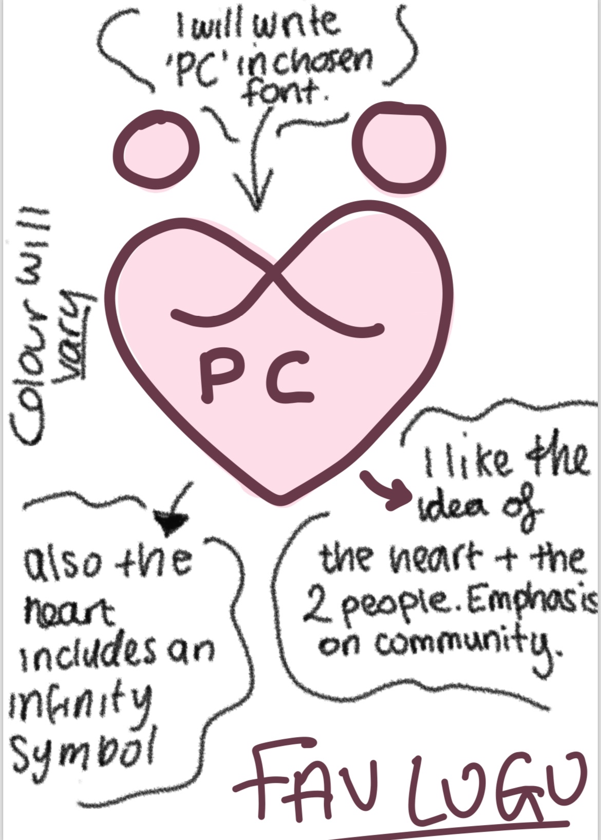
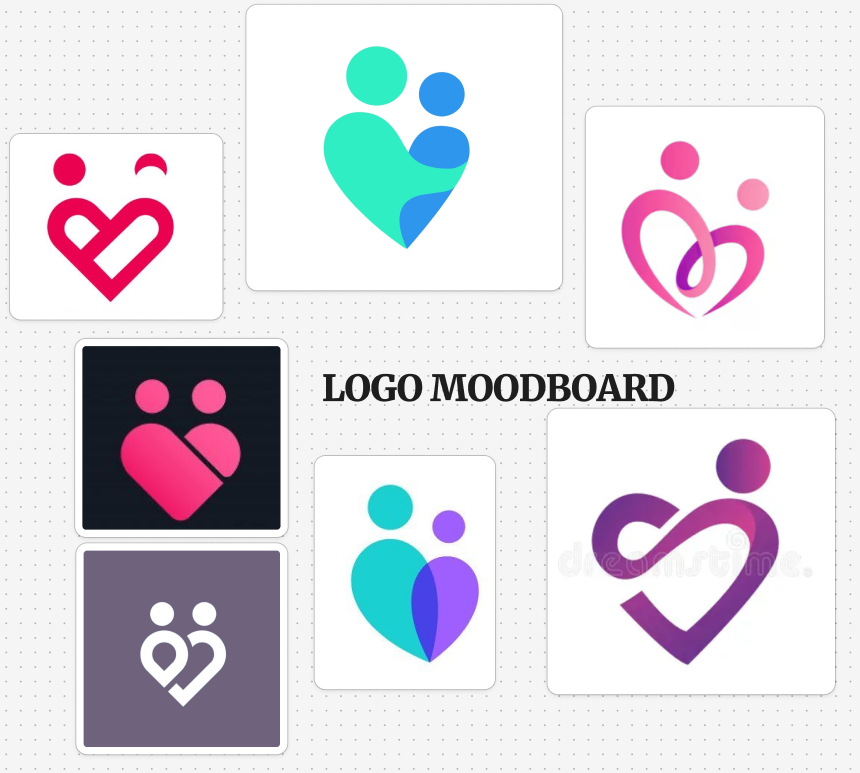
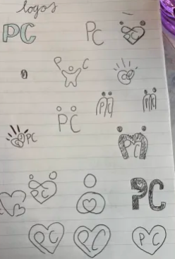
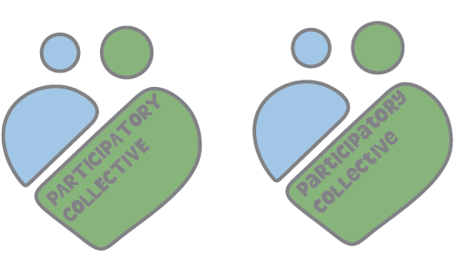
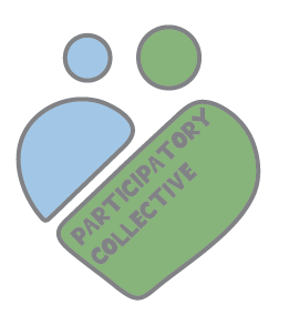
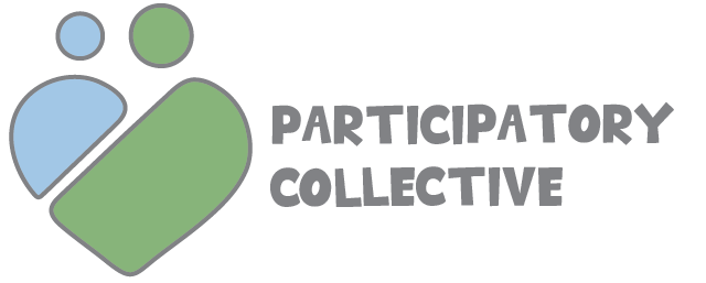
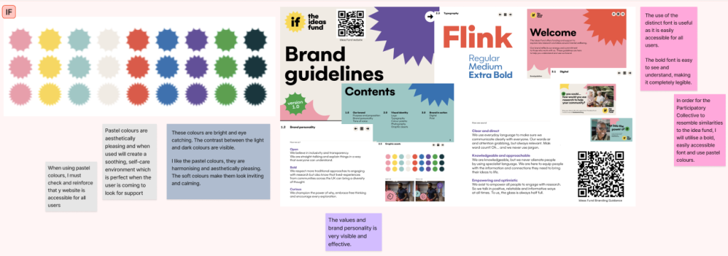
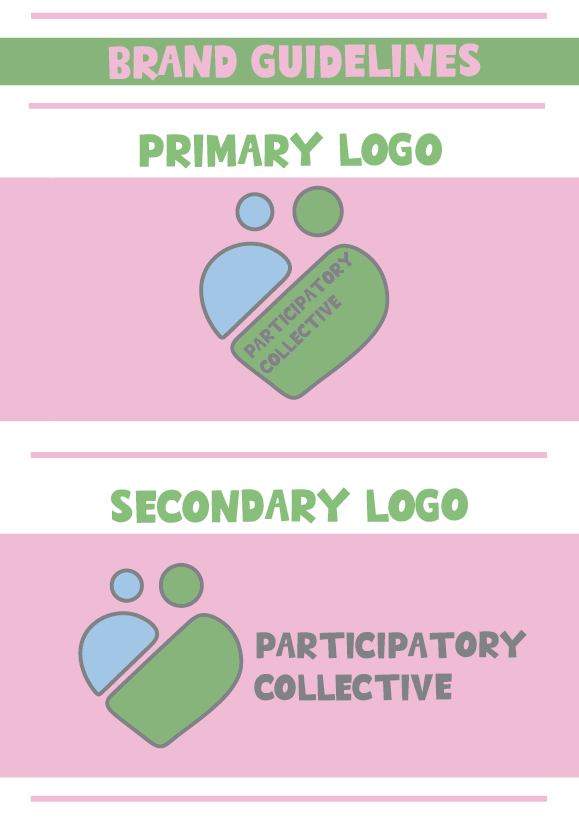
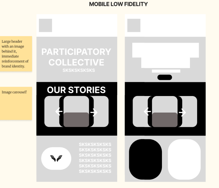
When creating my logo, I wanted to create something that would include a heart as that symbolises charity and community. Personally, I think that charity is often represented by a heart as it is much easier to humanise the charity which is full of compassion and support. “A heart is used for a charity because it is a universal symbol for love, compassion, and careThis makes it an easily recognizable and emotionally resonant way to represent a charity’s mission” (Figure 4) and I made this clear through the heart logo which also represents community and people together.

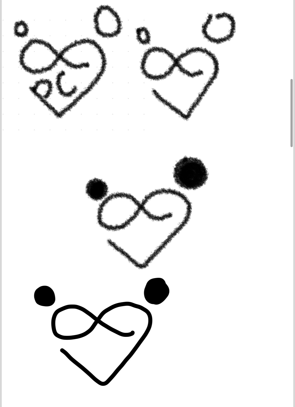
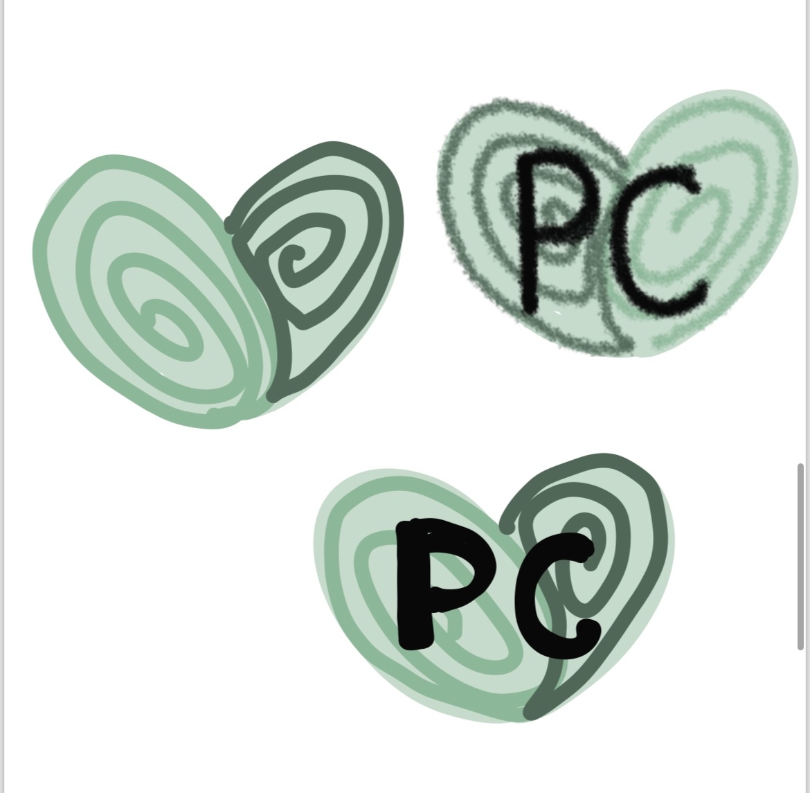
Originally, I wanted to use a more complicated logo with an infinity sign however, I decided that this was too overwhelming and it may limit my design. A complicated logo may be inaccessible, hard to understand and overall misleading. In regards to brand identity, I decided to use a more simple logo as “Using a simple logo is beneficial because it is memorable, versatile, and timeless”(Figure 3) which I found important as I wanted my brand to be recognisable and memorable.

MY DEVELOPED LOGO

(Scroll the carousel)

 I chose to split the heart in order to create two people, this represents the communities that are being built and growing stronger over time. I also want the users to feel like they are part of a community and this logo emphasises the support that is always available. My logo has soft rounded edges  in order to be warm and inviting to users and it is clear that it represents community and love. 


I have created 2 drafts of this logo, the first with the writing inside is the main logo. This logo will be used the majority of the time and be the usual logo. The secondary logo is used for when the logo must be shrunk smaller, this ensures the logo will still be accessible and legible.

BRAND GUIDELINES

Regarding my brand guidelines, I was originally inspired by the ideas fund as they have funded all of the charities within the collective. Furthermore, the client liked the ideas fund brand guidelines due to their strong brand identity. I utilised similarities such as the large bold font and warm but bright colours.

When creating my brand guidelines, I utilised these brand kits as inspiration as they are aesthetically pleasing as well as easy to understand. Each of these brand kits clearly convey a brand identity and they are all cohesive.

This is my current brand kit. It is a current review of my brand identity and mission. It is clear through the colour palette and logo that it is the Participatory collective and it aims to be memorable and recognisable.

As I complete my mid and high fidelity, I can expand this brand kit into a fully developed brand guidelines, including the common illustrations associated with my brand that I will create.

Here are my initial sketches for my website. I have taken inspiration from things such as the ideas fund which utilise illustrations.

I also intend to use an image carousel and I demonstrated this clearly through the low fidelity as well. Similarly, I tested and used an image carousel throughout these posts to prepare for my mid and high fidelity via elementor.

The use of images and videos are important to engage the audience as well as transmit the values of the collective easier.

Many of these pages will be interactive and feature the story of the ‘PC’. It is very important to make clear the values and mission of the collective in order to to emphasise their story and why it matters.

LOW FIDELITY

(Scroll the carousel)

This is my low-fidelity prototype of both a mobile and desktop homepage. Having an adaptive design is imperative therefore I showed both the versions. Emphasis on storytelling is clear as it is one of the main aspects of the design therefore is is a key focus on the website as seen by the stories panel. Through further development, I intend to create a way to show all stories equally in order to focus on an equal representation for the different charities. 


References

Figure 1 – Lightbulbs direct (N/D) Colour Temperature Psychology Using Light to Influence mood and behaviour https://blog.lightbulbs-direct.com/behavioural-impacts-of-colour-temperature-psychology/ (Accessed 20th October 2025)

Figure 2 – Purple Cactus (N/D) Web Design Trends: Bold and loud typographyhttps://purplecactuscreative.co.uk/web-design-trends-bold-and-loud-typography/ (Accessed 20th October 2025)

Figure 3 – Systematic (N/D) Why simple logos create stronger brands

https://www.systematic.uk/article/designing-simple-logos-for-stronger-brands/ (Accessed 20th October 2025)

Figure 4 – Bella Luck Charms (N/D) What is the meaning of the Faith, Hope and Charity Necklace https://bellaluckcharms.com/blogs/blog/what-is-the-meaning-of-the-faith-hope-and-charity-necklace#:~:text=The%20heart%20is%20an%20eternal,as%20romance%2C%20love%20and%20affection. (Accessed 20th October 2025)