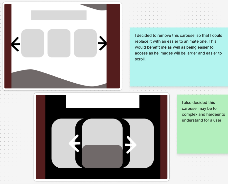
(Scroll the carousel) My rejected designs
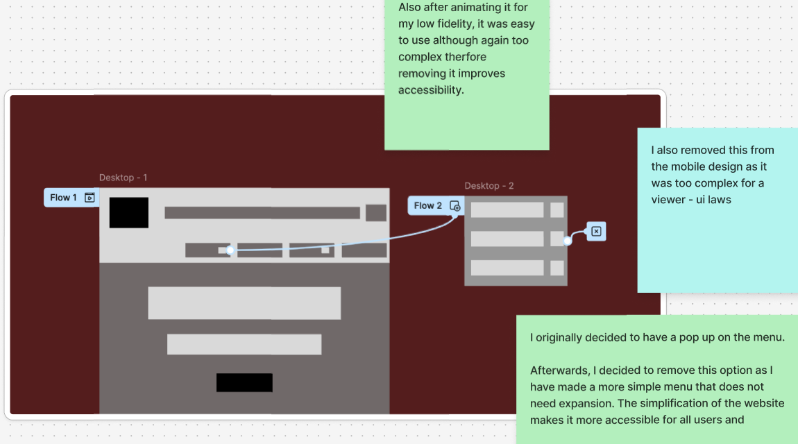
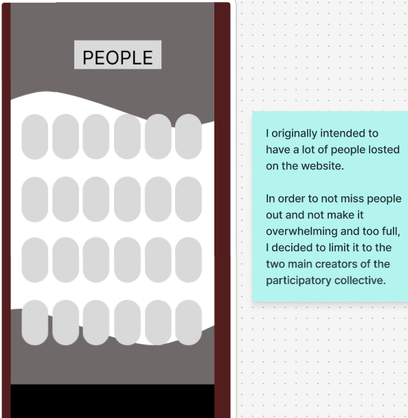
Here are my rejected designs, most of these are rejected in order for me to have a smoother, simpler and more conventional website. For example, I have removed the full list of people as I opted to replace this with just Gill and Kate. Using the main two stakeholders is more aesthetically pleasing and less overwhelming as well as making sure that there is equality for each charity as trying to incorporate images for each would be overcrowded and I would be at risk of unintentionally missing some people leading to a lack of equity. I also removed the pop up on the desktop menu, this was already wireframed however, as I tested it, I realised it would make the website too complex, leading to the stakeholders struggling to navigate and potentially leaving the website. These rejected designs were necessary in order to make progress on my mid fidelity and keep my focus on providing an accessible user-focused design.
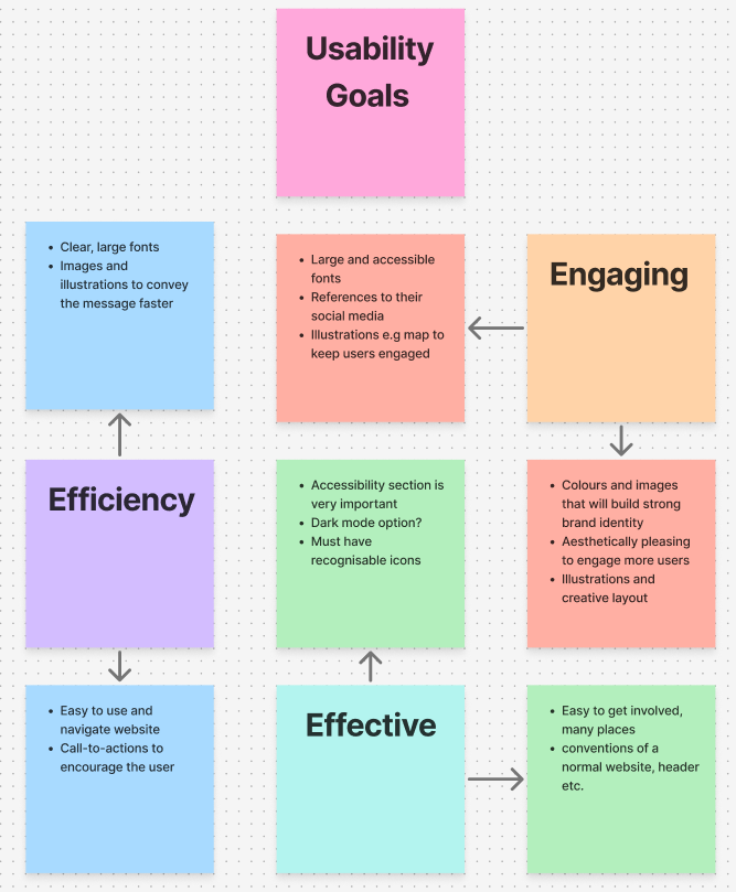
My usability goals
I have researched and utilised some key usability goals. I want my design to be engaging, effective and efficient and I will achieve this through building a strong brand identity and continuing to focus on the ethics and inclusivity of my design going forward. “Usability evaluation keeps the design focused on the people who will use the product. It ensures the user’s needs drive design decisions. This leads to a more effective and user-friendly interface.” (Figure 1) Due to this, I can focus easier on the stakeholders and users of my website due to the identification and explanation of key usability goals.
Feedback and iteration
Regarding feedback and iteration, throughout my design process I routinely asked my classmates for feedback and support of my design allowing me to alter it through useful feedback. For example, I was encouraged to make sure my boxes are round instead of sharp and after receiving this feedback I did some research and found out that it was very useful in my design, so I made some adaptations to account for this. I got lots of positive feedback, for example on the unique waves that I used throughout my design so I continued to develop those to add personality to my design as well as focusing on adding white space to break up the bright colours, this was recommended to me and it helped identify a hierarchy on my website. Removing some of the colours in replacement for white was also necessary in order to identify the Collective as a professional website as using too much colour may give a more child-like aspect to the website. I also drew inspiration from our stakeholders’ website, the Ideas Fund, which uses a great mix of bright colours with a white background to look creative but also sophisticated. Personally, I found that regular feedback was very helpful within the design process as it helped me understand what a user would want to see within the website and allowed me to create a fully user-centred design.
Ethical Design
In order to create an ethical design, I made sure it was easy to promote all communities fairly and equally. I did this through the simplification of the ‘people’ page and the addition of the communities’ page, listing each community together. The idea of each community being shown equally is imperative for fairness but also to show the groups as a Collective and unify them as one brand identity. I further focused on an equal design with the stories page, this will be updated frequently allowing a flow of news, not focusing on one community. I will continue to have a sustainable design through the use of the videos that will not autoplay. This will significantly help the carbon footprint of the website and help it to become environmentally friendly. This is further supported as for my primary font; I will exclusively use the ‘Woff’ font which is much more compressed and is much better for the environment than other fonts. Furthermore, in my final design, I intend to add a ‘dark mode’ and potentially replace the white backgrounds with a cream which will be better for the environment due to ‘led’ use.
Social Media Research
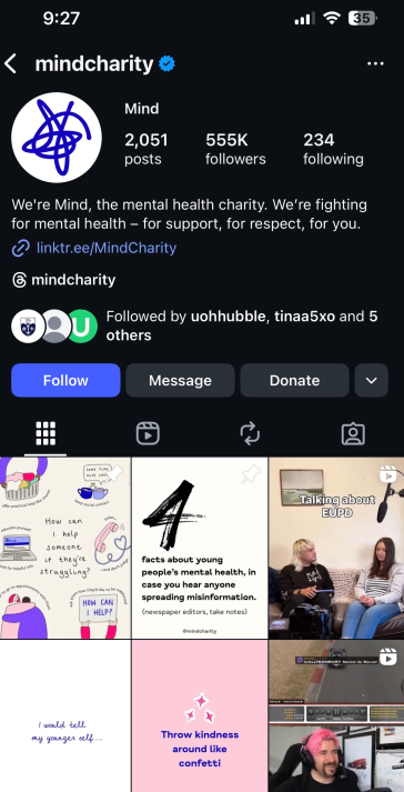
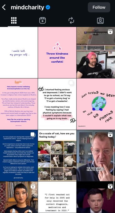
I did a small amount of research into Instagram and Facebook. “Social media can be a powerful communication tool for charities, to raise awareness and funds and to better engage beneficiaries. It can help charities reach a much wider audience, much more quickly, than traditional methods of communication.” (Figure 2) It is clear that social media is vital in recent times, especially for communication and fundraising. Regarding an Instagram page, the PC would need to post frequently, and these posts would need to be aesthetically pleasing in order to gain trust from the user. Furthermore, regular updates and stories are important to gain traction and popularity which would open the Collective up to a much broader audience. This cross-platform marketing is missing in many smaller communities and charities as they often struggle with having people who are tech-savvy enough to create a successful social media. The example of ‘Mind’ is an effective Instagram page however; it is a bigger charity which often have much larger funding in comparison to local communities.
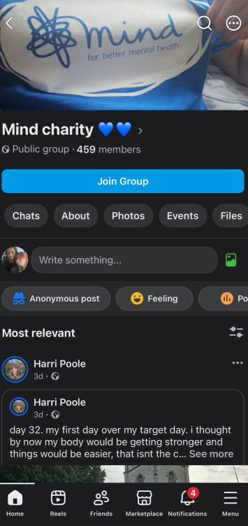
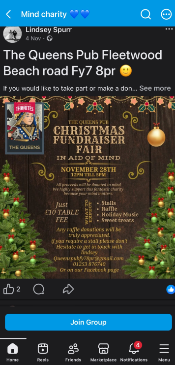
In regard to Facebook, I specifically researched groups. The PC could be made into a group which would allow users to interact and post their own experiences. This will lead to storytelling from all perspectives of each community and would easily encourage stakeholders such as funders and academics to get involved due to the personal stories which will further emphasise the mission and values of the collective. These groups are also a great way to set reminders and raise awareness for local events and projects going on.
Design Goals
Regarding my high fidelity, I have a few design goals that will be implemented into my final design. For example, I would like to advance my scroll carousel to one with arrows that is more in depth. I also aim to use inclusive language and make my design user centred. I also aim to reduce the carbon footprint through using quite a few illustrations rather than just images. This sustainable practice is imperative in progressing my design. I also intend to research further into social media, allowing me to see how to adequately create a successful social media for the ‘PC’. Furthermore, the storytelling aspect of my design is one of the most important components of design therefore, I must focus on making that a key aspect in all of my design pages and writing, making sure that the ‘PC’ shows it’s values and mission clearly. Finally, I would like to continue to adapt and change my design as I continue to get feedback in order to make sure my design is fully user-centred and beneficial to all users.
References
Figure 1 – IxDf (N.D) Usability evaluation What is Usability Evaluation? — updated 2025 | IxDF (Accessed 23rd Nov 2025)
Figure 2 – GOV.UK (2023) Charities and social media Charities and social media – GOV.UK (Accessed 23rd Nov 2025)