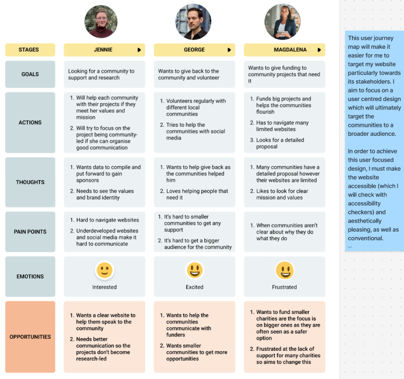
My user journey map
Before creating my mid fidelity design, I crafted a user journey map. I created this from my user personas that I created. This journey map illustrates the way I must do my design in order to benefit my stakeholders, for example, I must take into account the pain points such as making sure the values and mission of the collective are well known which will benefit all users, especially funders and academics that with to support the Collective. “Storytelling isn’t just a buzzword in UX—it’s a bridge between data and human connection. When integrated into user journey mapping, it transforms cold, analytical insights into relatable narratives that inspire meaningful design decisions.” (Figure 1) I utilised the storytelling aspect of user journey maps into consideration as I created mine from my personas. This helped me focus on a user-centred design that will tell a story, allowing the users to engage meaningfully with the identity and values of the Collective.
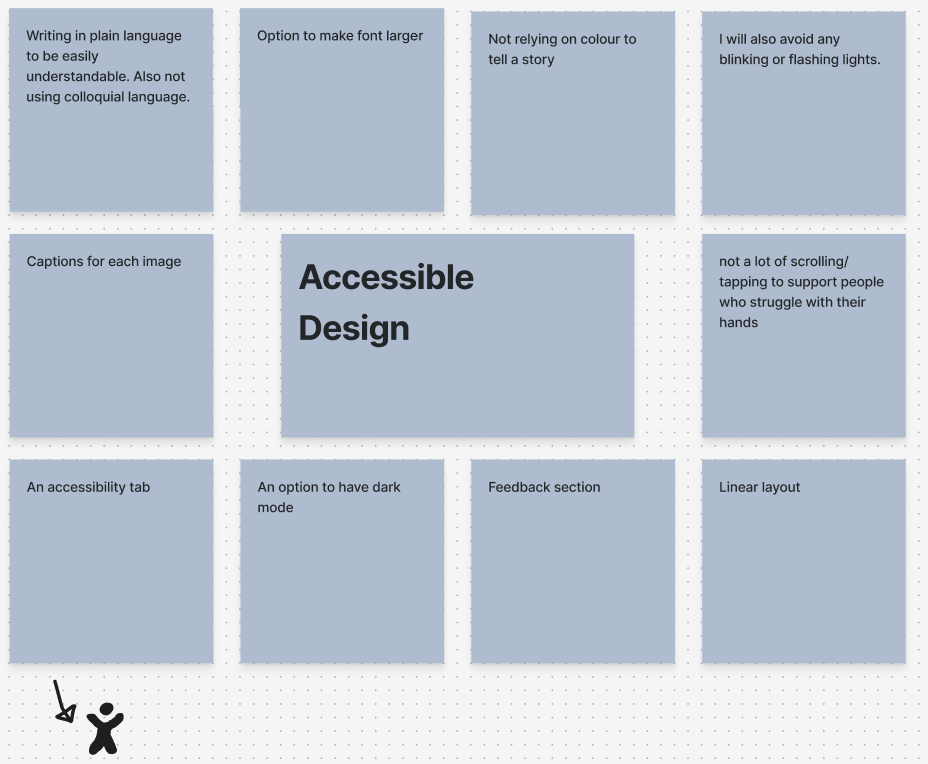
My mind map to encourage an accessible design
Regarding accessibility, I focused my mid fidelity design on being inclusive and easy to interact with. I focused on this with using colour as a decoration rather than it being important for conveying information. I also focused on having my typefaces be large and legible, allowing any user to be able to interact. Furthermore, I also added an accessibility tab and as I develop into high fidelity, I intend to make this interactive, allowing users to activate dark mode or make text larger.
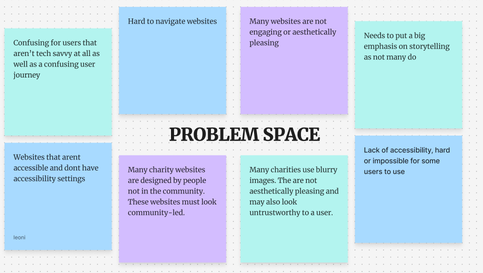
The problem space within my design
After creating my user journey map, I focused on identifying the problem space so that I could try to work around it to make an accessible, user-centred design. Through research into other community websites, it was clear that many of the problems stemmed from these charities not being ‘tech-savvy’. Many websites were limited and underdeveloped, and a majority did not have a social media. This lack of an online presence is harmful to the communities as they will struggle to grow and attract stakeholders like funders and academics to support them in projects.
UI PRINCIPLES
I then did some research into UI principles such as Jacobs law (users prefer your site to be designed the way other sites they use are designed) and I will utilise this to make my website trustworthy for viewers. I intend to achieve conventionality through the homepage. This will be aesthetically pleasing, and the menu will replicate many other similar sites. By having an easy to navigate website, it widens the website up to a broader audience as even those who aren’t tech savvy can use it. Conventional designs include: Logo, menu, interactive layout etc.
Another design law that will affect the creation of my website is Hicks law (too many / too complicated a choice means that the user will not choose any) and I aim to have a very simplistic website that is conventional and easy to navigate. This user-central design will encourage users to continue to navigate the website rather than click off. Regarding the Participatory Collective, having an easy to navigate website is very important as many of the community and leaders of the individual charity struggle in regard to technology. I will use Hicks law throughout my website by keeping it streamlined and only utilising my call-to-action buttons when necessary. This way, users will not click away from the website and will instead be encouraged to click further and engage with the content.
Finally, the law of Pragnanz means that the more complex a design, the user will automatically simplify the design mentally. Therefore, I will focus on maintaining the simplicity of my call-to-action buttons. In regards to the collective, I will utilise rounded corners in my designs, this is more inviting and is suited more to a charity and they also “evoke warmth and trust. Many call them “friendly rectangles” for this reason. This is exactly why many call-to-action buttons (a.k.a. buy-now or sign-up buttons) are designed this way. It makes customers feel safe about doing business with a brand.” (Figure 2) Due to this, I have focused heavily on these rounded corners throughout my design, as they are trustworthy and aesthetically pleasing. They are also very useful and affective as my call-to-action buttons, clearly encouraging the users to click further into the website and get involved.
In order to focus on user centred design, I will make stories, projects and volunteering easily accessible on my website. Furthermore, the stakeholders play an imperative part in my design as I make the ‘PC’s values and mission a key component within the website, building brand identity and growing a broader audience is imperative to gain more support.
References
Figure 1 – Kaarwan (N.D) The Role of Storytelling in User Journey Mapping Weaving Narratives into UX: The Role of Storytelling in User Journey Mapping (Accessed 23rd November 2025)
Figure 2 – Bryant (2024) Rounded Corners and Why They Are Here to Stay Rounded Corners and Why They Are Here to Stay (Accessed 23rd November 2025)