My project focuses on developing a website prototype for the Participatory Collective to promote awareness and build human connection. The Collective is a network of communities supported by the Ideas Fund. My goal is to design an ethical, accessible website that offers a safe and supportive space for all users.
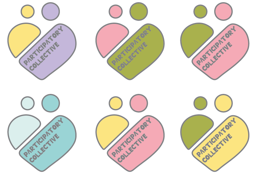
(Scroll the carousel)
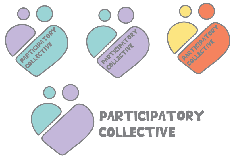
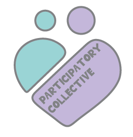
After changing the colour palette, I tested the colours on my logo. After a few trials I finally chose the purple and blue logo as “Blue and purple color palettes offer a unique blend of tranquility and creativity, making them a popular choice for various design projects. These hues can evoke a sense of calm while also adding a touch of sophistication.”(Figure 1) I aimed to have a colourful logo which builds brand identity whilst being creative but also professional. Therefore, I chose the blue and purple to be sophisticated whilst also creating a clear safe, supportive atmosphere for all users.
(Scroll the carousel)
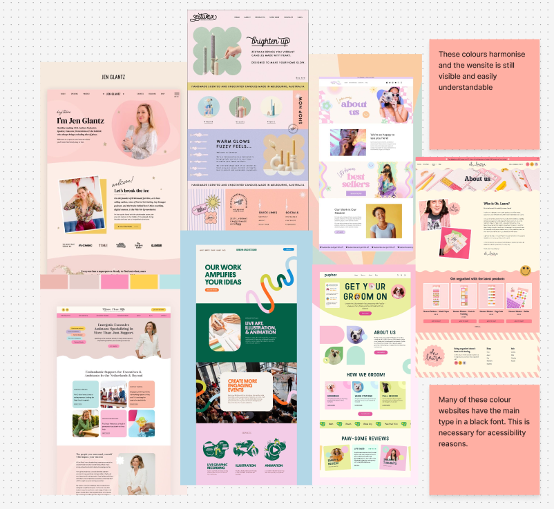
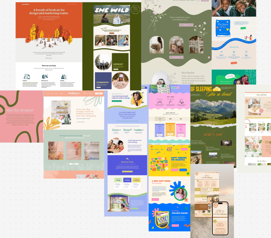
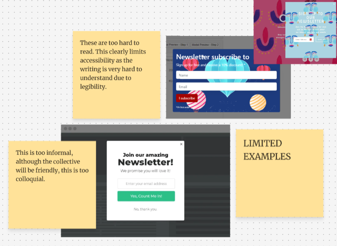
While selecting the colours and layout for my mid-fidelity design, I explored similar colourful websites to understand how they balance a warm colour palette with accessibility and visual appeal. Most of the sites I researched used a black typeface, as it offers the clearest and most conventional approach to providing readability and accessibility. Prioritising this accessibility through a legible typeface is essential and aligns with the ‘Collectives’ brand identity, which aims to be inclusive and accessible to all users.However, after creating my mid-fidelity, I can see that through research, the font colour ‘Pure Black’ on a white background is limited for readers with dyslexia and for eye strain. “Pure black text creates an unnecessarily harsh visual environment that can cause eye strain, reduce actual readability, and make extended reading sessions uncomfortable for users.” (Figure 2) This makes it clear to me that I can use the Pure black font however, I must ensure that I use it over a highly contrasting colour in order to focus on inclusivity.
I also did additional research onto websites to see how they employed creativity and illustrations. After looking at an array of creative websites, I decided using waves was a great way to build brand identity whilst also remaining professional and not straying too far towards a childish design.
(Scroll the carousel)
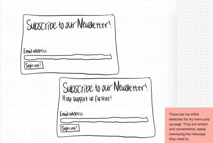
Before doing the low fidelity, I did a few sketches to help guide my design. I sketched the pop-up newsletter as well as the main design layout. After doing these sketches, I created additional sketches to refine and correct any changes I decided to make for my mid fidelity.
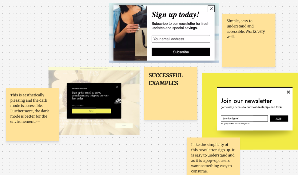
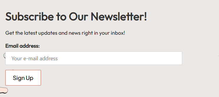
After sketching my newsletter, I prototyped it into ‘Mailchimp’. Through this Figma extension, I easily added a newsletter pop up. After researching similar designs, I decided to keep my design simple and easy to understand. This conventional design is useful as it will be familiar to the user, allowing them to understand the call-to-action very easily whilst also being an aesthetically pleasing design.
(Scroll the carousel)
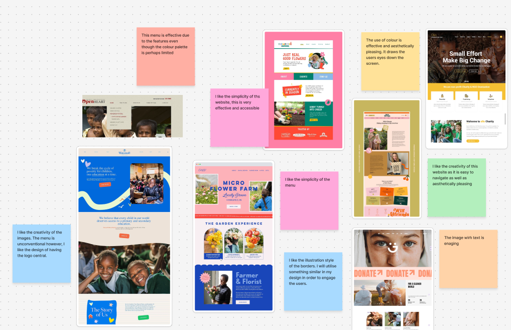
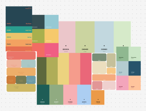
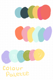
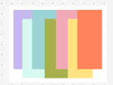
Regarding my colour palette, I decided to change to a different combination of colours. I made this decision due to feedback from people who had viewed my design, this change was easy to me as I felt the original colours did not complement each other as much as I had hoped. Through further research (as seen by the mood board), I decided on a simpler colour palette of warm colours that aligned much better with my brand identity.
I also chose my second typeface (Arbutus slab) for my design which complements my primary font. Both typefaces that I have chosen are legible and accessible for all users and this inclusive font is comfortable to read. Furthermore, the font adds a sense of sophistication and conveys the brand identity of professionalism linked with creativity.
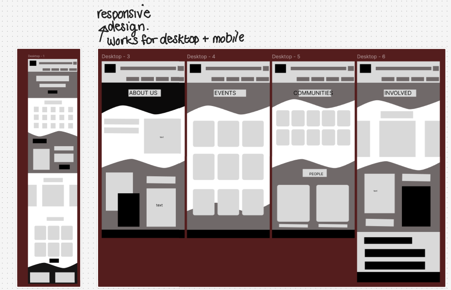
(scroll the carousel) Low Fidelity Desktop
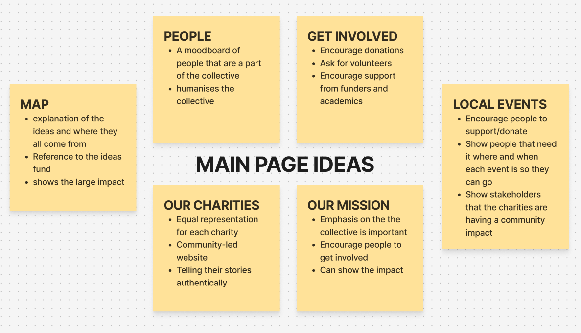
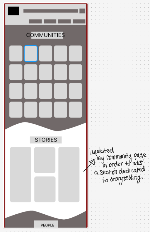
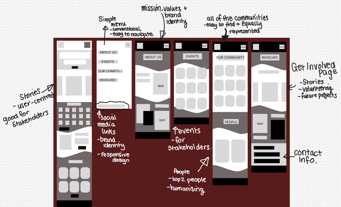
Here is my low fidelity, I made a design that works for both phone and desktop. This responsive design will allow any user to access the website. I annotated the desktop version in order to show the key components that I will develop in my mid fidelity. This captures important changes such as my addition of the ‘Stories’ tab which will help improve the storytelling aspect of my website (showing users the mission and values of the Participatory Collective through real-life experiences) and help make the design of the collective community-led, allowing each community equal space to share their stories.
After completing the low fidelity, I decided there are a few components I needed to add to the mid fidelity. For example, a section to include posts and updates, similar to social media. This will fit in the main page and on the ‘Our Communities’ page. The idea of a potential blog-style section will further interest the stakeholders as it continues to humanise the Collective to the user.
(Scroll the carousel) Low Fidelity mobile (wireframed)
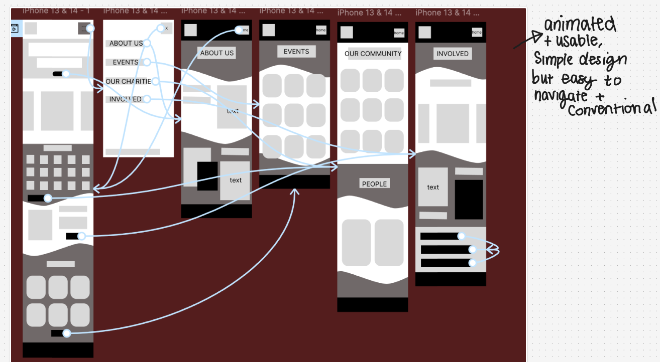
I also wire-framed the low fidelity mobile version, this simple animation makes it easy for a user to access all the pages conventionally, allowing them to navigate through. When moving to mid-fidelity, I aim to continue keeping the stakeholders in mind, for example having the stories and updates as a key part of my homepage which further humanises the Collection and makes them easy to relate to which should encourage policymakers and funders to get involved. “Shared stories are the essential building blocks of community, providing a sense of belonging and shared identity” (Figure 3) and I aim to communicate this through the call-to-action stories that humanise the collective.
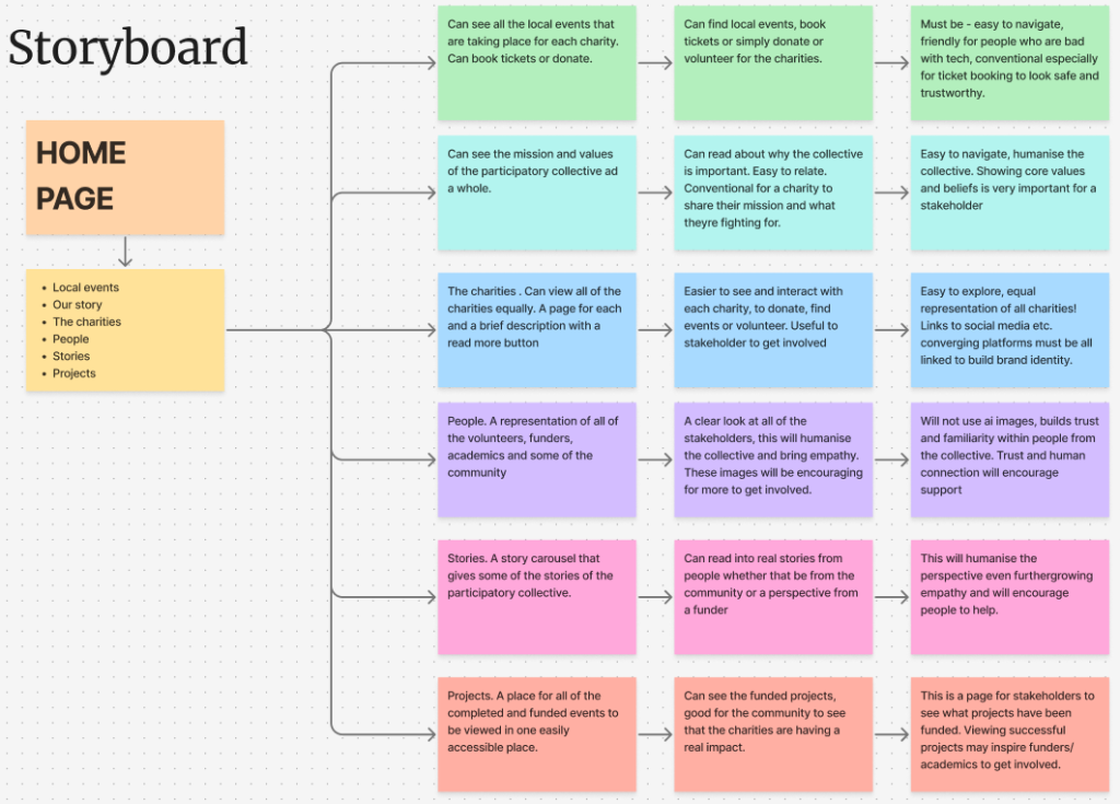
Before I started on my mid fidelity, I created a storyboard. This was to help guide my website before I started creating the prototype. This also helped me focus on what the stakeholder would need to create a user-centred design for example having a story carousel which is educating as well as useful for the user as they can make a human connection with the collective. Furthermore, this storyboard helped me think in depth at what my target audience would need in regard to inclusivity when navigating a website. I focused heavily on being able to easily access and navigate the website through using a conventional design.
References
Figure1 – PiktoChart (2024)The Best 15 Purple Blue Color Palette Combinations https://piktochart.com/tips/purple-blue-color-palette (Accessed 23rd November 2025)
Figure 2 – Weir (2025)Why I Stopped Using Pure Black Text (And You Should Too)Why I Stopped Using Pure Black Text (And You Should Too) (Accessed 23rd November 2025)
Figure 3 – SustainabilityDirectory (2025)Why Are Shared Stories Important for Communities?Why Are Shared Stories Important for Communities? → Question (Accessed 23rd November 2025)