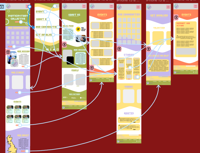
A video of my working mid fidelity wireframed mobile prototype
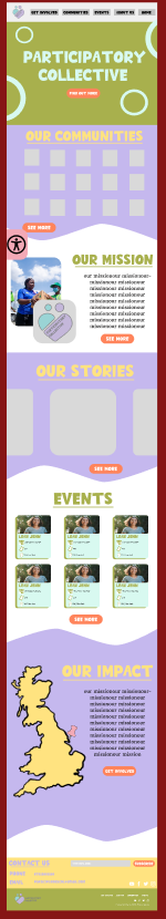
I have linked here a clear walkthrough of my mid fidelity mobile design. My website is very easy to navigate, and all of the buttons are simple and bright, showing a clear call-to-action. The website navigation is smooth and natural and each page links in to the identity of the ‘PC’, using each colour to convey their brand further. I focused on having image carousels which worked well as they are designed to be aesthetically pleasing as well as functional. For my high fidelity, I would like to implement a more detailed carousel, incorporating arrows to make navigation clearer and more accessible. I would also potentially like to remove the scrolling aspect entirely, focusing solely on arrow clicks in order to support users that may struggle with swiping motions. This inclusivity is imperative as I get to my high-fidelity design, and I intend to place strong emphasis on making the design accessible for all users.
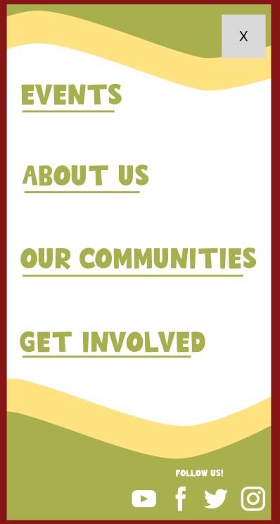
Furthermore, my burger menu is very conventional, following the design of many similar websites. I did this to keep my stakeholders in mind as many users will not be tech savvy, especially people within the communities and the elderly. It was made clear to me through my user personas that a simple design that would be familiar to users will be refreshing and much better suited to support all users and promoting inclusivity.
I have strong call-to-action buttons throughout my website for example, the events section, story section and volunteering opportunities. I intend to have a strong emphasis on encouraging users to support the participatory collective and allowing users to engage through clicking the bright buttons is meaningful as they often lead to storytelling sections which personalises the collective and builds an emotional connection which the stakeholders in my user personas prefer (for example the evident mission and values).
(Scroll the carousel) My Mid Fidelity desktop design (not wireframed)
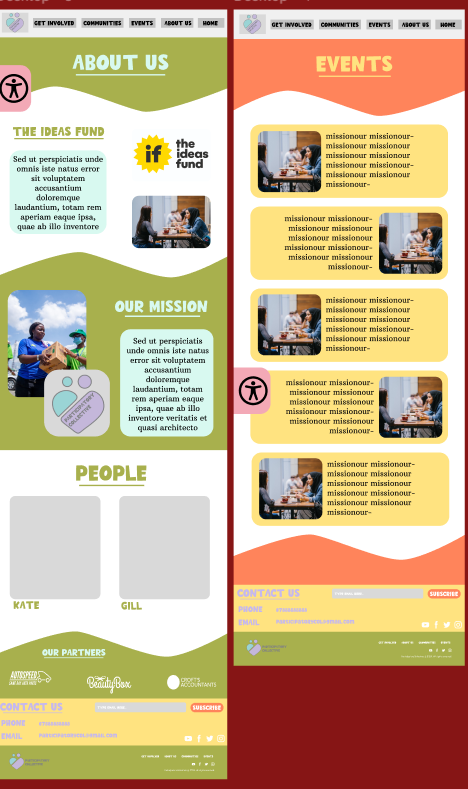
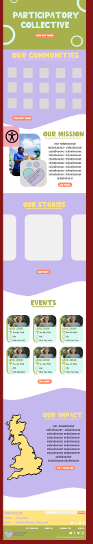
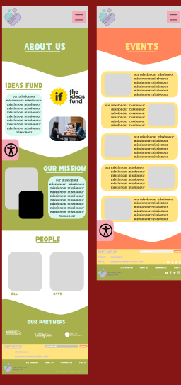
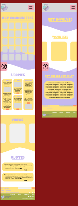
Here is my mid-fidelity desktop design. This responsive design clearly has strong brand identity links to my mobile version. I put a very strong importance on having a design which can easily be compared and linked together. The main difference between the mobile and desktop version is the menu. In the desktop version, I explored Figma communities to find a suitable header and footer that could enhance my design. I found this header, which is clear and conventional, allowing users to quickly understand and navigate simply throughout each page. Although I have not yet wireframed my desktop design, each section in the header will lead to an individual page.
Regarding the footer, I have used a very similar footer in both the mobile and desktop design. This simple footer is very similar to many other websites, and it is clear to navigate. The use of the subscribe option is helpful as although there will be a newsletter pop up (which I researched and designed on Mailchimp), it will encourage users to get involved even if they have clicked away from the original pop-up. Furthermore, the emphasis on social media is imperative in my design as I would like the build a cohesive brand identity and in the current Web 3.0, social media is vital in growing any business or community. Finally, the contact us section is also important as it allows the user to engage with the brand directly, this is especially useful for the stakeholders such as funders or academics to immediately and simply get in touch with the Collective.
Illustrations I have done so far for my mid fidelity.
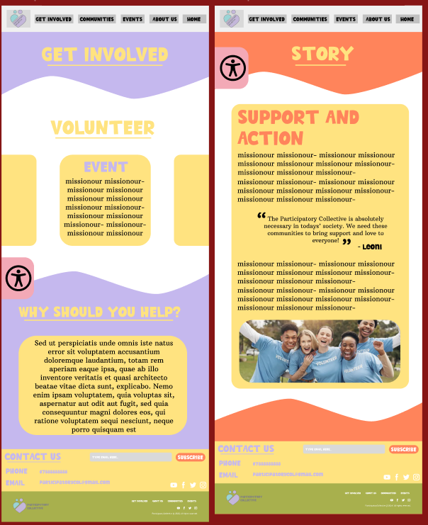
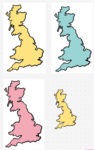
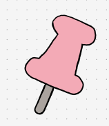
I have created and drawn illustrations for my mid fidelity design. On my ipad, I drew a map of the UK and a pin, these simple illustrations are aesthetically pleasing whilst also engaging the user, showing them the real impact the ‘PC’ has and the positive change they bring to many communities. Using an illustration over an image is imperative for sustainable design as they are much better for the websites carbon footprint, allowing the Collective to be ethical. Furthermore, illustrations are great to quickly send a message to the user as pictures/illustrations are understood much quicker in comparison to writing. “ Illustrations, in their many forms, have become an essential feature in modern website design. These creative manifestations not only enhance the visual appeal of a website but also serve as powerful tools in conveying complex messages in an easily digestible format. “ (Figure 1) Throughout my website in my high fidelity, I intend to focus on clearly conveying the brand identity and values through illustration in order to create understanding throughout my audience.
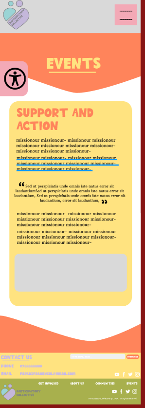
I have added an accessibility icon to both my website and mobile app. This feature is essential, as it significantly improves accessibility and supports a wider range of users. Although this functionality is not yet included in the wireframes, it will be fully developed in my high-fidelity design. The accessibility button will allow users to increase/decrease the font size and enable dark mode. Incorporating dark mode not only benefits users who are sensitive to brightness but will also be better for the environment. “Around 15% of the population all around the world is going through some sort of disability. Not adding a web accessibility icon to your website is a barrier between you and your potential audience. By adding a web accessibility icon, you can boost traffic to your website for real.” (Figure 2). By following accessibility guidelines, I align with the mission of the ‘PC’ and attract a broader audience, allowing for more stakeholders such as potential funders and academics to get involved.
My wireframed mid fidelity mobile version
Here is my wireframed image of my mobile website. It is easy to navigate, and I added more advanced animations such as a scrolling carousel.
(Scroll the carousel) My wireframed mid fidelity mobile version. Please refer to figma link as the quality is bad
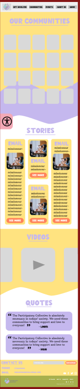
Finally, this is my mobile design. One of the key components of this design is the video section. I intend to make sure the video section does not play automatically to keep my website sustainable and ethical.
Although it was not necessary, I added colour to my mid-fidelity desktop and mobile version. Personally, I did this in order to understand how I could enforce my colour palette in a way which is aesthetically pleasing and accessible. I used the colour palette with the stakeholders in mind, ensuring that all text remained legible and avoiding the use of colour to convey essential information, making the design accessible for colour-blind users. After creating a new colour palette, I found it much easier to see the colour palette being used to determine whether the colours harmonised. The colour palette I chose has similarities with the Ideas Fund, which the stakeholders liked, while still feeling unique and warmer, helping to create a welcoming and comfortable environment for users.
The link to my Mid Fidelity Figma page
References
Figure 1 – PixelTrue (2023) Why Illustrations Are Important In Website Design Why Illustrations Are Important In Website Design (Accessed 23rd November 2025)
Figure 2 – Accesibility Spark (2021) 10 Reasons you Should Get the Web Accessibility Icon on your Website 10 Reasons you Should Get the Web Accessibility Icon on your Website (Accessed 23rd November 2025)