Early logo sketches
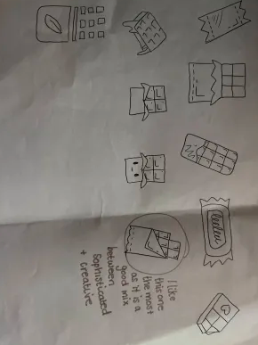
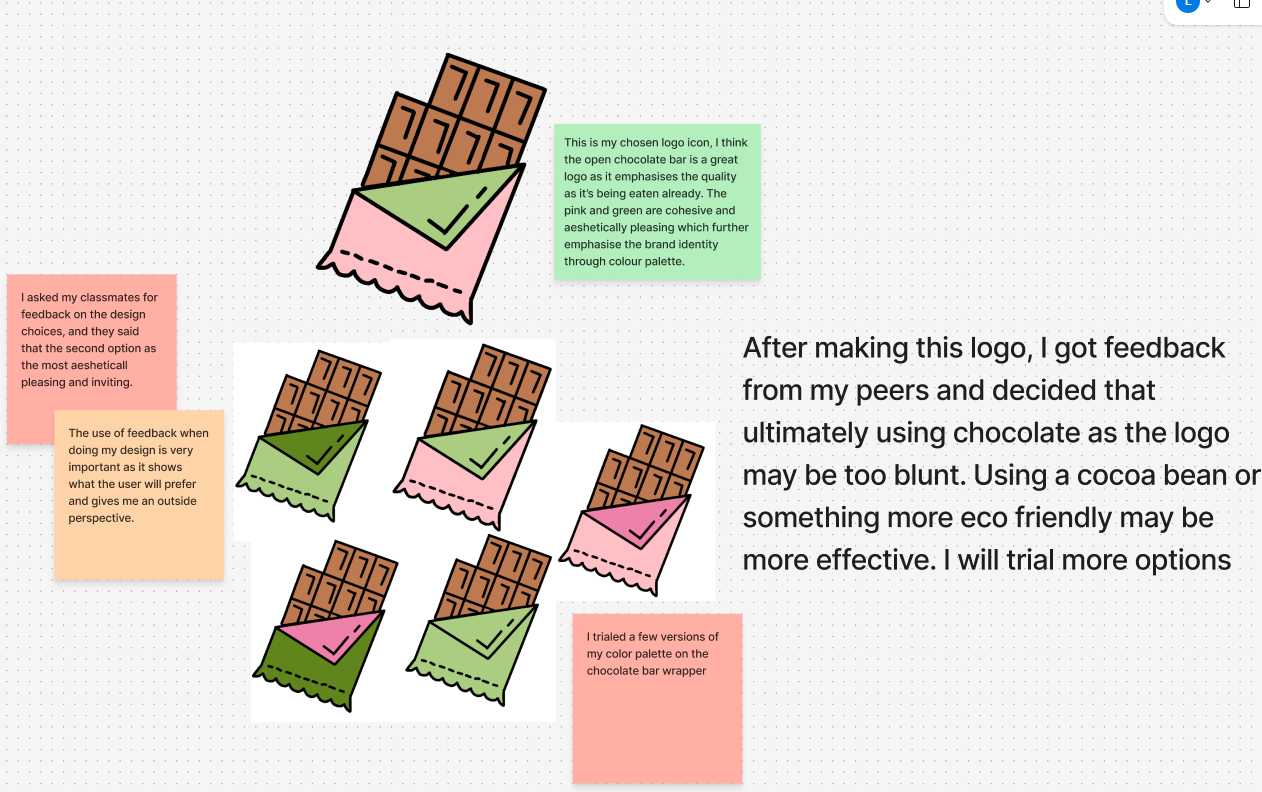
These are my early logo sketches. Originally, I decided to utilise a chocolate bar as my logo in order to emphasise the quality of the chocolate. I wanted to reinforce a sophisticated and traditional chocolate brand. However, I asked for feedback from my peers and decided that using a chocolate bar as my logo may be too blunt. Using feedback as a way to develop my design is imperative as it simulates the user experience. Using insight from people that would use the brand makes it easier to create something that will engage the final user. “ Feedback from stakeholders ensures the design aligns with business objectives and speaks to the right audience” (Figure 1). This is very important as I must make sure that my brand ideology is clear and all users understand the sustainable nature of the brand. Therefore, I decided to trial some more logos that better reflect an eco-friendly design, for example with leaves and cocoa beans.
I decided to change the name from eco-future to chocolution. I made this change as I feel like as I am doing a chocolate company, I had to have a chocolate themed name which will build brand identity and make the brand stronger and more recognisable.
The name chocolution means chocolate revolution which is applicable as my brand is an eco friendly chocolate. After research, I have found that many chocolate brands (for example ferrero rocher) are very unethical therefore my brand is an outlier, starting the journey towards a more sustainable chocolate bar with good ethics and 100% recyclable packaging.
New logo sketches
(Scroll the carousel)
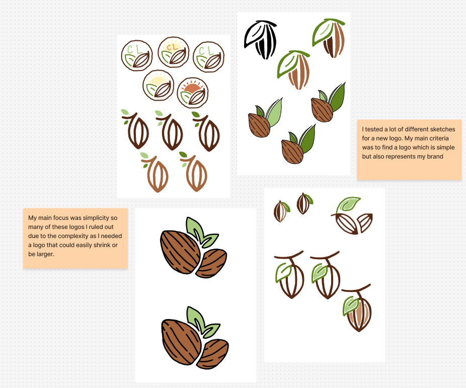
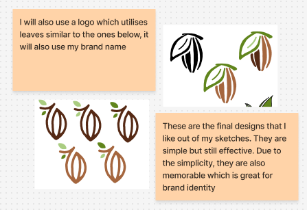
Here are my new logo sketches. I trialed many sketches of different cocoa beans, experimenting with leaves and distinct colours, drawing them on my iPad. My main concern was trying it make a logo that is simple enough so when it is resized, it is still recognisable. This accessibility is imperative in a design as it must be inclusive for all users, especially in order to reach a larger audience.
Logo development
(Scroll the carousel)
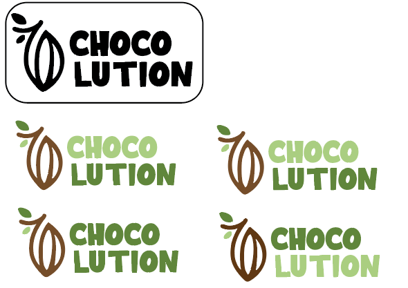
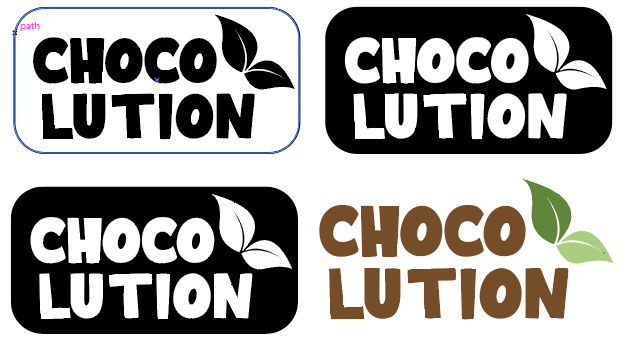
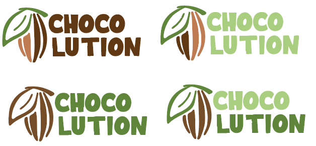
After choosing my most effective logos, I developed them and made them more refined. I first put them onto illustrator using my chosen font to go alongside the icons I created. Employing my colour palette brought together the final design of my logos. I trialed several ways of creating the logo, for example, experimenting with using a cocoa bean throughout the word and breaking up the words shorter. My final logo variants are accessible and aesthetically pleasing, utilising colour palette to emphasise the eco-friendliness of the brand.
Logo inspiration
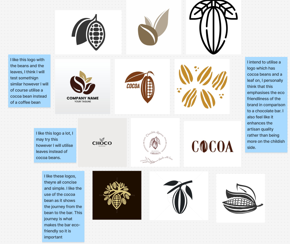
As I started to refine my logos, I created a mood board of inspiration for a cocoa bean logo. Using these logos as a reference, I found it much easier to design a simple logo for my brand.
Final logo variants
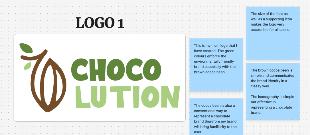
Here I have annotated my final logos. I have created 3 separate logos which all have distinct aspects that make them effective. The first logo is my main logo that I will bring forward into my other designs such as my website and brand kit. This logo is creative and playful which will be effective for a broad audience. The logo is aesthetically pleasing regarding the colour palette and the conventionality of using a cocoa bean makes the logo familiar to users whilst also being unique.
My other logos are still effective however, both being accessible and simple, allowing for all users to recognise and understand the brand through the logo. My main reason for not bringing the other logos as my main logo is that the style is too sophisticated as my brand will be catered towards families and students. This audience means that the playful logo works best and it also reinforces my brand, allowing me to be more creative and use illustrations throughout my brand.
Logos in print and digital
LOGO 1
The first logo on the left is the digital version in RGB colour mode whilst the image on the right is the print version, CMYK colour mode.
The RBG and CMYK logos both look very similar however, the RBG digital version is formatted differently to the CMYK print version. Although they have different colour swatches, both of my logos ended up looking the same no matter whether it was RBG or CMYK. Both logos are good quality and I formatted them on illustrator before exporting them to Wordpress.
LOGO 2
The first logo on the left is the digital version in RGB colour mode whilst the image on the right is the print version, CMYK colour mode.
LOGO 3
The first logo on the left is the digital version in RGB colour mode whilst the image on the right is the print version, CMYK colour mode.
Colour palette mindmap
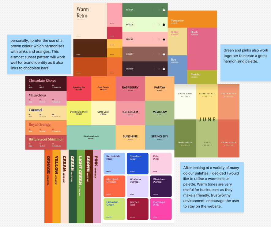
Before deciding on my colour palette, I researched and created a mind map of inspiration. I decided I wanted to use earthy tones and stick to a warm colour palette in order to be an engaging, friendly, and trustworthy brand. “warm palettes have this incredible ability to create instant emotional connection – they draw people in, make them feel comfortable” (Figure 2). This shows that using a warm colour palette is the easiest way to connect with my user and build a relationship with the brand identity.
I also want to use more unique brighter colours to pay homage to and link to sustainable chocolate brands that utilise brighter colours (such as montezumas). This familiarity will help the user associate the brands together and therefore encourage them to interact and stay in the website.
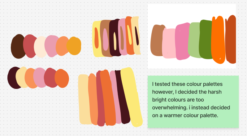
When I first created my colour palette, I experimented with a few different ideas. I knew I wanted to utilise warm colours; therefore, I focused on trying to create a harmonising colour palette. I found that my original palettes were too harsh therefore I developed my final colour palette which utilises brown, pink and green.
Final colour palette
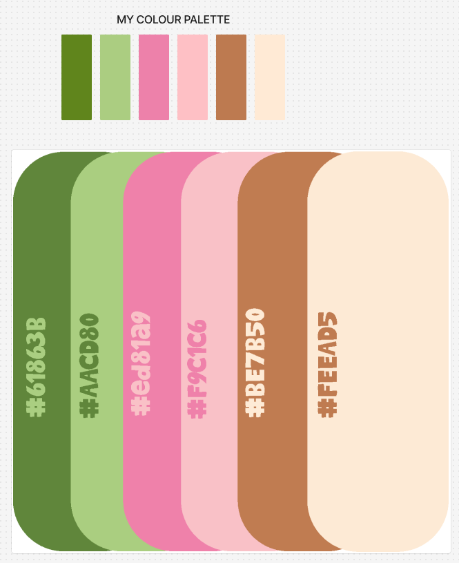
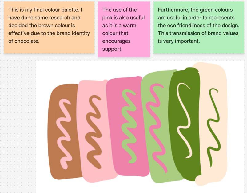
My final colour palette utilises warm colours and provides an inviting atmosphere. I used a few pink shades which is unique for a chocolate brand, but I believe this is effective for creating a strong, recognisable brand identity.
Typography
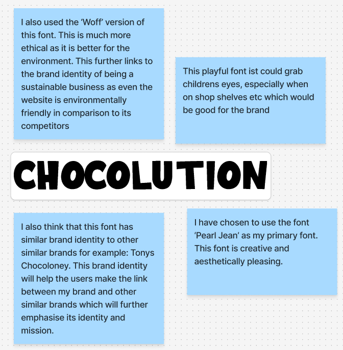
Finally, this is the font I decided to use for my brand. This font, ’Pearl Jean’ is creative and playful which perfectly suits my brand identity. Furthermore, this font resembles the competitors of sustainable chocolate brands. Building a strong brand identity between similar brands is imperative as the user will easily understand the ideology of the brand and communicating that message instantly is important for engagement.
Also, this font is also ethical as it is the ‘WOFF’ version of the font, using the sustainable version of the font is important as it shows that the brand is serious about being eco friendly. The font size is much smaller to download therefore it is much better for the environment when a user clicks on the website. This will make a difference and continue to build brand identity. “Sustainability on the internet is becoming more popular and one way you can improve your website’s loading time drastically is to convert TTF and OTF font files into WOFF” (Figure 3). This clearly emphasises the importance of making sustainable decisions wherever possible.
REFERENCES
THEKOOLSOURCE (N.D) The Importance of Feedback in the Design Process The Importance Of Feedback In The Design Process | Award Winning Atlanta Digital Marketing Agency 2025 (Accessed 26th December 2025)
Preston Lee (2025) 10 Warm Color Palettes That’ll Brighten Your Day 10 Warm Color Palettes That’ll Brighten Your Day – Design Work Life (Accessed 26th December 2025)
Andersen (2024) Reduce File Sizes by Converting TTF and OTF Fonts to WOFF and WOFF2 Reduce File Sizes by Converting TTF and OTF Fonts to WOFF and WOFF2 (Accessed 26th December 2025)
