Pencil Sketches
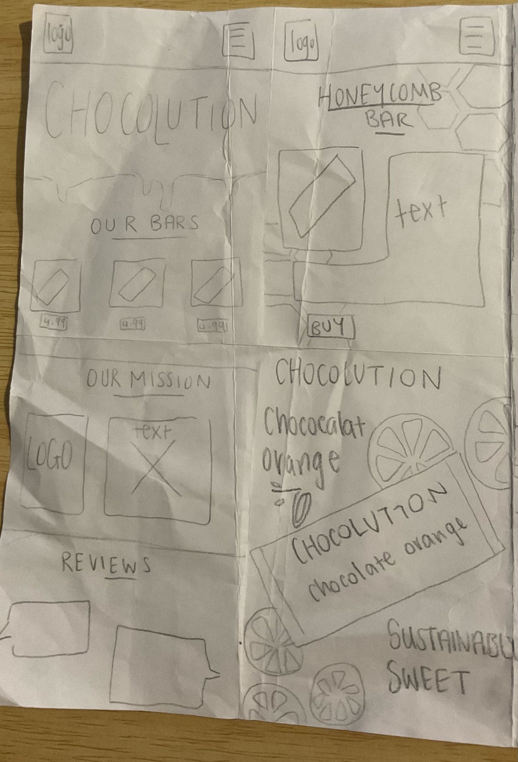
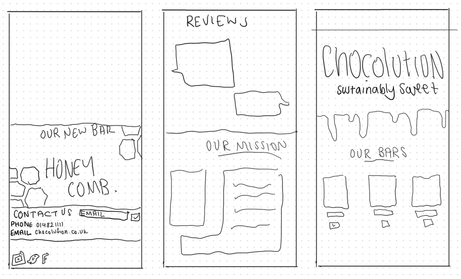
Before starting with my low-fidelity design, I did some rough pencil sketches as well as sketching on my iPad. I decided on a rough layout that honours conventionality to bring familiarity to a user. This familiarity, paired with the unique chocolate brand will be memorable and engaging for a user. Main parts I wanted to include in my design are reviews, our mission, a main banner and the chocolate bars themselves. In my initial design I focused on getting all the key components of a website homepage, especially the contact us page with hyperlinks to social media. This digital convergence is key to having a successful brand as being able to reach the social media from the website is vital. “A company’s website and social media channels are two fundamental pillars that significantly contribute to its visibility, credibility, and customer engagement” (Figure 1). This is why I will focus on having this as increasing the brand awareness and reach it can achieve is imperative for being successful.
Website inspiration
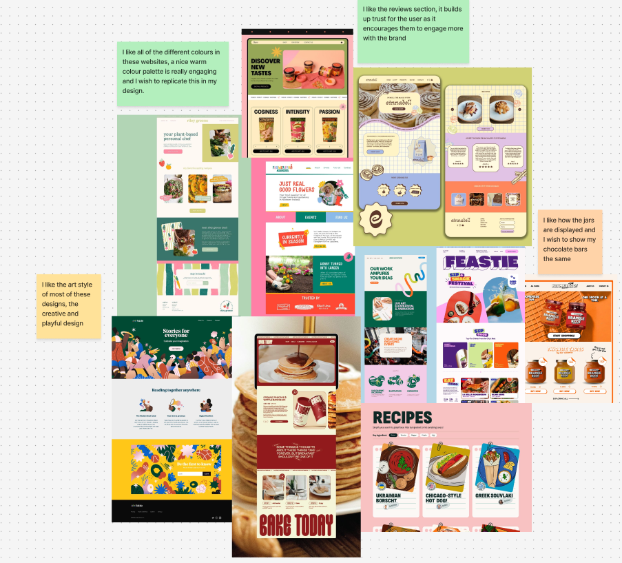
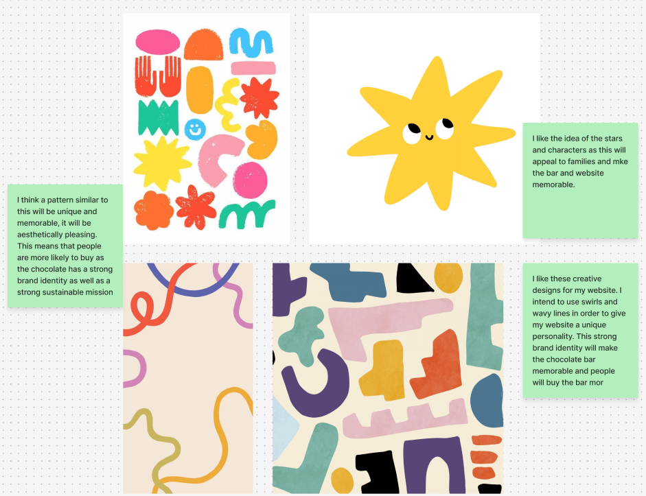
Originally, I wanted to utilise illustrations throughout my website design. The idea of using drawings to engage an audience would have worked particularly well for a family audience, allowing my brand to be accessible to a wider audience. However, I instead decided to use a chocolate dripping effect on my mobile layout as this fits better with my brand identity as an eco-friendly chocolate brand. Furthermore, I decided that utilising illustrations may have made my brand too busy and overwhelming which would have ended up in less users.
Furthermore, after researching inspiration for my website layout and style, I decided to go with a fun, playful website that is engaging and aesthetically pleasing. I will utilise many elements I saw in the mind map such as a review section and displaying the product on the page.
UI principles
I then did some research into UI principles such as Jacobs law (users prefer your site to be designed the way other sites they use are designed) and I will utilise this to make my website trustworthy for viewers and emphasise the eco-friendliness of the brand. I intend to achieve conventionality through the homepage. This will be aesthetically pleasing, and the menu will replicate many other similar sites for example, ‘Tony’s Chocoloney’. By having an easy to navigate website, it widens the website up to a broader audience. Conventional designs include Logo, menu, interactive layout etc. Furthermore, I will focus on using easy to understand ad designs, allowing the user to understand the message and values that I am trying to convey.
Another design law that will affect the creation of my website is Hicks law (too many / too complicated a choice means that the user will not choose any) and I aim to have a very simplistic Ad campaign that is conventional and easy to navigate. This user-central design will encourage users to read the banners rather than click off or look away. I will use Hicks law throughout my campaign by keeping it streamlined and only utilising my call-to-action when necessary. This way, users will read the banners and advertisements and then go on to interact with the brands’ website.
Finally, the law of Pragnanz means that the more complex a design, the user will automatically simplify the design mentally. Therefore, I will focus on maintaining the simplicity of my call-to-action. For example, in my social media ads, I will focus on having a strong call-to-action which will be imperative in interacting with users. For example, using a hook and then focusing on clarity of the brands identity is vital, however, this must all be displayed clearly to have a strong relationship with the user. This is also why I ultimately decided against using illustrations as I didn’t want my brand to be too overwhelming and complicated.
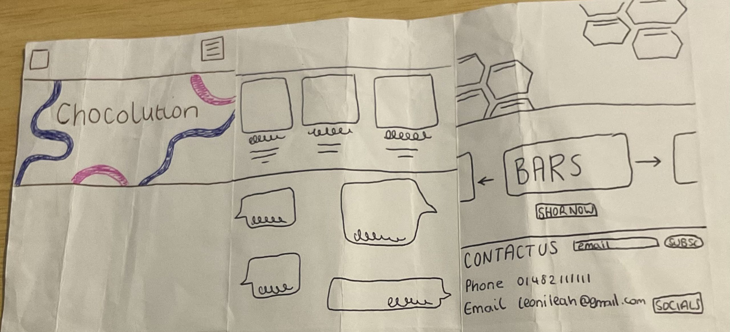
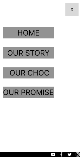
Figma low fidelity
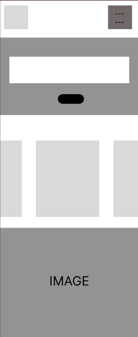
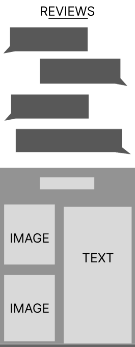
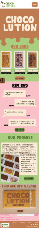
This is my low fidelity; I created a very simple design in Figma with grayscale shapes. When I move onto mid fidelity, I would like to add chocolate bars that I have mocked up. This would give the website realism and personality, engaging a user with images of the product. Having a low fidelity design is important as “Testing a low-fi prototype with real users enables teams to validate proposed functionality and identify pain points” (figure 2). After I created my prototype, I got feedback from my peers who gave me advice which I kept in mind as I created my mid fidelity. Feedback is crucial within design, and I listened to feedback such as adding mock-ups of my bars and having an engaging banner at the beginning. This greatly improved my design and simulated a user-focused design due to listening to consistent feedback.
I have also included a low fidelity menu that I will develop as this is a key component of my website design, showcasing the accessibility standards of my website with large text and contrasting colours.
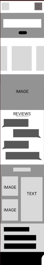
Figma mid fidelity
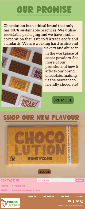
This is my mid fidelity design; I have utilised my colour palette throughout this website in order to make my website recognisable and build brand identity. The colours all complement each other, and the website is still accessible as there is a large contrast between colours. This accessibility is imperative to have a successful brand and reach a wider audience. Furthermore, I also utilised tactics such as reviews which engage the audience and makes them trust the brand due to the personal connection with other users that are leaving reviews. Finally, the emphasis of the ‘Our promise’ section makes it clear the brand ideology of ‘Chocolution’, and this is very important as most of the users will be eco-conscious therefore, they will steer towards brand that have sustainable methods.
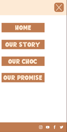
I also designed an extra page which is my menu page. I decided the menu page was necessary to further show the components of my website. I have kept a simple colour scheme with both elements and focused on making the call-to-action buttons clear and engaging. This menu represents all the places that would have been available to see on my website, these components such as ‘Our Promise’ and ‘Our Choc’ is important in brand design and follow the conventionalities of sustainable chocolate brands linking to brands such as ‘Tony’s Chocoloney’.
Accessibility
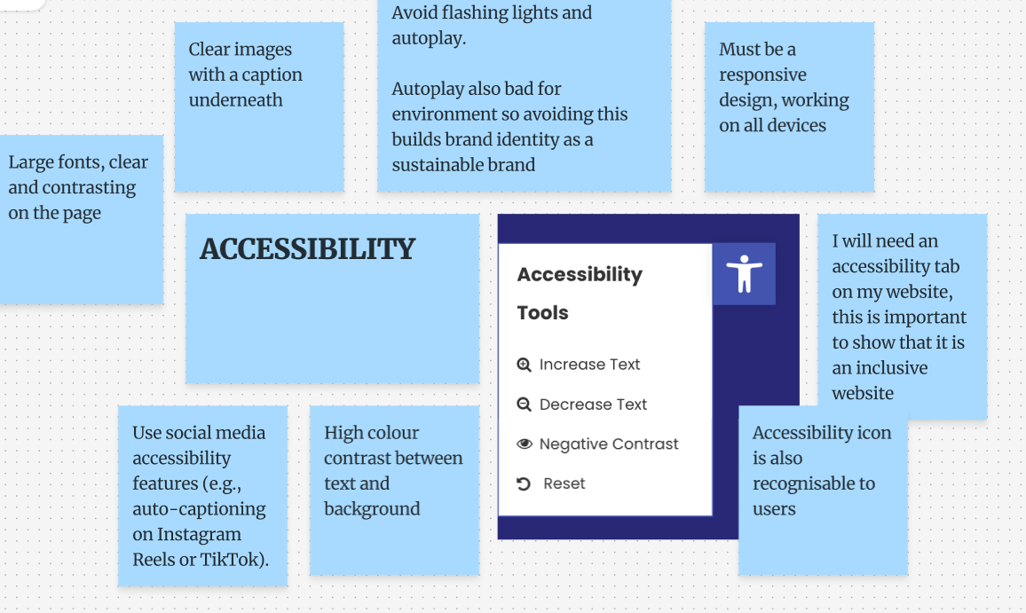
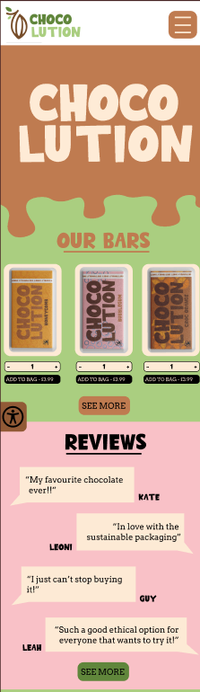
Finally, I have put a great emphasis on accessibility throughout my design. I have included an accessibility icon on my website as this is crucial in allowing all users to engage with the website. This icon would have been expandable allowing for larger fonts and dark mode. This is important as “Digital accessibility strives for inclusive design that allows anyone to use, engage, and enjoy digital content regardless of the level of ability, condition, or circumstances. It focuses on eliminating barriers that can block a user’s access to digital content” (Figure 3). Removing barriers that would have otherwise limited users is imperative in order to be a strong brand. Utilising easy adaptations such as a bold font, contrasting colours and using an accessibility tab is crucial to be inclusive for all audiences. This also opens the brand to a wider, more diverse audience.
REFERENCES
Figure 1 – ScreamDigital (N.D) Discover why having a website and social media channels is crucial Top 10 Reasons Why Having a Website and Social Media Channels is Crucial for Your Company – Scream Digital (Accessed 1st January 2026)
Figure 2 – Satter (N.D) Low Fidelity Prototype: What it is, Importance & How to use it why is doing a low fidelity important – Search (Accessed 1st January 2026)
Figure 3 – UNCG (N.D.) Why accessibility is important Why Accessibility is Important | Accessibility Resources at UNCG (Accessed 1st January 2026)