Poster Research
(Scroll the carousel)
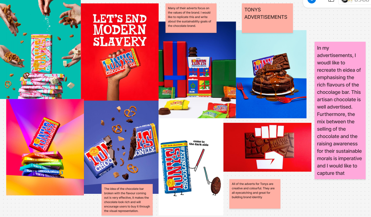
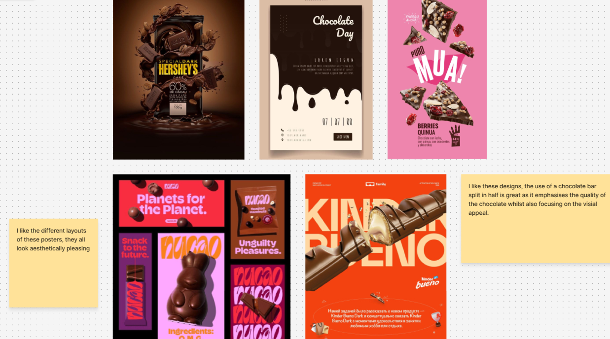
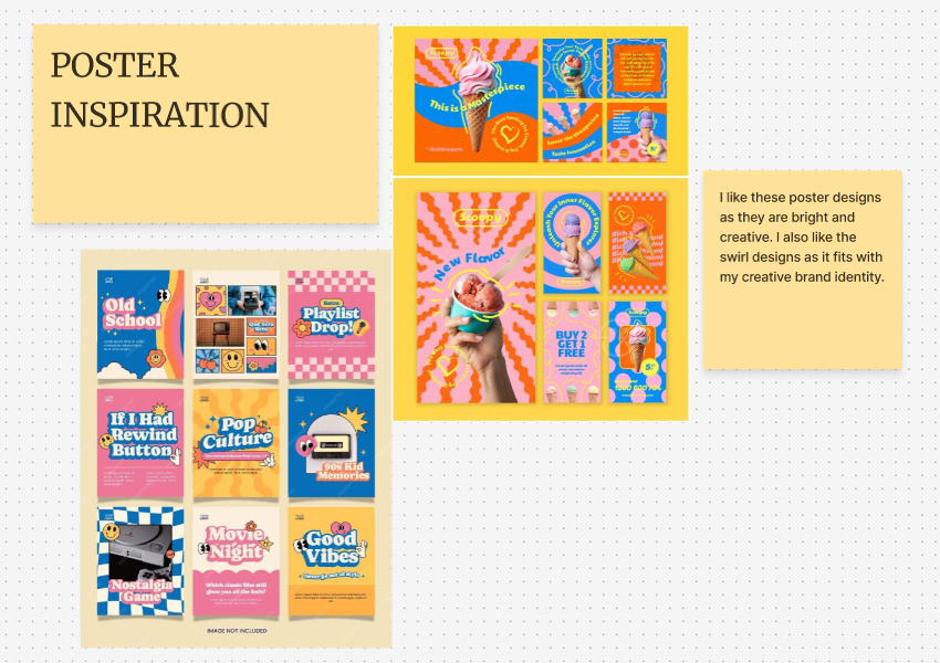
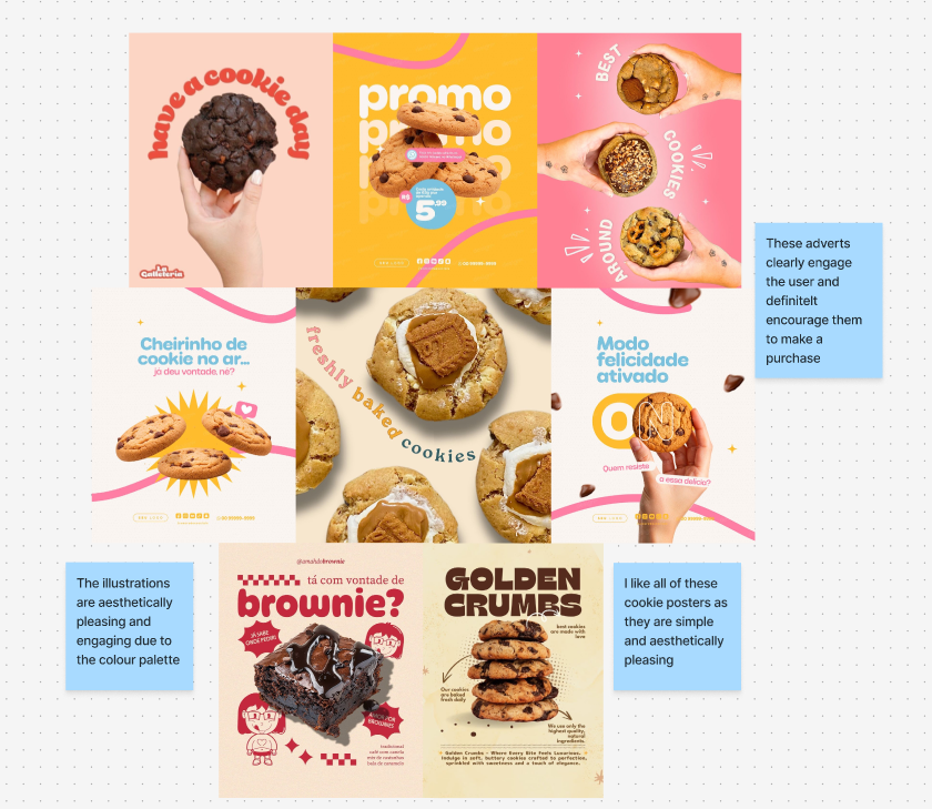
Before doing any development or sketches, I decided to do research on different poster designs to find inspiration for my designs. I liked creative designs that included having mock-ups of the product. Utilising the product in the ad design is imperative as it is engaging and encourages the user to find out more through the image rather than through overwhelming text. A simple ad design is most effective, and I aim to produce a simplistic design with engaging images and bold text to be accessible for all users.
AD research
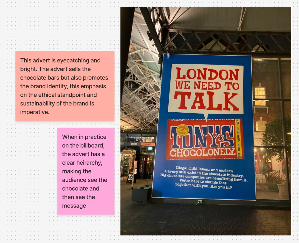
After looking at broad advertisement research, I looked at the sustainable chocolate brand ‘Tony’s Chocoloney’. Many of their ads focused on the sustainability of their brand whilst also promoting the chocolate bar with various imagery of the bars. I aim to market the chocolate bars whilst also engaging the audience and reinforcing the sustainable aspect of the bar.
Furthermore, I will use a more warm, brown colour palette (already associated with my brand) to engage the audience and using the same colours throughout my ad campaign will build brand identity. “Brown’s primary branding advantage lies in its immediate signal of authenticity and natural quality. In an era where consumers increasingly value transparency and organic materials, brown creates instant associations with these desired attributes” (figure 1). I aim to convey the organic, sustainable part of my brand as its main competitive point at standing out from other chocolate brands.
Initial Sketches
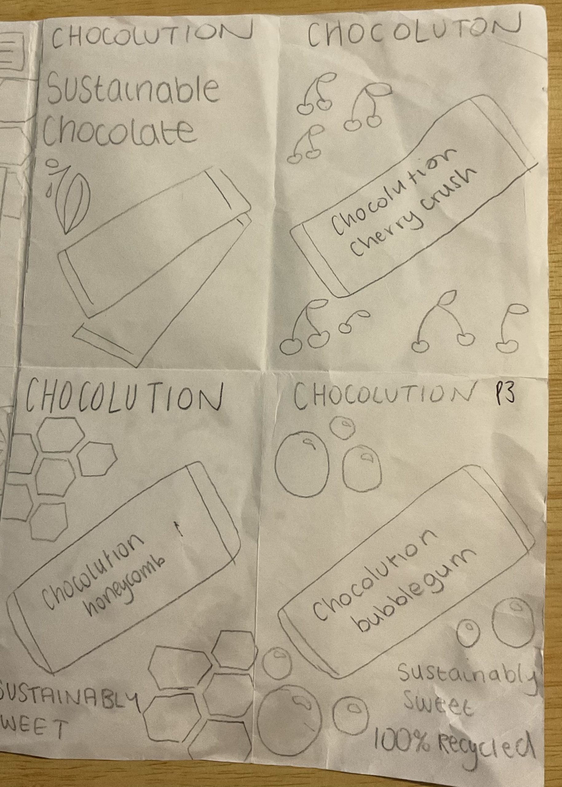
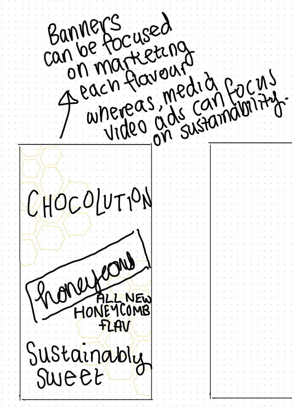
Initially, I designed my ads to market each individual flavour. I created 3 chocolate bars in various flavours in order to advertise them throughout my campaign as new flavours. However, after starting my design on Adobe Express, I decided the sizing of the adverts meant that advertising a new flavour may be too overwhelming, so I focused on a more simplistic design.
Wide skyscraper Ad

My wide skyscraper ad is aesthetically pleasing and simple. The design focuses on the dripping chocolate which also links to my website as I utilised a chocolate drip on my main banner. Whilst building brand identity, this advert also mentions the sustainability of the bar in a bubble which is crucial as the brands main ideology is being eco-friendly. I made sure to keep everything large and visible in order to maintain accessibility.
Mobile Banner Ad

My mobile banner advert mirrors the skyscraper ad. I aimed to have very similar adverts to focus on brand identity. The main difference here is that the chocolate does not have a dripping effect. I decided due to the measurements, this would have been too overwhelming, so I focused on an even simpler design. Both designs also utilise a QR code and this call-to-action makes it easy for users to explore the website just from the advert. This responsive design is crucial to get users to look deeper into the brand.
Rectangle Ad (x2)
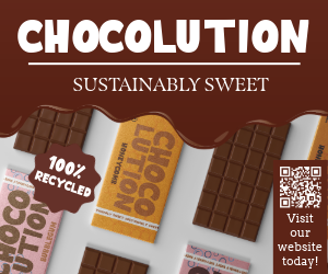
My first rectangle ad mirrors the other ads as ut utilises the chocolate drip, detailed mock-ups of all the bars in an aesthetic design and focus on my slogan ‘Sustainably sweet’. The use of a tagline is also crucial in order to reinforce brand identity and emphasise the sustainable standpoint of the brand.
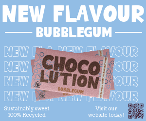
I also created a second rectangle advert. I did this in order to show a different style that I may utilise. I like the brighter colour and the engaging images of the new flavour. I also used a QR code in this advert, making it easy for customer interaction. The creative design is engaging and easy to understand whilst also employing the brand colours.
Both adverts are effective in marketing the chocolate bar and they are aesthetically pleasing and engaging to the audience.
Chocolate bar wrapper inspiration
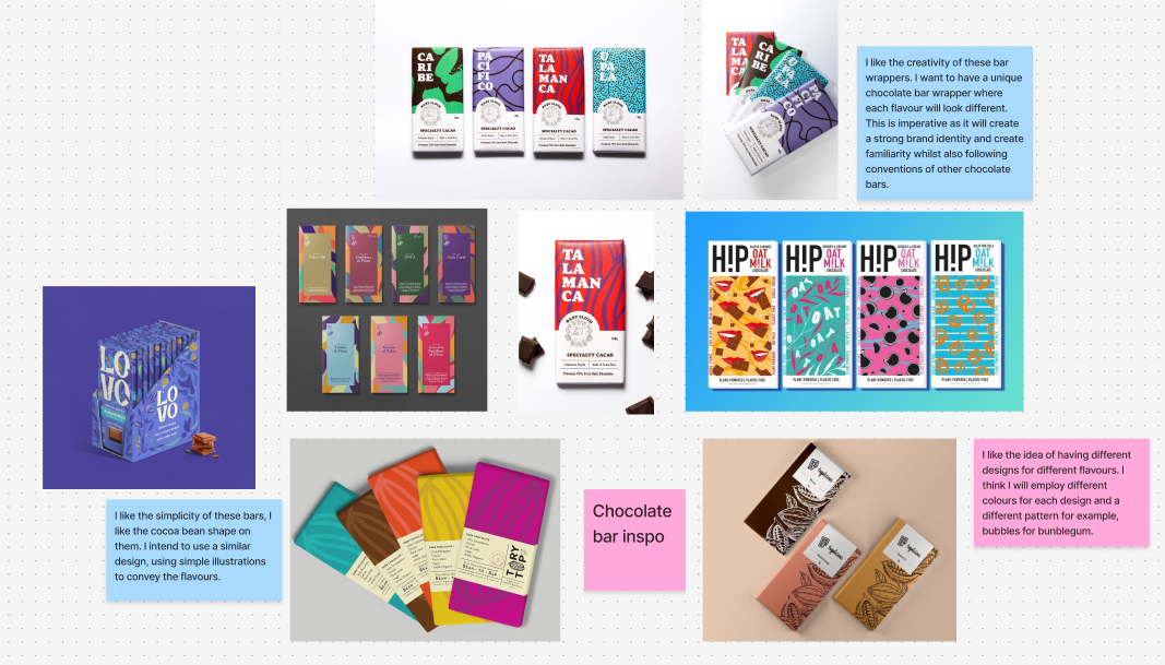
In order to create my mock up chocolate bars, I had to do some research to decide the design and style I wanted to use. Ultimately, I decided to use a simpler design, making each flavour a different bar to create various designs that all have common components to keep the identity strong.
Chocolate bar Sketches
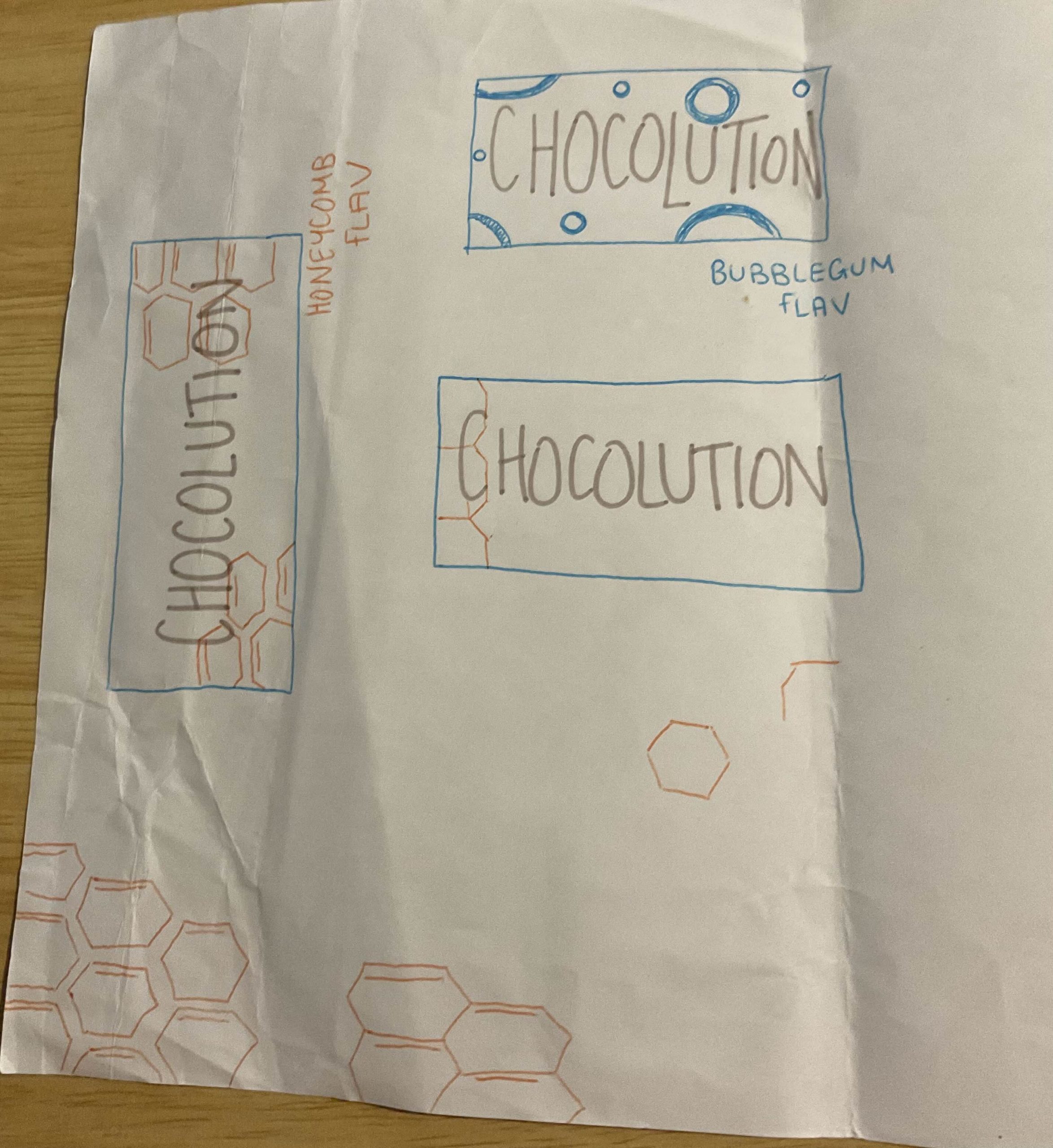
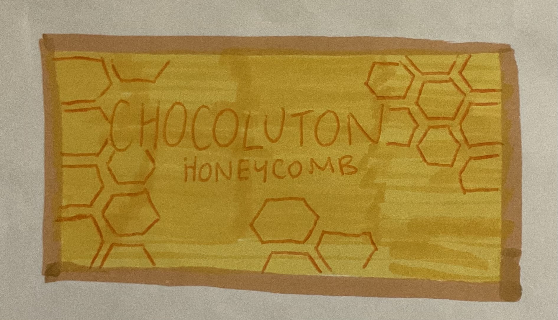
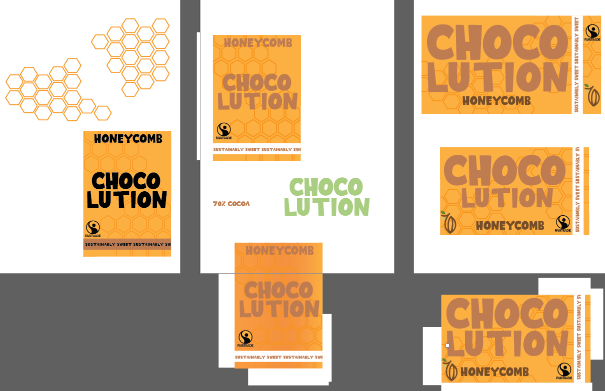
My initial sketches of my design showcase the main ideas behind my designs. I decided to utilise my main font large and bold in the middle of my bar, having the flavour underneath. This is the case for all the bars however; they each have differing designs and colours to emphasise the rich flavour. My initial design showcased honeycomb as a hexagon design.
Chocolate bar development
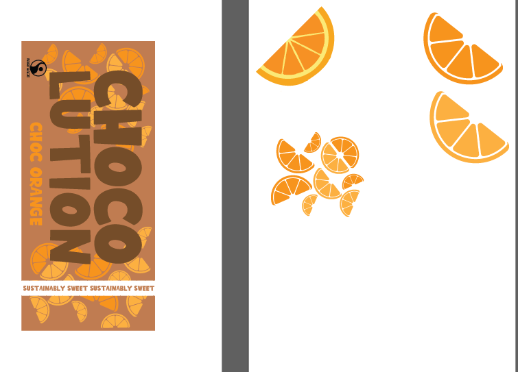
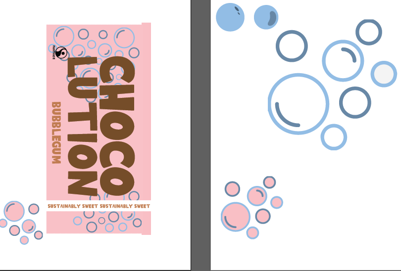
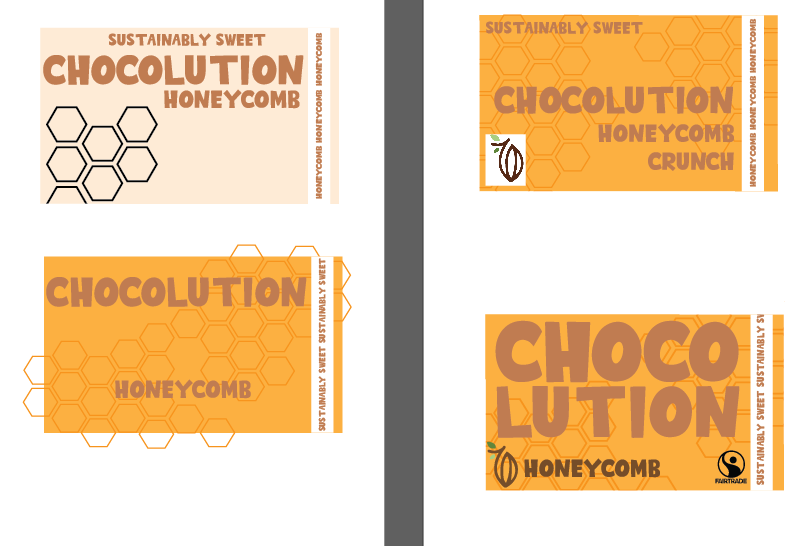
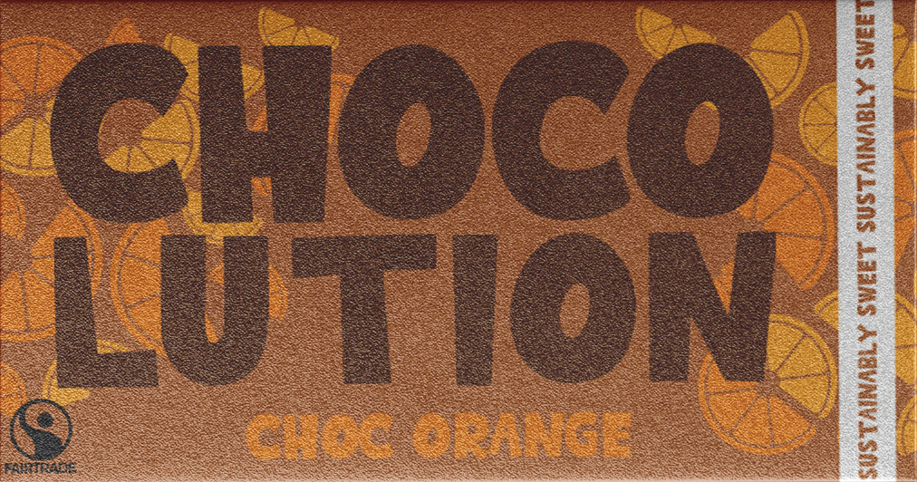
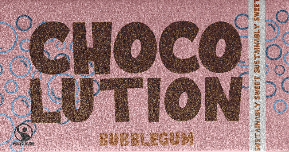
After my initial sketches, I developed my designs on illustrator. I played around with different designs and colours. For example, I tested different sizes of honeycomb and experimented the harmony with different chocolate bar colours. This development supported me in finding the perfect composition for my chocolate bars, allowing me to utilise a simple design that was aesthetically pleasing. I also decided on the other flavours, bubblegum and Chocolate orange. To represent these, I developed a design with bubbles and orange slices. This enhances my design, and the visual representation of the flavour makes it more engaging.
Chocolate Bar Illustrator
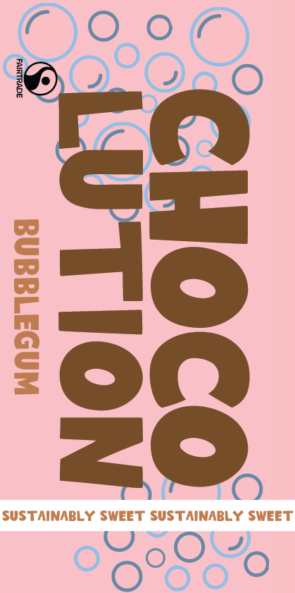
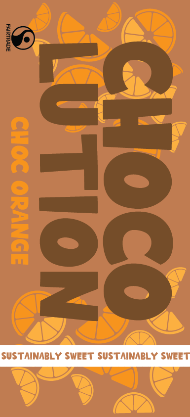
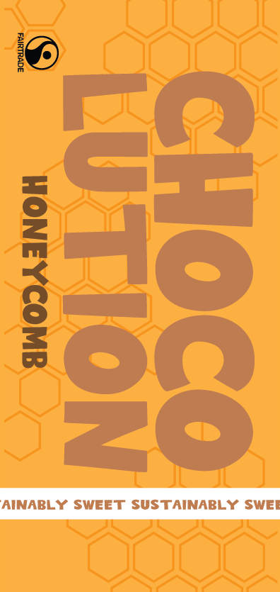
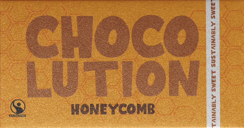
Here are my three chocolate bars that I made. Each bar has key components that create brand identity such as the large brand writing and flavour in my primary font. Furthermore, each bar has a side banner with the slogan in it which also links to ‘Tony’s chocoloney’ as they have a similar band that instead has their flavours in. This recognition of similar brands and having similar conventions means that the chocolate bar will be more recognisable to a wider audience.
Finally, I also added the ‘fairtrade’ logo as my brand would follow the fairtrade standards and focus on their sustainability above all else. Finally, although each design is different, they all clearly represent the same brand ands this is crucial for a design as the user will be able to recognise each bar as ‘Chocolution’.
Chocolate bar mockups
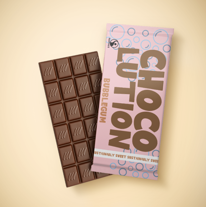
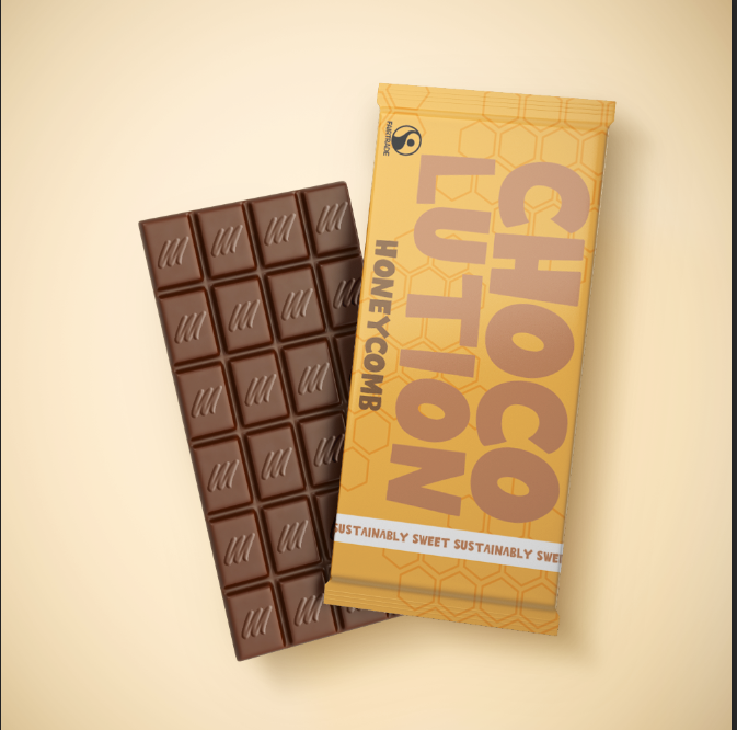
Finally, after creating my chocolate bars, I mocked them up in order to give them some realism and make them easy to picture. I utilised these mock-ups throughout my design process on ads and on my website. This realistic image of the chocolate bar is engaging and aesthetically pleasing making the user want to see more. I tested a few different mockups however I decided that the first rounder chocolate bars are more effective as they are more aesthetically pleasing and also link further to other sustainable chocolate brands such as ‘Tony’s’.
REFERENCES
Figure 1 – ClairMonet (N.D) Color Psychology in Branding: The Grounded Authenticity of Brown Brown Color Psychology in branding: Authentic & Natural Identities (Accessed 1st January 2026)
