Exercise 05: Social Media Advertising – Motion

Social media research

 After doing some social media research on sustainable chocolate brands, I found that many of these brands focus heavily on their sustainability as well as their rich chocolate. On social media, the colour palette and brand identity is the same as their websites, and this is crucial for a successful social media design. 

Initial sketches

I did many initial sketches of my videos in order to map out the key components such as the hook, clarity, impact and finally, call-to-action. Many of my sketches aimed to focus on both the sustainability and the new flavours and variety of chocolate bars. 

Video 1

My first video focuses specifically on the variety of bars on offer. Utilising each bar transitioning into the video means that it is easy for the consumer to stay engaged and interested in the chocolate bars. Furthermore, as well as marketing the chocolate bars, the advert also emphasises the eco-friendliness of the ethical, recycled chocolate bars. The hook of the first frame engages the user as the chocolate bar moving is eye-catching. Then there is clarity with the motive and ethical standpoint of the brand which also emphasises the impact on the user, allowing them to invest in a sustainable brand that is good for the environment. Finally, the call to action would be the scannable QR code on the last page and the emphasis on going to the website for more information. This video is effective and follows the brown colour scheme of the website and the banner adverts. 

Video 2

 Video 2 focuses more on the taste and new flavours that the brand is creating. Although, it has a slightly different message, the brand identity grows stronger due to the same colour palette, fonts and last frame. The hook is clear as the chocolate bar is eaten on the first frame, this engages the user to see the next frame which showcases the new flavour. This frame is aesthetically pleasing and shows the user clarity and the impact they will have by trying this new delicious flavour.  

Key video frames

Finally, I picked out key frames of each video to explain the key concepts and why they are effective as adverts selling the chocolate bar. 

Brand kit

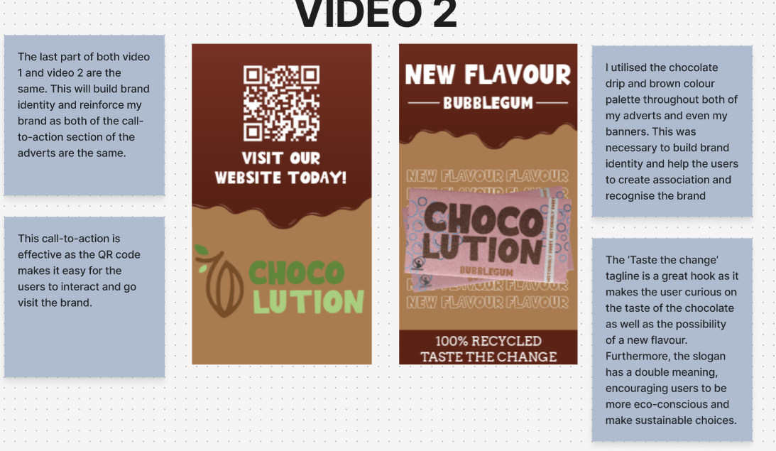
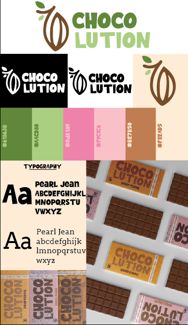
 This is my brand kit. It follows conventions of a brand kit by including, typography, logo, colour palette and even mock-ups of my chocolate bar. I have kept this brand kit in the style of my brand allowing it to be aesthetically pleasing. The use of the colour palette hex codes makes it easy to use the correct colours and the use of the logo in black and white contrast emphasises the accessibility aspect of my brand. “As your business scales, a brand kit ensures your visuals stay consistent and recognizable across all platforms. This helps you look professional and trustworthy as you reach new audiences or work with larger teams” (figure 1). This was imperative to me as I journeyed from using different platforms from a website, banners, social media and even chocolate bars. This brand kit helped me stay aligned with my brand identity and keep everything recognisable. 

REFERENCES


Figure 1 – Photoroom (2024) Create a cohesive brand identity with your own brand kit Brand kit: what it is, why it’s important and useful examples | Photoroom (Accessed 2nd January 2026)