I initially drew a paper-based low fidelity prototype. This outlined the key features as well as some rejected designs. The rejected designs are a progress bar (which was removed as it didn’t seem relevant to the app) and an onboarding process. Personally, the onboarding process didn’t feel necessary due to the very simple app with only a few key features.
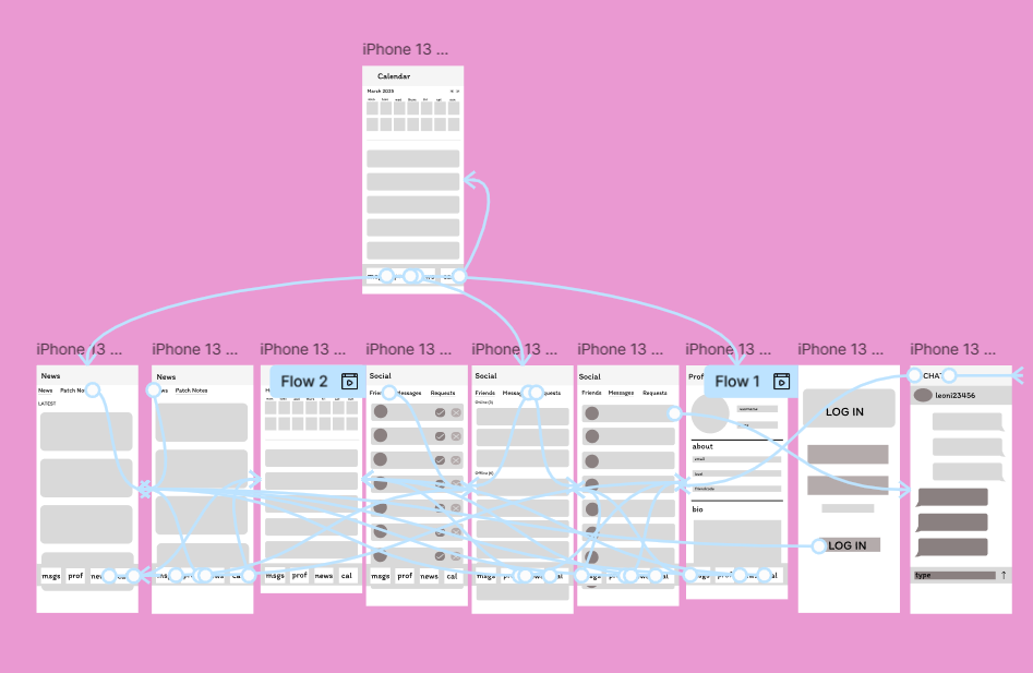
Fully wire-framed low fidelity
This is the fully wire-framed low fidelity prototype. It is simple to navigate the app and the interface is consistent. The navigation bar remains at the bottom for simplicity and for consistency as it is common in these apps. When creating my high fidelity design the navigation bar will be much more aesthetically pleasing with icons that I will design.
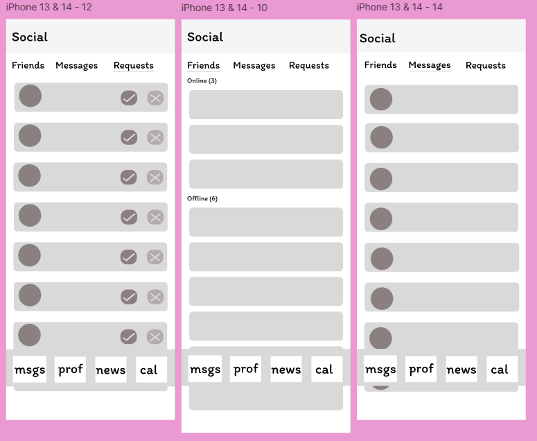
Social menu
A key part of my design is the easily accessible social menu. It includes a variety of features as well as sending messages. The simple layout out of my design is created to be accessible to all users and the large fonts will also allow this. Furthermore, the colour pink is useful for “Enhancing approachability: Pink can soften interfaces, making complex tools or services feel more accessible.” and this is a key part of my design as whilst also being feminine to appeal to my target audience, the colour pink will make my software feel inviting and motivating. Furthermore, my high-fidelity prototype will follow the pink colour scheme I planned and through this it will create a brand identity, linking all 3 platforms of my app.
My paper based prototype
Rejected designs
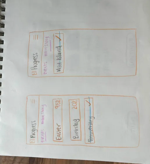
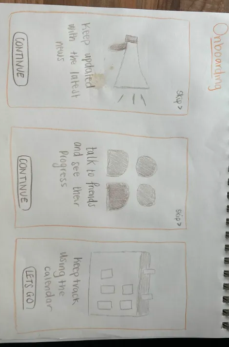
Onboarding and progress prototype
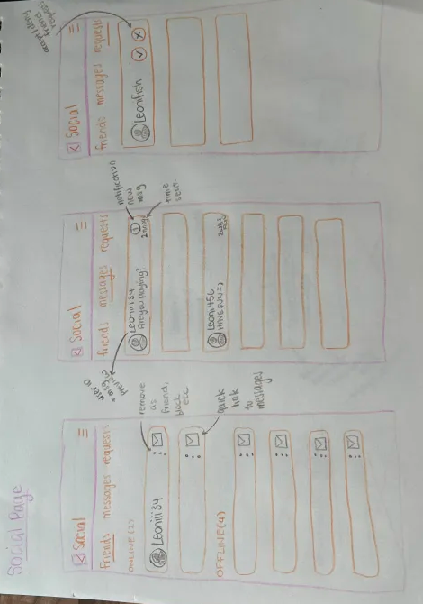
Social page prototype
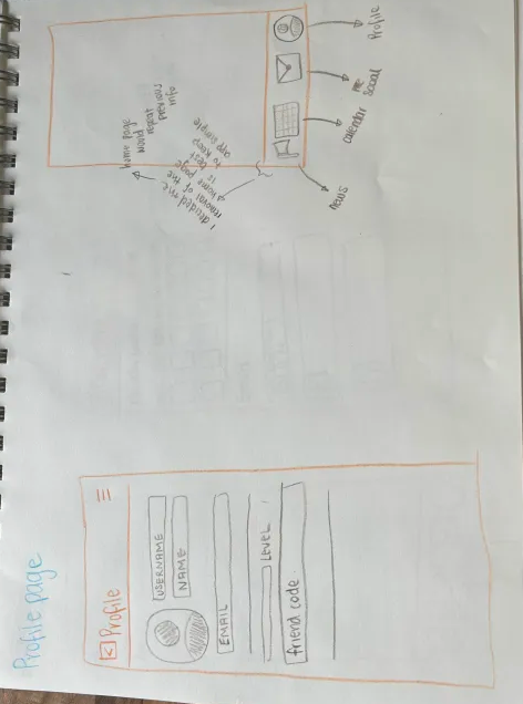
Profile page and navigation bar
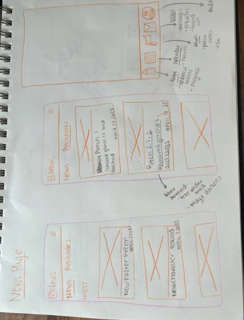
News pages and rejected design for navigation bar as i removed the home icon
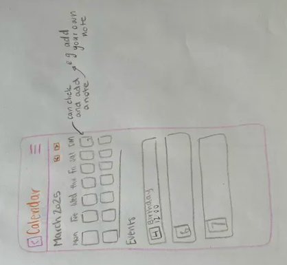
Calendar page prototype
References
Inspiringapps (July2024) The Psychology of Color in Branding Digital Products https://www.inspiringapps.com/blog/the-importance-of-color-in-design#:~:text=In%20digital%20product%20design%2C%20pink’s,%2C%20fresh%2C%20and%20emotionally%20resonant. (Accessed 1st May 2025)
My Figma Link