Whilst creating my high-fidelity mobile app, I made sure to keep using my colour palette that I decided on previously through research. The colour scheme compliments the game company which is called “sugarplum studios” and it appeals mostly to a female audience.
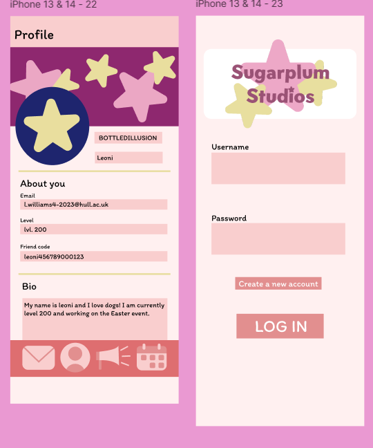
Here are my profile page and log in
Here are my first 2 pages of my high-fidelity mobile app. The log in page is the first page a user will see. Therefore, it perfectly represents the brand and what will be in the app. The profile page is made to be customisable from user to user, and it follows the same themes.
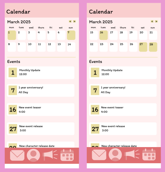
The high-fidelity calendar pages
The calendar pages of my app are clear and easily understandable. The user can switch between the dates at the top and view the upcoming events and changes in the game. This will be useful as the user will be kept updated with changes and improvements of the game.
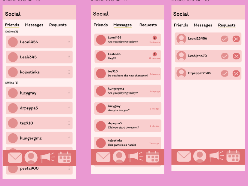
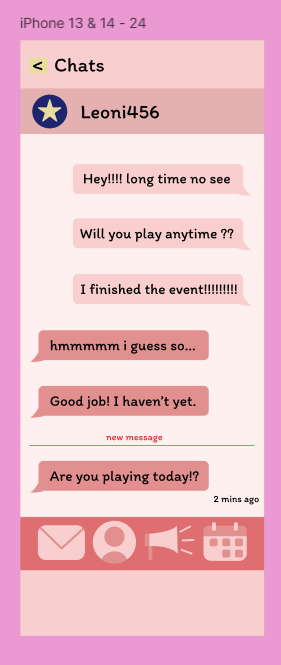
The social and chats pages
The social menu is clear and representative of similar companion apps that have this feature. This familiarity will make it easy for the user experience. The messages page also follows these conventions, easily allowing any user to chat with friends online that play the game.
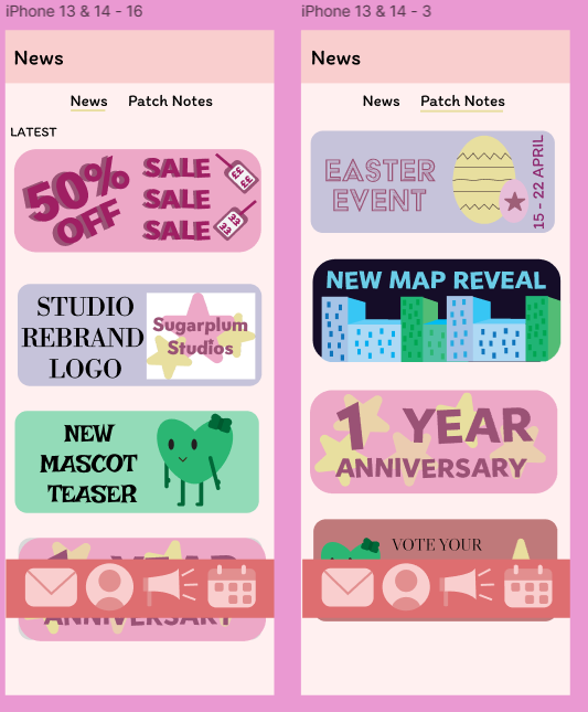
The news pages
The news pages are clear and distinctive with each article being colourful and having icons and drawings with will encourage the user to click on them.
Figma link