I adequately followed accessibility guidelines with my app. I started with the easily understandable typeface which is clear and legible. Furthermore, even with the pink colour scheme, I made sure to have a clear contrast between the colour and the typeface, making it accessible. Also, the simplicity of the app means that there are limited motor movements and this makes it very accessible for people who struggle with pinching and swiping.
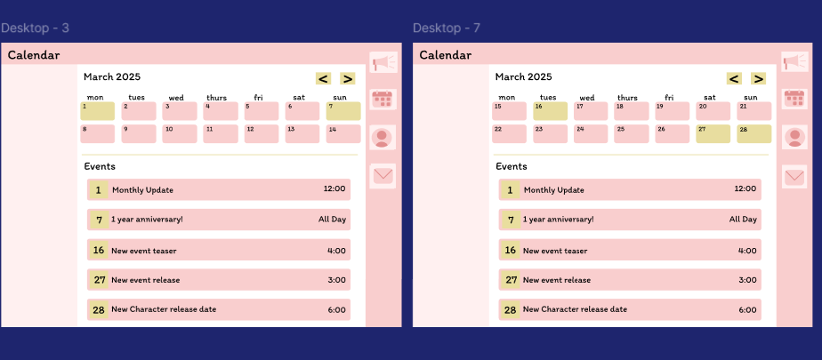
The calendar pages, both tablet and desktop
The calendar pages for both the desktop and tablet are very similar which will ensure for a smooth transition for users that use more than one platform to use any of these apps.
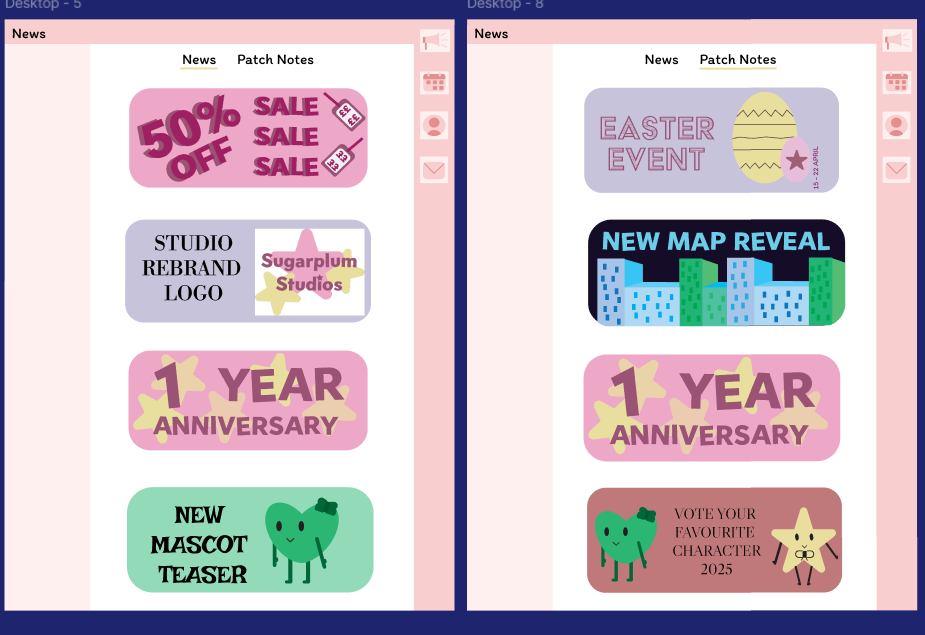
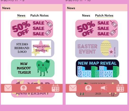
The News page for the desktop and tablet
Regarding the news page, both the app and the website follow the same conventions and colour scheme as the mobile app to maintain a recognisable brand identity. Furthermore, the website has some white space around the news page in order to refrain from making the pages overstimulating and confusing.
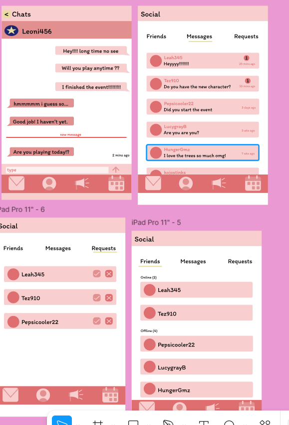
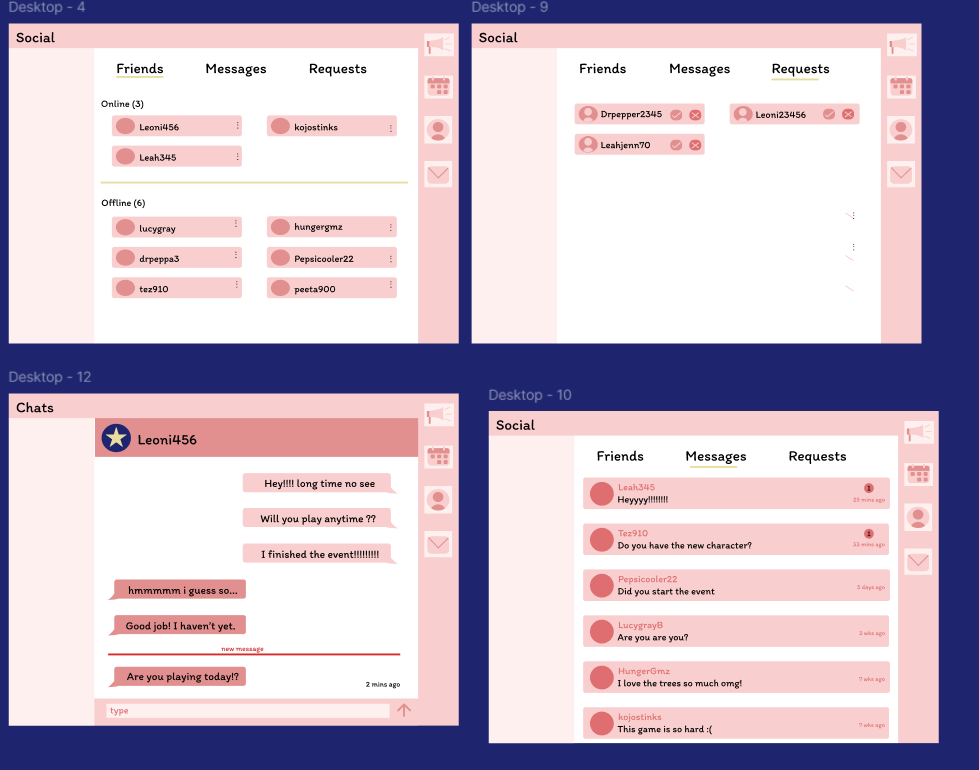
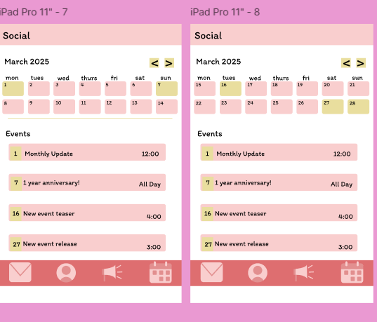
The social pages for desktop and tablet
The social pages are both very similar however, the desktop is more landscape, allowing the information to take up more of the screen. The desktop chat box follows conventions of apps such as discord and the seamless transition from mobile to desktop.
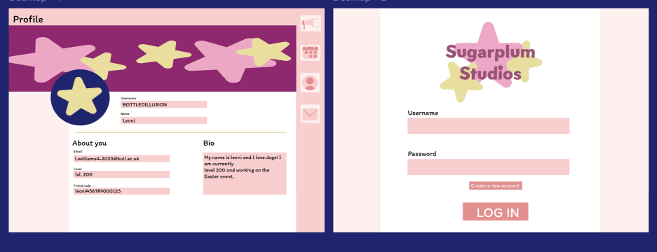
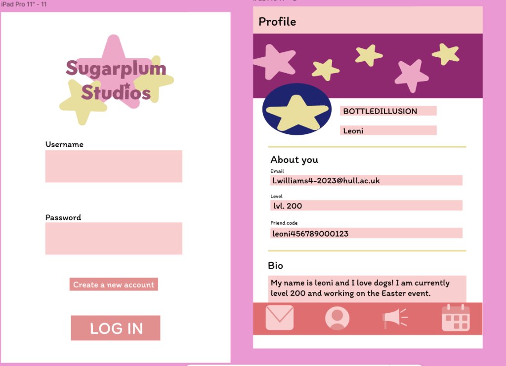
The first 2 pages, profile and log in for both desktop and tablet
Finally, the first 2 pages, profile and log in for both tablet and desktop are very similar. The main differences between the tablet and desktop versions are the navigation bars. The tablet navigation bar is consistent with the mobile application however, the desktop bar is fixed onto the side which is consistent with many other similar desktop applications
Figma links
Desktop
Tablet