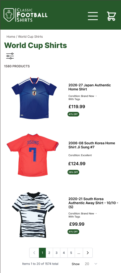
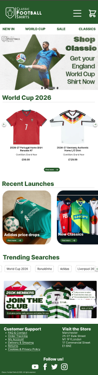
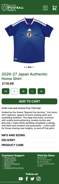
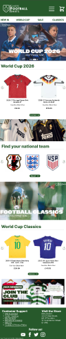
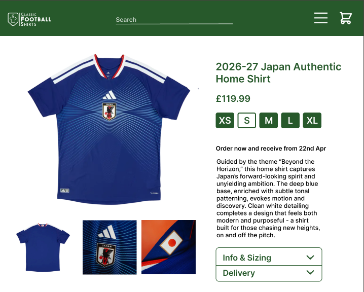
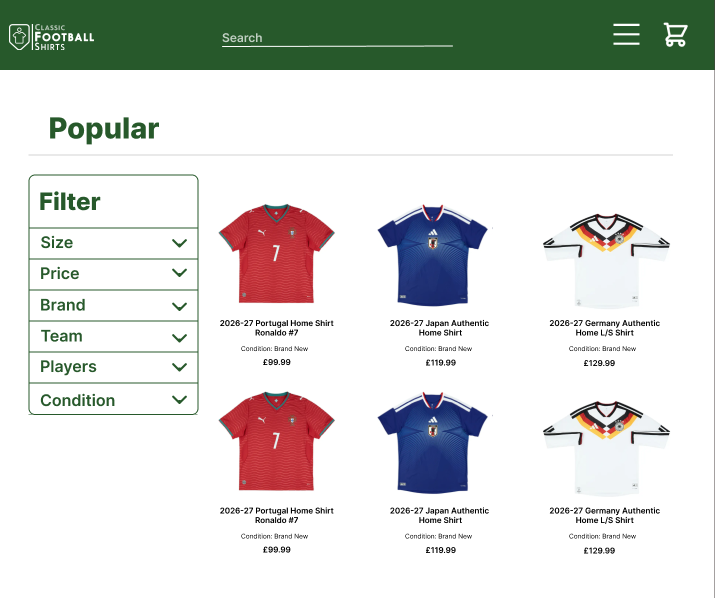
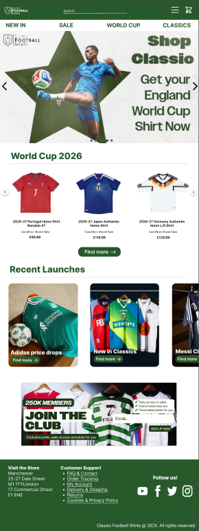
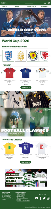
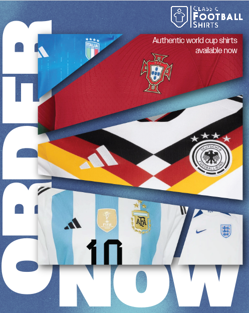
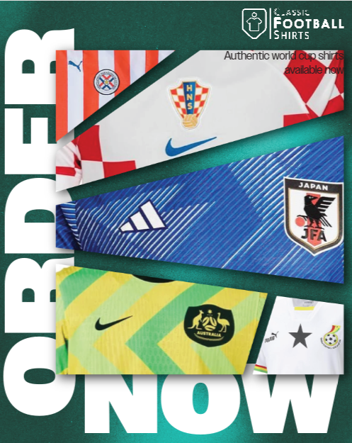
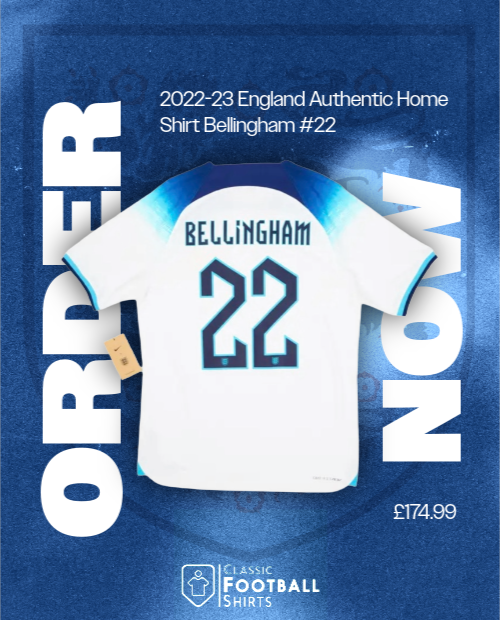
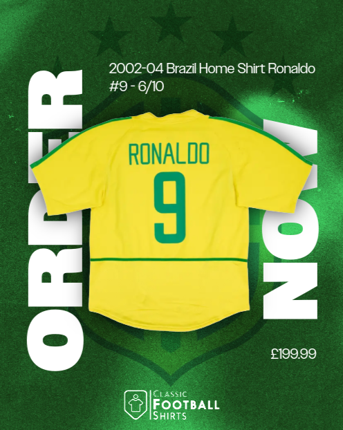
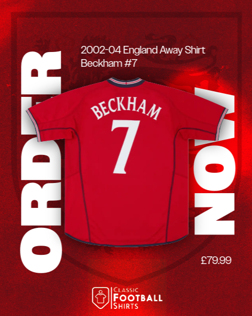
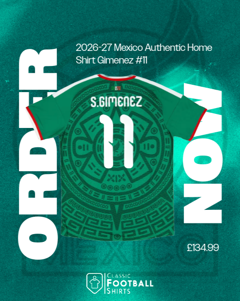
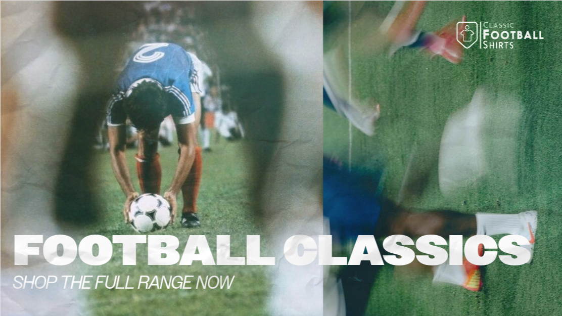
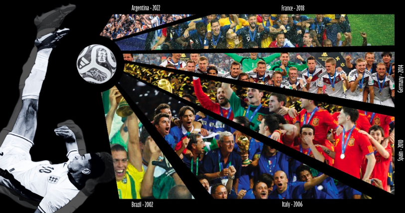
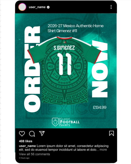
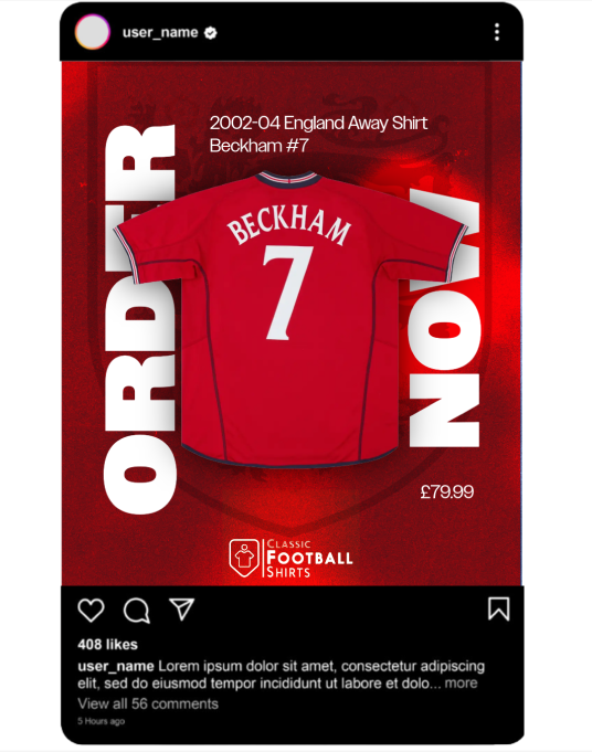
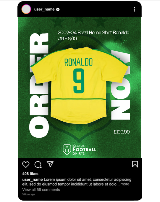
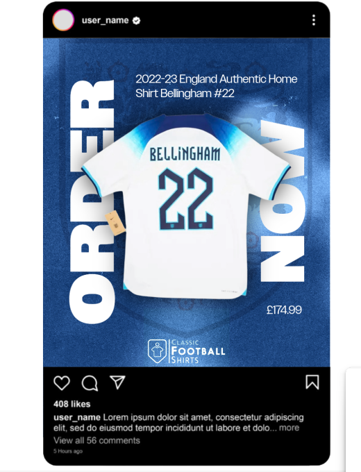
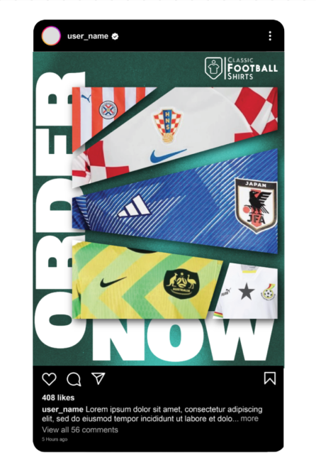
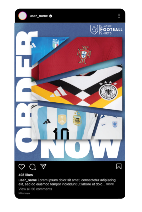
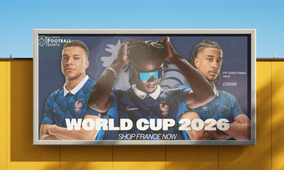
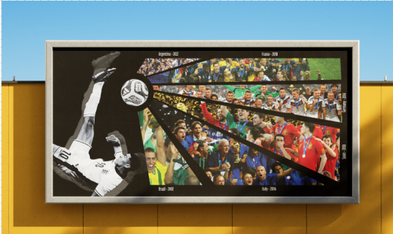
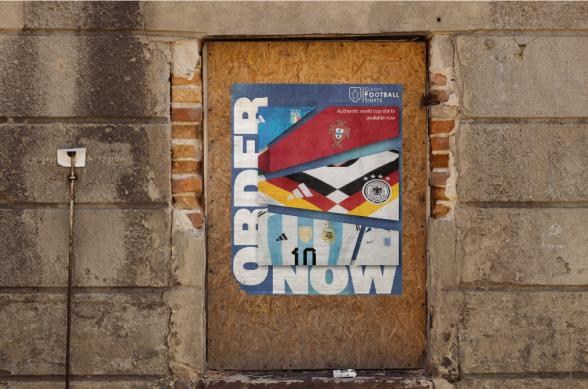
Here is my desktop version of the website layout. It is the same as the mobile version which builds brand identity and keeps them cohesive. Regarding feedback, I focused on building these websites based on the information from the marketing team, for example, keeping it simple and focusing on key elements e.g. our murals. Finally, I also utilised feedback from my CRIT presentation that I did in front of my peers, and they advised I focus on the brand identity and keep the green colour palette and main elements, which I did.