Task 2

002 Development log

Client website anlaysis

Task 2


(Scroll the carousel)(I cannot get rid of the second ‘Task 2 it is a glitch)

In order to better understand the client and context within this brief, I firstly looked at the website for Classic Football Shirts.  As an art director, I dissected the strengths and weaknesses of the website. These proved helpful as I learnt the brand identity and through collaboration with the Marketing team, we decided on future steps that must be taken in this project.

World Cup 2026 Moodboard

In order to get a more in depth understanding of the brief, I looked at all of the branding of the current world cup. Many adverts are bright and energising and this atmosphere I wanted to reproduce into our campaign. Furthermore, my previous research into collaboration within projects showed me that there are certain roles and responsibilities within each team therefore I focused on trying to understand the client and context in order to communicate that with the marketing team.

Similar World Cup Campaigns

We decided to research into similar World Cup 2026 campaigns held by Nike and Adidas. These campaigns are both clear and effective which is great to utilise within our design.

Competitor Research

We then focused our research on larger brands and companies that sell football shirts. This research is vital and as an art director, having lots of research means that the art decisions are more well informed and creative.

User Personas

After doing a large variety of research, for example competitor research and campaign analysis, I decided to start creating a user persona. This was also aided through the collaboration with the marketing team as they also had in-depth research to support choosing a certain target demographic. Through all of this research, we realised that it is imperative to focus on the target audience and always keep it on our minds when continuing with this design.

Social Media Research

As we will be creating social media adverts, I decided to do some research on the current social media pages of Classic Football shirts. Analysis of their Tiktok and Instagram feeds showed me that they have a strong brand identity regarding football. They focus on all news football and this clear agenda also stays true for Nike as their social media has started to already produce marketing for the WC 2026.

Through further communication and collaboration with the marketing team, we decided to use TikTok and Instagram for our social media pages that we are creating content for as they are the most popular, especially regarding the World Cup.

Sitemap

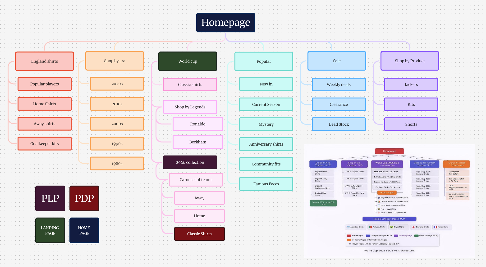
After deciding how they wanted the sitemap to look, the marketing team sent over an AI generated sitemap. I decided to collaborate with them and utilise this data to create my own sitemap on Figjam. I mixed their research with our own to create the finished sitemap and after getting feedback from my lecturer as well as the client, Ash, they decided it was an adequate sitemap therefore I let it help influence my further design. Whilst making the sitemap for the marketing team, I tried to keep their ideas in mind whilst also making it effective from a design point of view as “According to a study in MIT Sloan Management Review, 75% of cross-functional teams are dysfunctional, citing conflicting goals, unclear governance, and broken communication.” (Figure 2). Therefore, I decided to make sure the Marketing team was involved with each stage of the creation process.

Colour Palette Research

In order to determine the best colours for the campaign, we looked at both the client website and the colour palette for the WC 2026. We decided that using the unique colours of the World cup would be the most effective as it is familiar and eye catching. We will move forward utilising a mix and match approach using a few colours at once and ultimately painting the picture of the World Cup.

Typography

After seeing the WC 2026 font, as the art director I decided that it was limited due to the inaccessibility. Furthermore, I decided to find a similar bold typeface which promotes inclusivity as well as bringing familiarity of the unique World Cup typeface.  As an art director, I found the strengths and weaknesses of the original font and found a way to highlight the strength and eliminate the weaknesses with my own chosen type, ‘Owners’.

References

SMRS (2025) Connected but distracted: Rethinking collaboration https://www.smrs.co.uk/insights/the-importance-of-collaboration Accessed 19th April 2026)