Figjam Research pages
(Click through each page on the top left menu)
Here are all my figjam boards. To get a specific image of my brand, I did lots of in-depth research covering all the key details of a brand. For example, competitor research, problem statement, brand prism, and user personas. All of these were vital in creating my second-hand bookshop brand, Fox & Fable.
Brand Guidelines


(Scroll the carousel)
Here are my brand guidelines. I worked hard to create a very detailed design for this brand. Through the colour palette, typography, logo and even the packaging proposals, its clear to see the direction and personality of my brand. The mixed media scrapbook aesthetic carries on throughout each animation I made and my brand identity continues to build throughout.
Animated Logo
(The GIF is embedded into the image above and I also posted a screen recording on youtube in the case that it may not load)
This logo animation was the first one that I created. I followed a tutorial for this and used a few different effects to create this stroke effect. The effect is seemingly hand drawn/ handwritten, and it feeds into my brand identity. I wanted a simple animation that was accessible for all but also recognisable and unique.
Animated Typographic example
(Unfortunately, my animated GIF was too large of a file to upload and I also had complications uploading it on youtube so I screen recorded the animation. I can share the GIF file if needed (the same for the second animation))
When reading the assignment brief, I noticed that there was a minimum requirement for each animation for the task. In this case, I decided to test myself and my abilities and create a second typographical animation.
The first typographic animation was created through repeating the tutorial we learnt in class. This is highly effective for my brand as the handmade effect builds my brand identity. This style of animation suits a mixed media atmosphere and would work well in my brand identity.
This second animation focuses on more of a handtyped, grungy animation. The moving paper texture is key in this animation.
The second, grainy typographic effect is also effective in promoting my brand, using the brand name in a scrapbook-like fashion world to build brand identity. To create this effect, I followed a tutorial on YouTube and added many effects such as noise and posterize time.
Both of my typographic animations are simple but still suit a second-hand, scrapbook aesthetic bookstore.
Animated Infographic


(Here are the individual pages I created for my book animation. Each asset is simple and links well to my brand, perfectly fitting into my brand guidelines.)
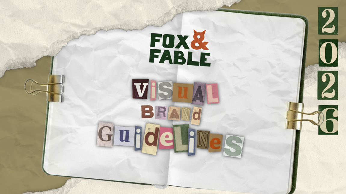
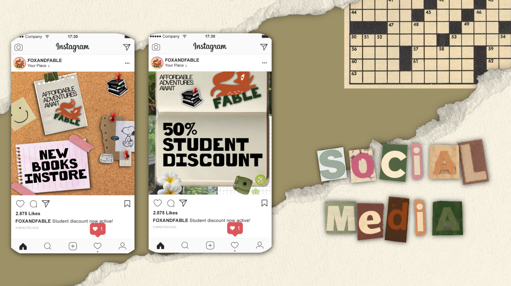
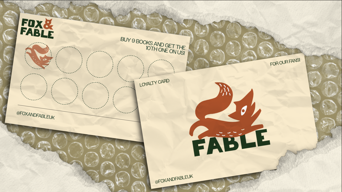
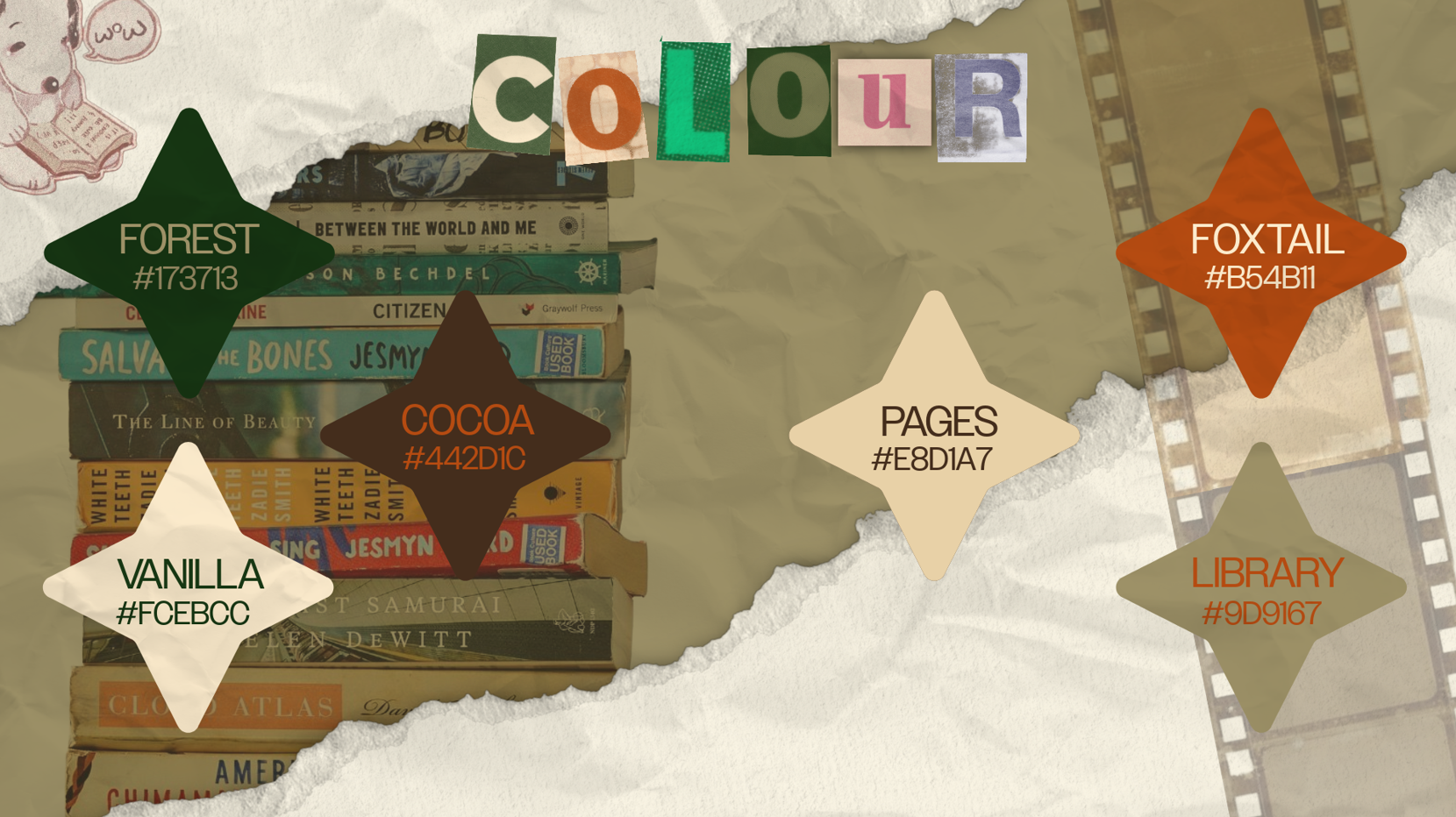
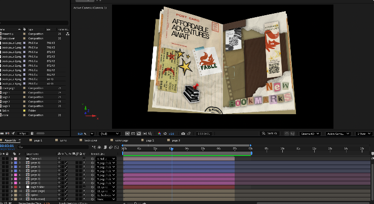
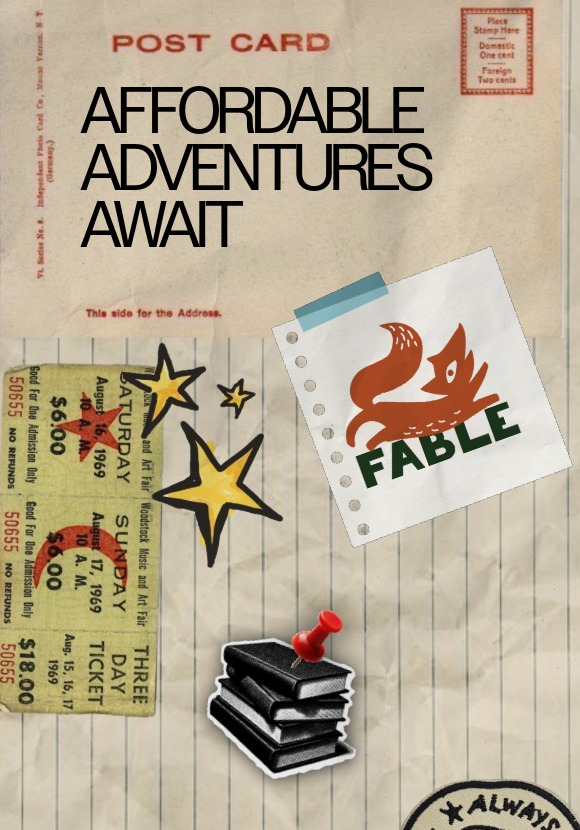
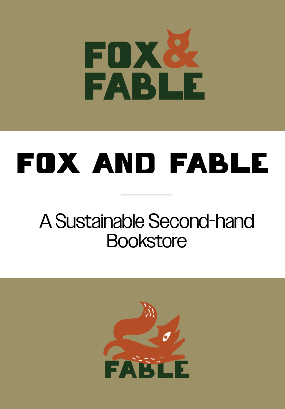
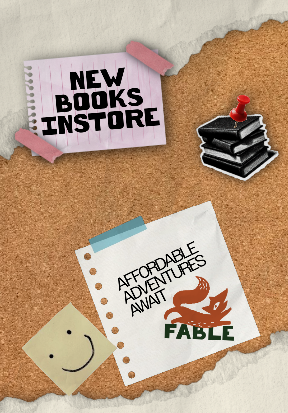
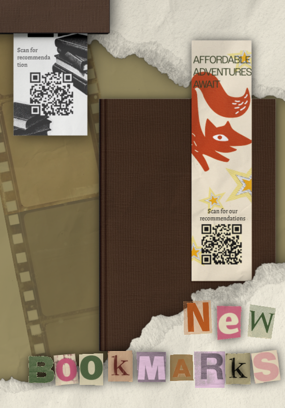
This is my infographic animation. I made the decision to use an infographic because, “Effective infographics are a powerful way to cut through the noise, engage your audience, and communicate clearly, no matter the context” (Figure 1) and therefore I focused on creating an effective infographic that reflected my brand identity.
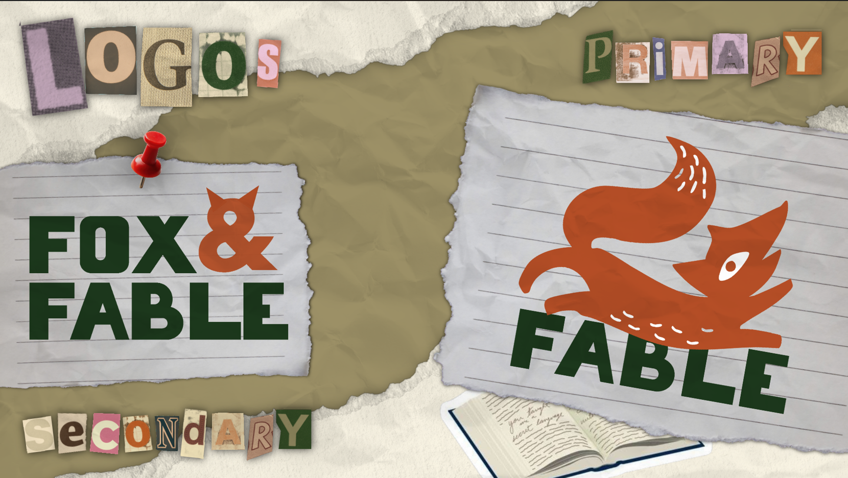
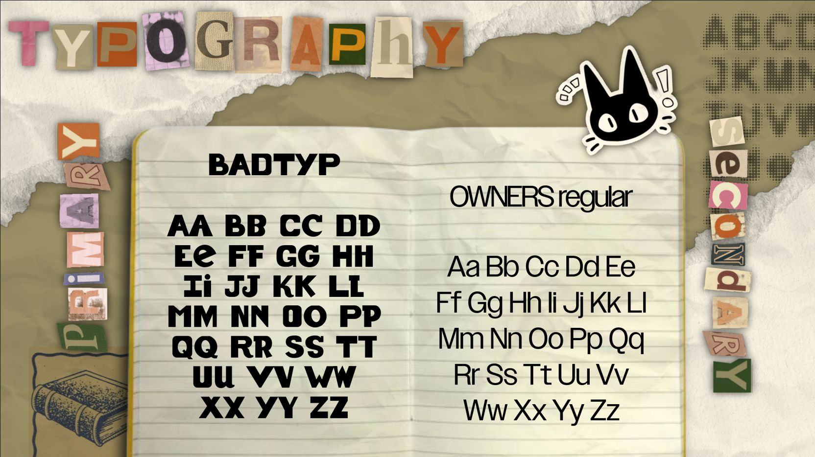
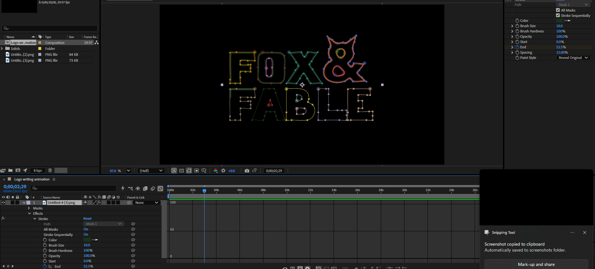
This was inspired by a tutorial we followed in class however; I found a similar tutorial on YouTube which better suited the aesthetic of my brand. To create this animation, I firstly created each individual page on Adobe Express/illustrator before moving them into my composition. Key reflections from this animation are my experimentation with new aspects such as null objects and cameras. I also designed the front cover to suit my brand.
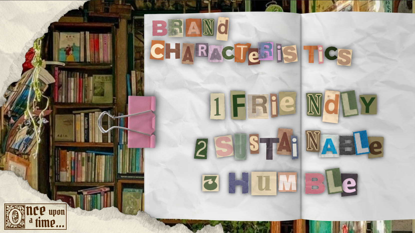
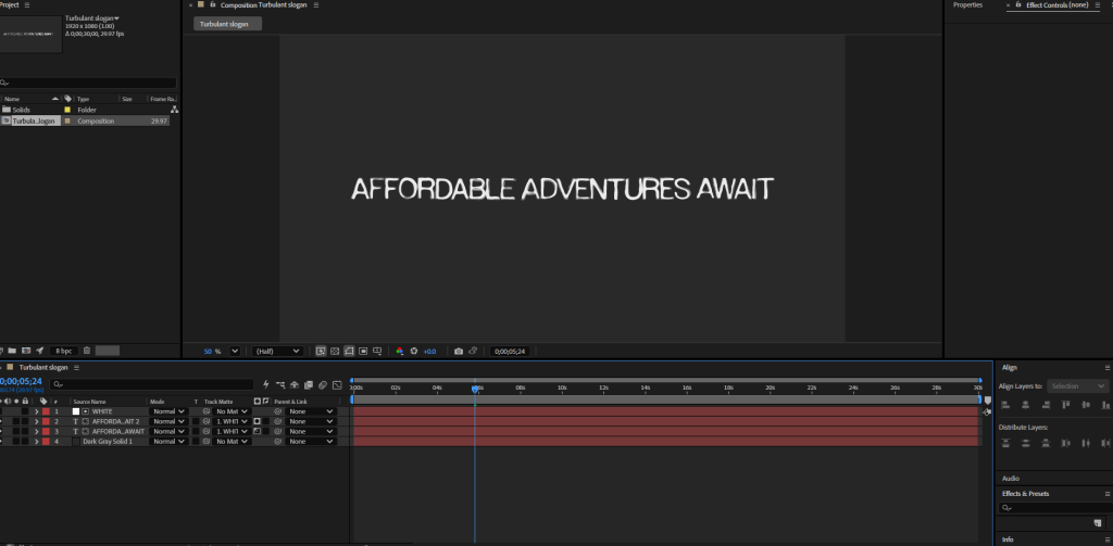
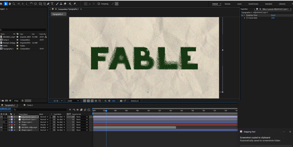
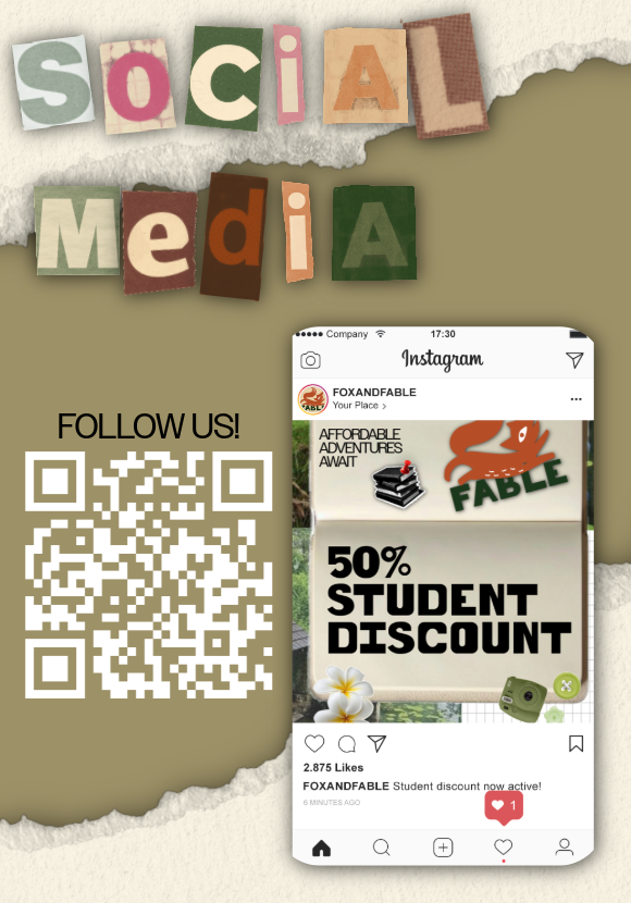
All of my animations continue to build brand identity for my secondhand bookstore. Each animation embodies my tone of voice and brand personality, stayingf friendly and sustainable.
REFERENCES
Elmer Drogt (N.D) Illustration & Infographics for Bookshop Illustration & Infographics for Bookshops | Elmer Drogt Graphic Design (Accessed 3rd May 2026)