Refined Brand kit
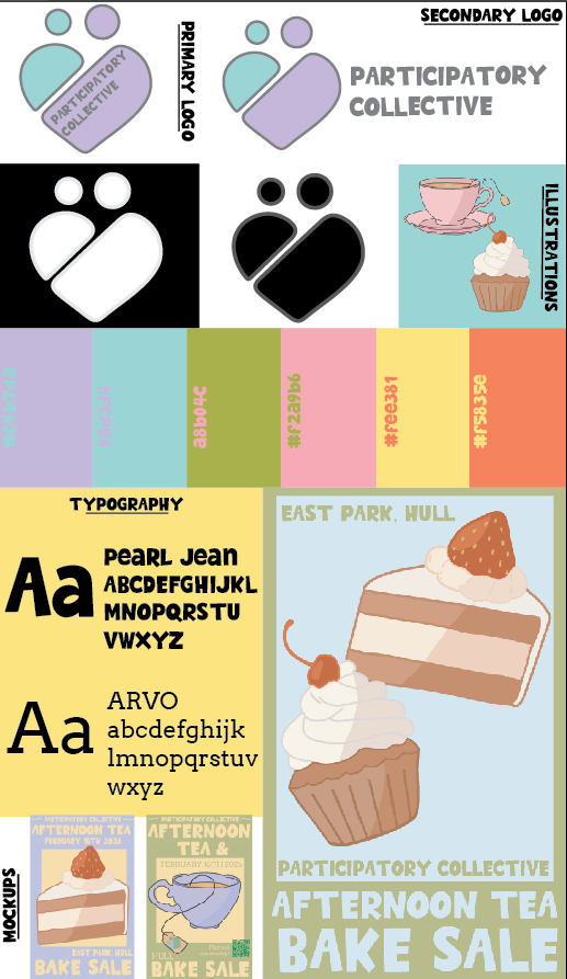
Here is my redesigned brand kit. I created this to clearly show all my completed brand components. I emphasised the brand identity throughout the kit by using my mockups. The mock–ups reinforce the brand identity through the realistic depictions of my brand in use. Furthermore, the brand kit itself is aesthetically pleasing and easy to understand. The brand kit also has key components such as my primary and secondary logos, my logo with contrast (to prove accessibility and recognisability, colour palette and my fonts.
Refined primary and secondary logo
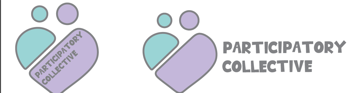
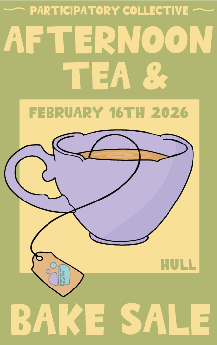
Regarding my logo, I finalised it before uploading it to my brand kit. My logo is effective as it captures the love within community and the Participatory collective aims to provide a nurturing, supportive atmosphere. The main logo has the text within the heart and the colours are from my brand colour palette which builds brand identity. This design is effective and accessible due to the contrasting colours.
The secondary logo is slightly different as the typography is outside of the heart. This was done primarily for when the logo is shrunken as then the text will still be easily visible. This promotes accessibility within my brand and makes the logo inclusive for all users. Both of my logos are clear and very similar, this brand image is strong and the logo is used throughout my website and my campaign.
Refined colour palette
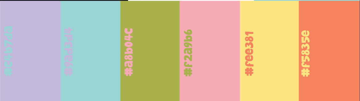
Here is my refined colour palette. It is a warm palette comprised of blue, green, pink and orange.. I utilised this palette throughout all of my branding such as the posters, website and the logos. These colours work well together to create a unique environment that makes the user feel comfortable. The colours also are slightly similar to the ‘Ideas fund’ which is directly effective as they are the sponsors of the PC. Furthermore, the stakeholders Kate and Gill both expressed that they liked the Ideas Fund and would like a subtle link to it as homage which I have captured.
Refined Primary and Secondary typography
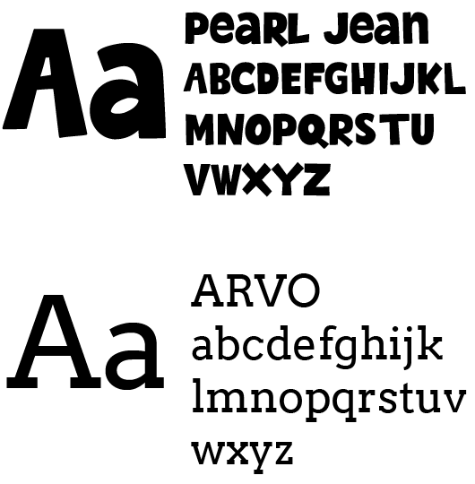
I have also got my primary and secondary font. My primary font, ‘Pearl Jean’ is a bold, playful font. This font combines aesthetically pleasing with functional as it provides an inclusive font due to its bold nature allowing it to be accessible. Furthermore, this also links to the Ideas fund as they also utilise a bold, cheerful font. Additionally, the font is environmentally friendly as it is a “woff” font, this means that it is more sustainable as it is a much smaller font to download.
My secondary font I have decided to alter since my mid fidelity. I decided to change to the font ‘ARVO’ as it complements my primary font more. This font is also bold and easily readable allowing my brand to be focused on accessibility. I have utilised this font for main text as well as secondary information on my posters and banners. The use of both fonts was necessary to create a visual hierarchy and simplify the ads for the viewers.
Brand identity across platforms
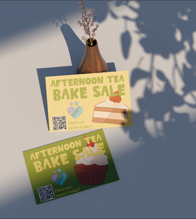
Finally, I have focused on my brand identity across platforms. I wanted my brand to be able to be recognisable in any media. I focused on creating this brand identity by using my colour scheme on all of the platforms, for example the website, logo and posters/ads all stick to my colour palette. Furthermore, I have reused my logo throughout all of my campaign and my websites. Utilising the logo is very effective as it is recognisable, allowing the user to see the brand instantly. Finally, I continued to use all of the components of my brand kit throughout each platform. This design is crucial to build an audience and make sure my brand identity is strong. “brand consistency fosters trust and recognition. It makes your audiences feel connected across various social platforms” (Figure 1). This is why I aim to focus on having my brand components mirrored across all platforms, my users must feel comfortable and trust the brand. This is especially important for the collective as it is imperative to build trust to help make a change in society. These communities want engagement and that is much more likely when there is a strong relationship with their users.
My designs such as traditional media (postcards/posters) are reminiscent of the social media side of advertising. This is key especially as a large portion of my user will not be tech savvy allowing them to have the same experience as a user that may have accessed the social media. The use of both platforms is great for all stakeholders, especially funders and academics as they will see the passion of the brand and want to get involved.
REFERENCES
Figure 1 – Branding (2024) The Importance of Consistent Branding Across All Platforms https://www.litmusbranding.com/blog/importance-of-consistent-branding-across-all-platforms/ (accessed 2nd January 2026)