3. Social Media Campaign

Project 3

I decided to base my campaign on an afternoon tea and bake sale event. Personally, I thought this event was effective as it represents the ideas of the PC, bringing communities together. I decided I would create illustrations to utilise within my campaign in order to focus on the storytelling aspect as this is crucial for any community brand. “Storytelling is at the heart of most successful nonprofit campaigns. Whether it’s a fundraising campaign, a call to action, or a campaign to raise awareness, illustrations can bring these stories to life in a way that captivates the audience. Illustrations have the power to depict stories in dynamic and imaginative ways.” (Figure 1) I emphasised the storytelling through my posters and banners that include hand drawn illustrations and I did this with the user in mind, encouraging them to engage with the brand and join in with the community.

Social media research

Before starting on my media campaign, I did some research in order to determine the style and ideas I like with the online media. I liked the personalised look of hand drawn illustrations and the human connection that is made with the user. This is particularly important for the PC as the collective focuses on bringing communities together and fighting social inequality.

Poster research

I did some research on different banner designs. I like designs that make it clear that my event is an afternoon tea. I intend to utilise the hand drawn sketches that I made of a teacup and cake in order to emphasise the event and continue to reinforce brand identity.

Initial Sketches

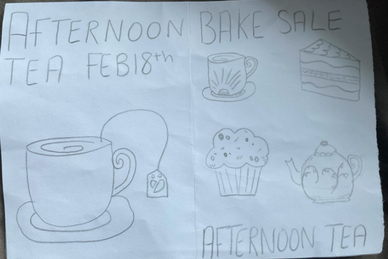
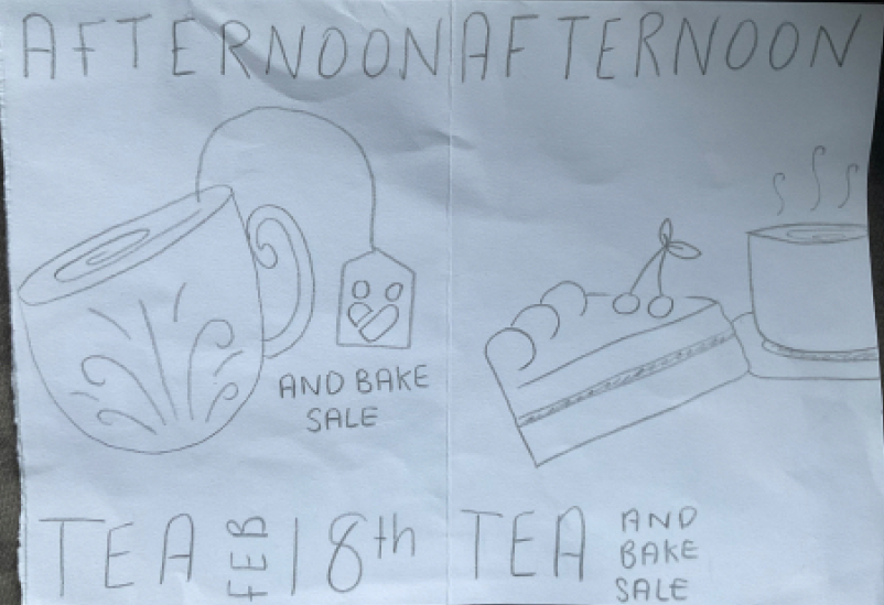
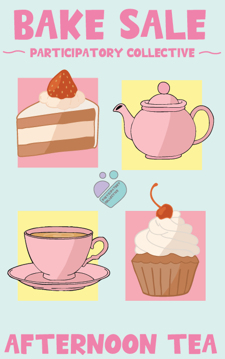
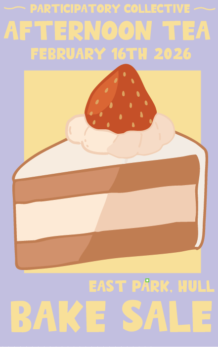
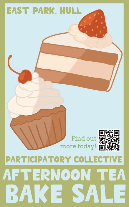
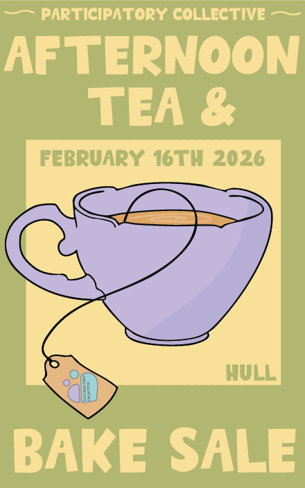
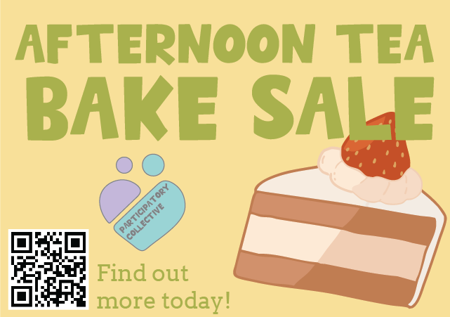
Here are my initial sketches of my posters. I wanted to utilise a simple design which is aesthetically pleasing and easy to understand. All of my designs include key components such as the name of the event, the date and location and a reference to the participatory collective. Each design focuses on the event and I kept my stakeholders in mind as I created these as the designs are accessible due to the bold font and large pictures. These pictures simplify the poster allowing a user to understand the purpose straight after seeing them. This storytelling is crucial in a successful campaign and each component of the campaign must be user-focused.


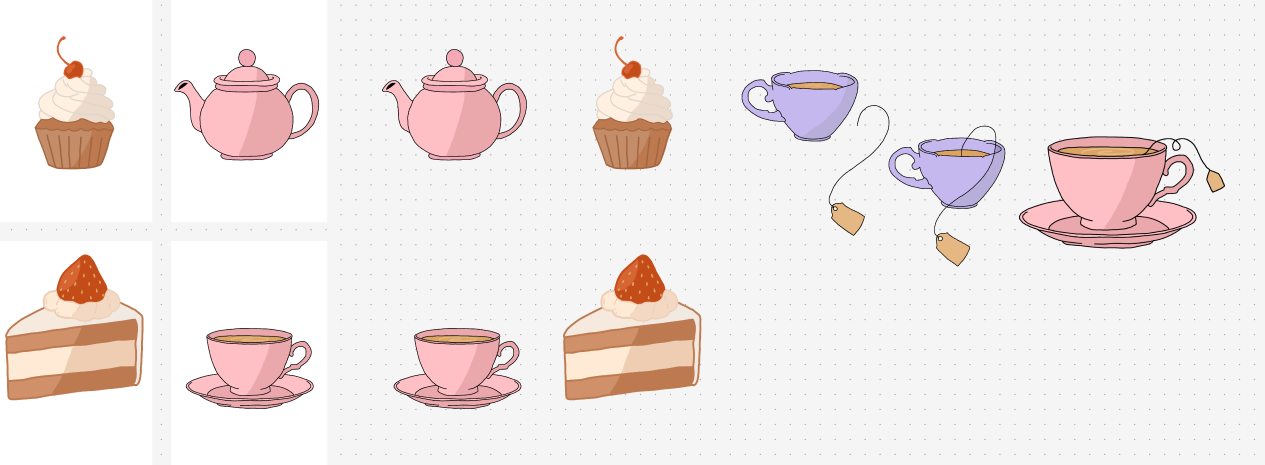
I have also shown my drawings that I did and that I will utilise in my design. These drawing are effective for a user as it humanises the campaign, allowing the user to relate and enjoy the poster even though it isn’t perfect.

Posters

Here are my 4 posters I created for my campaign. They all follow my brands colour palette however each has a slightly different style. The first blue poster is the brightest and it has all 4 of the illustrations I created. Clearly represents the PC through the use of the logo and fonts. My other posters all represents the PC in some way, for example utilising the logo in the design or the name of brand in bold text (in my primary font). I have utilised a QR code in one of these poster to allow for easy movement into the ensure for a user. This transition between platforms is smooth and encourages engagement.

Banners

Here is the banner I created for my design. Banners are essential as “Studies show that 71% of consumers prefer more personalized digital ads. Banner ads achieve this by effectively targeting your audience.” (Figure 2). My banner follows my brand standards and also links to my brand identity. It is also bright and recognisable as banners are usually at the top or bottom of websites therefore having it as eye catching will encourage a larger audience.

Reels/Video Ads

I have created this reel to promote my campaign. It follows the trends of my campaign as it utilises the same colour and illustration of the posters. The cupcake gets eaten which is the hook, encouraging the user to gain clarity on what is happening. The call-to-action is the QR code which makes it easy to get involved.

I have also created this second reel. This reel also follow brand identity, a cake slice falling into the page. The logo and PC is clear and brand identity is established clearly. Both of my reels are engaging and the user will understand the campaign through watching either of them therefore they are very effective.

Postcards

Finally, here are the small cards I made. I made these to be used as postcards or even business cards. The different types of media are integral in having a strong brand. These postcards are very similar however have clear links to the campaign and my brand.


REFERENCES


Figure 1 – Imagination (N.D) Illustrations For Nonprofit Organizations: Making A Difference Through Art https://www.madebyman.co.uk/blog-details/illustrations-for-nonprofit-organizations-making-a-difference-through-art (accessed 1st January 2026)

Figure 2 – CAMPAIGNMONITOR (2020) Should I Use Banner Ads? Learn the Pros and Cons https://www.campaignmonitor.com/blog/email-marketing/banner-ads-pros-cons (accessed 1st January 2026)