1. Initial ideas and concept development
Typography, Colour Palette and Imagery
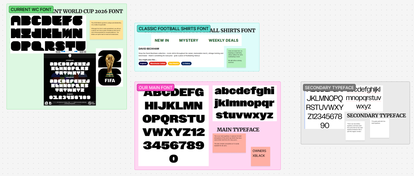
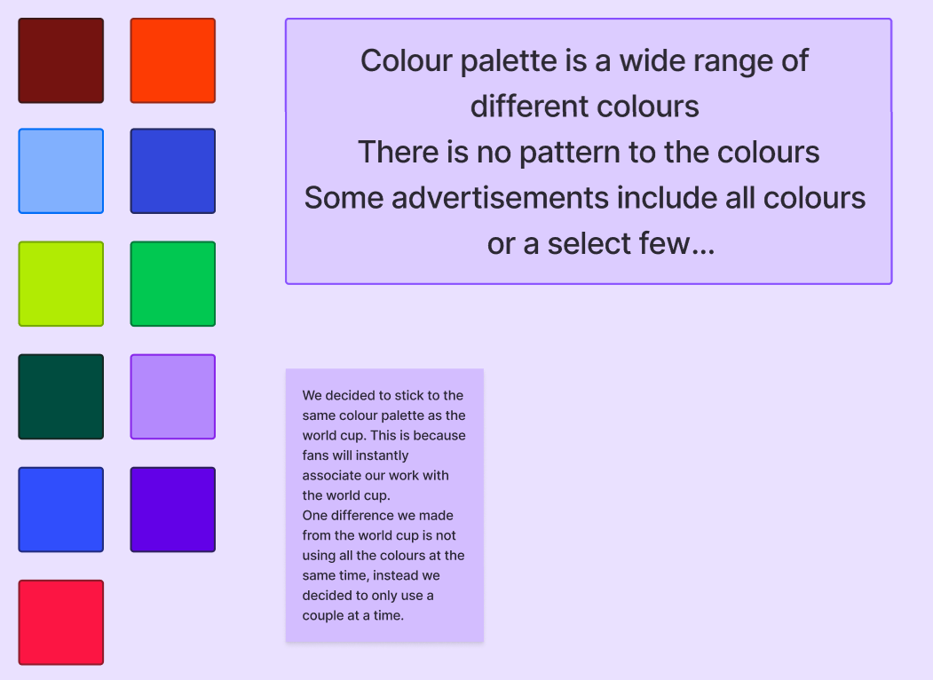
The typography and colour palette for this brief was developed through our own research into the world cup and also aided by the data gathered from the marketing team. We decided a bold, inclusive font and the vibrant world cup colour palette was effective.
Regarding imagery, we decided to go forward with the idea of putting famous players and teams within our work. Through collaboration with the marketing team, they gave us important data on popular football players (e.g. Bellingham) that would be beneficial to our campaign. This was also aided through in-class discussion with our lecturer and peers who decided that this was an effective route to take for the campaign.
Tone of voice
After thinking about the client and context, we decided the tone of voice for this campaign would be something energising and exciting. This idea was built due to one of our lectures discussing the importance of brand identity. Our campaign will build eagerness for the World Cup through promoting the nostalgia of previous WCs as well as the unique atmosphere for the 2026 WC. The marketing team provided us with their input (e.g. through their own sitemap/user personas) and this helped us decide on the definitive tone of voice for this campaign.
Early concept development and collaboration ideas
Initially, Leah and I created a mood board of ideas that we thought were aesthetically pleasing as well as giving us inspiration as art directors to choose how to move forward with the creative brief. We wanted something that aligned with our idea of what we had in mind as well as staying on the same page with the marketing team therefore this initial ideas mood board was imperative for collaboration and learning diverse perspectives of our work. Furthermore, mood boards are great for collaboration as they were easy to show to the marketing team when we met up with them, allowing us to include their ideas about trends and data to enhance our work, attracting a larger audience to our camapaign.
Furthermore, as art directors we had to push our ideas forward whilst also considering the ideas of the marketing team. For example, they had some campaign design ideas already which they presented to us and we thought they were less effective than the designs that we had made based upon our individual research. To combat this, we communicated effectively and showed them how our design was more effective whilst taking the strengths of their design onboard (e.g. focusing on the nostalgia).
2. Feedback and Big Idea
How did feedback influence decison making?
Over the course of this brief, I had lots of opportunity for feedback and made a lot of iterations to my designs. For example, when speaking to the client, we made sure to showcase our work alongside the marketing team’s data and research. Ash and Alec saw our work on multiple occasions and gave us tips and pointers which we implemented in our design for example, creating a mural for our landing page and home page rather than a simple banner.
As an art director, listening to feedback and criticism is imperative when working on a project in order to create the most effective design for the user.
In lectures, we had many opportunities to showcase our designs which got critiqued and this was very effective for our design iteration process. For example, I learnt that one of my designs was perhaps too crowded, so I ended up focusing on a simpler design. Furthermore, we decided to utilise a strong call-to-action and focused on developing this with the marketing team e.g. buttons to click on social media or strong engaging slogans.
Changed made to concept or direction
Throughout the design process, we made many iterations and ultimately had many rejected designs. This is due to a multitude of reasons such as the design not being inclusive, the design was limited as well as changes being made to make the design stronger. The use of having feedback makes the design have diverse perspectives and avoid being streamlined and limited. Using the marketing team as well as the in-class sessions, we got lots of valuable feedback which resulted in changes such as which social media platform we intended to make content for and what to include on our murals.
It is clear that feedback is imperative within design, for example we also gave the marketing team feedback on their work. Through this collaboration, we ultimately made an aesthetically pleasing visual design that was supported with marketing trends and data to attract a larger audience.
Reflection
Initial/ Rejected designs
Me and leah created a mood board filled with all of our design ideas. Following this we started to develop some initial sketches and mock-ups. These sketches ranged from website mock-up sketches and layout sketches to sketches for the mural we would like to create. Sketches are crucial as “By sketching out their ideas and alternatives, designers can identify flaws or unforeseen opportunities early in the design process” (Figure 1) and this is clear as many of our sketches we decided were limited so they did not make it to the mock-up stage.
Whilst creating our initial poster ideas, I used Adobe Express and Illustrator to create them. Firstly, I designed the shape cutouts and design on illustrator. I then masked the images into the shapes before moving over to Express. In Express I found it easy to play around with the layout and grain textures as well as using the font that I had identified with.
Sitemap
This sitemap was created due to collaboration with the marketing team. This helped us decide a way forward for our website layout and landing pages. This was very effective as it showed what was most popular due to their trends research and also allowed us to play with what would be most aesthetically pleasing.
Initial Website Ideas
We started to create our low fidelity based on our sketches. These are mainly comprised of shapes and no colour. These are useful in order to show to the marketing team and get feedback based on their own research.
Overall, after getting feedback from the marketing team and our peers, we decided to move forward with the idea of promoting nostalgic and current players and focusing on their shirts as a selling point.
We decided to go with a vintage/ grungy style as this was aesthetically pleasing whilst also targeting our desired audience. Furthermore, design trends show that this style is popular and the nostalgic atmosphere it brings is perfect for our design.
References
Bierut (2026) Why Is Sketching Important In The Design Process? Why Is Sketching In The Design Process (Accessed 20th April 2026)